Crown Street, Wollongong, 2500
Law Firm Website Design
Beautiful, Modern Websites We've Designed for Law Firms
Kells the
Lawyers

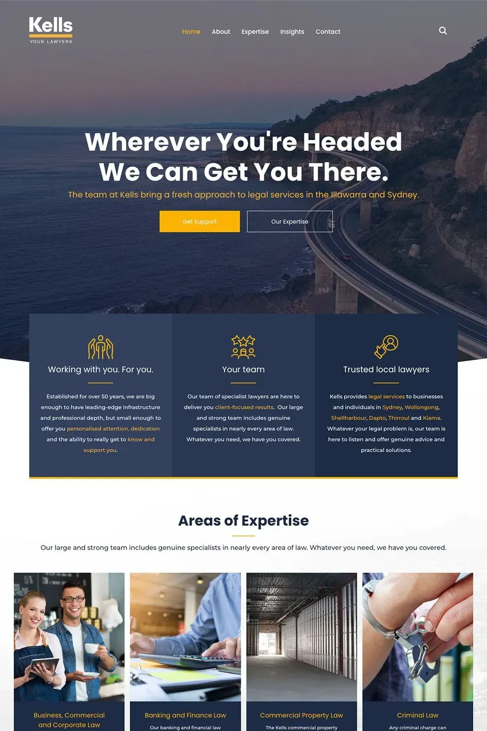
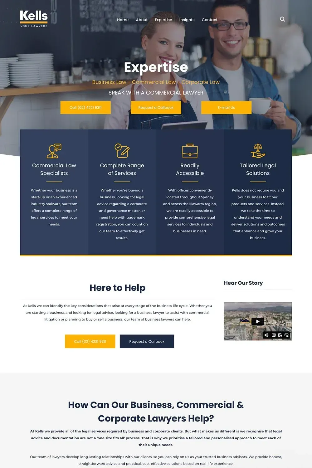
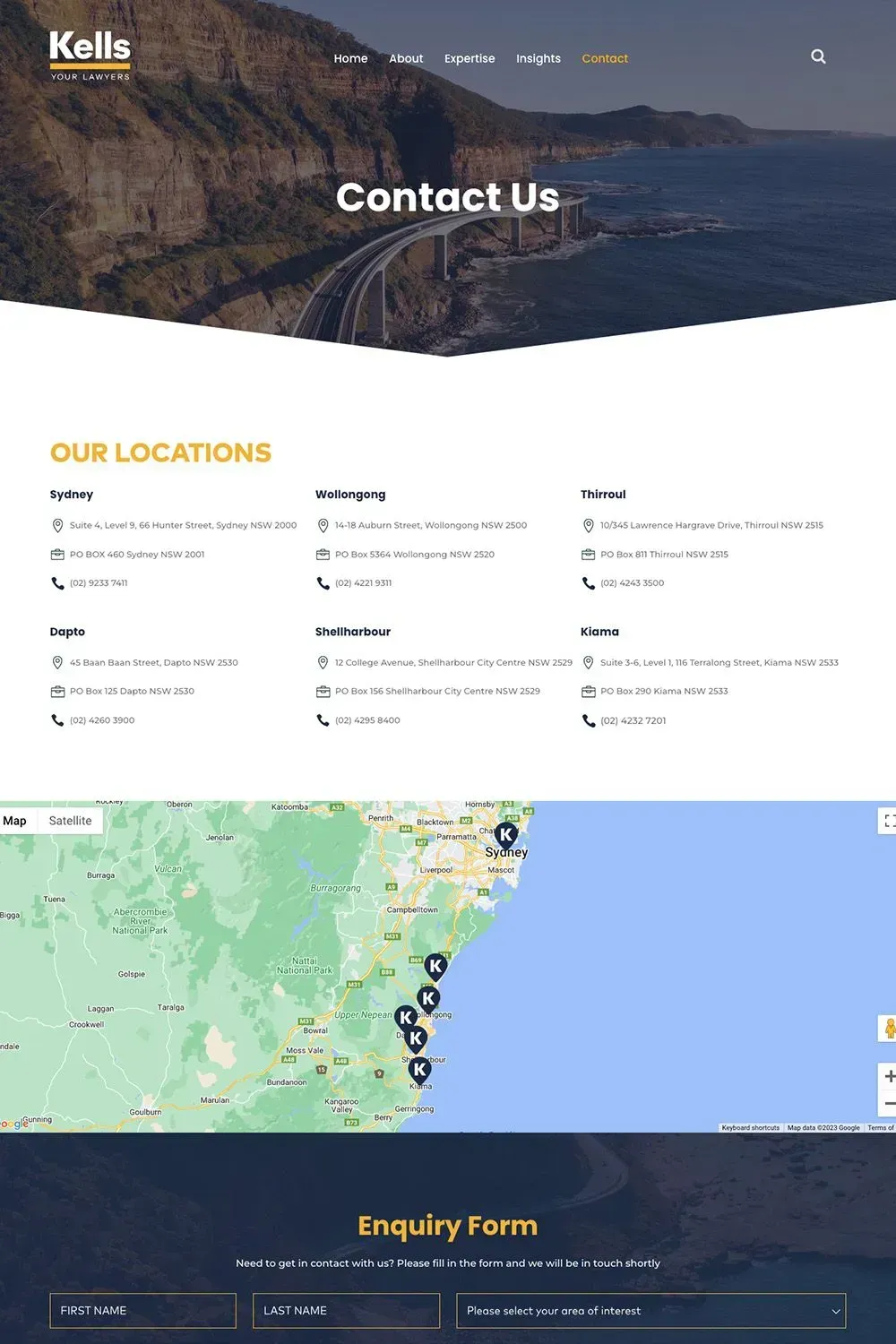
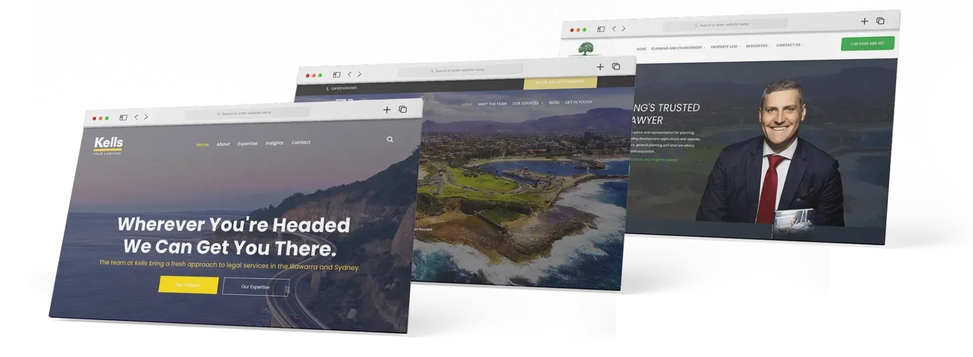
Kells the Lawyers is one of the most well-known names in NSW when it comes to legal services, with offices in Wollongong, Sydney, Shellharbour, Kiama, Dapto, and Thirroul. While already an established law firm in the region, they wanted to further improve their online presence starting with their website.
Their old website was good, but good is not enough for an esteemed organisation like Kells. A great, stunning website is more suited for a law firm of their calibre. They realised that, so they came to Love My Online Marketing and asked us to redesign their website as they know we specialise in web design for lawyers.
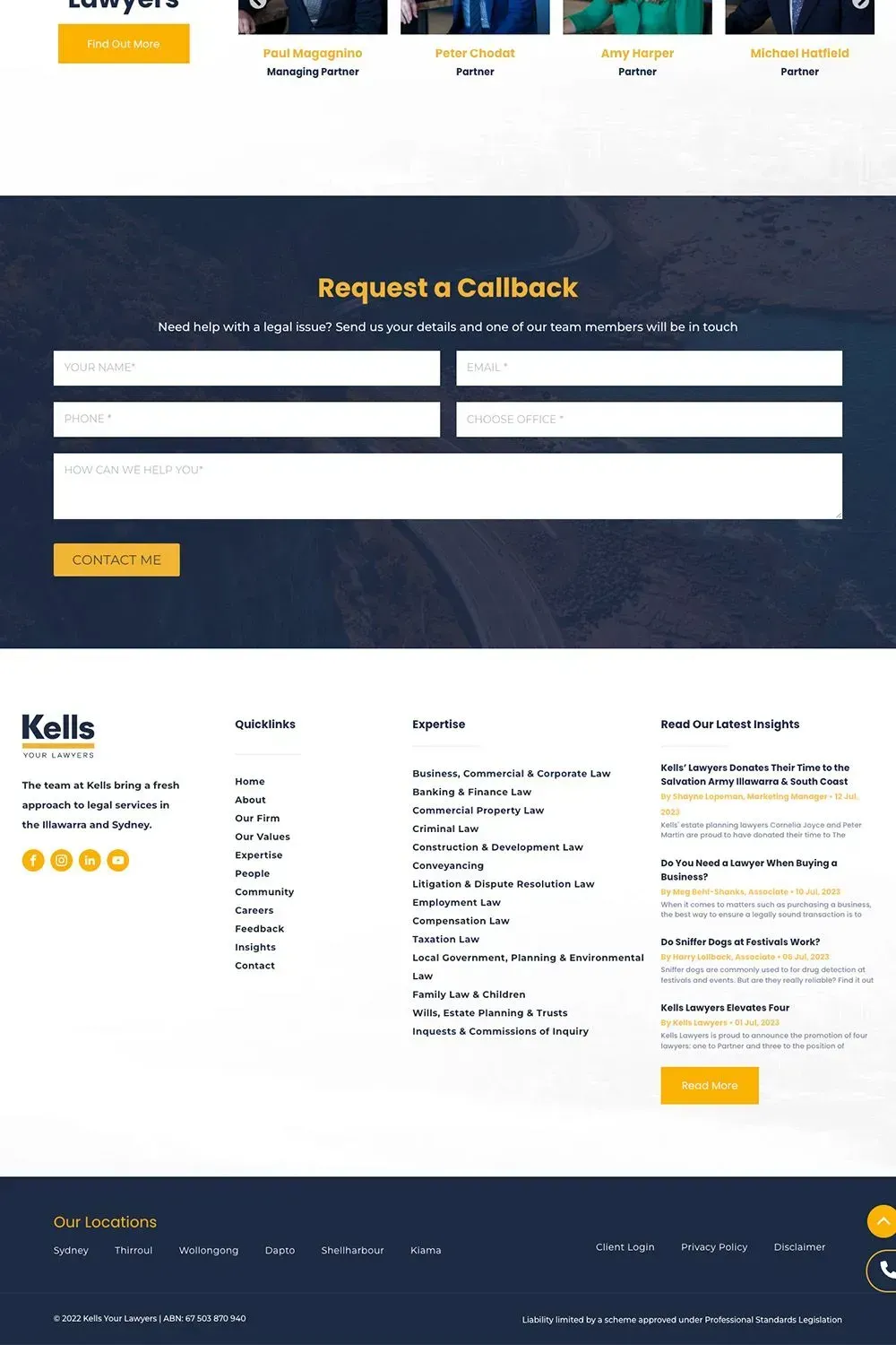
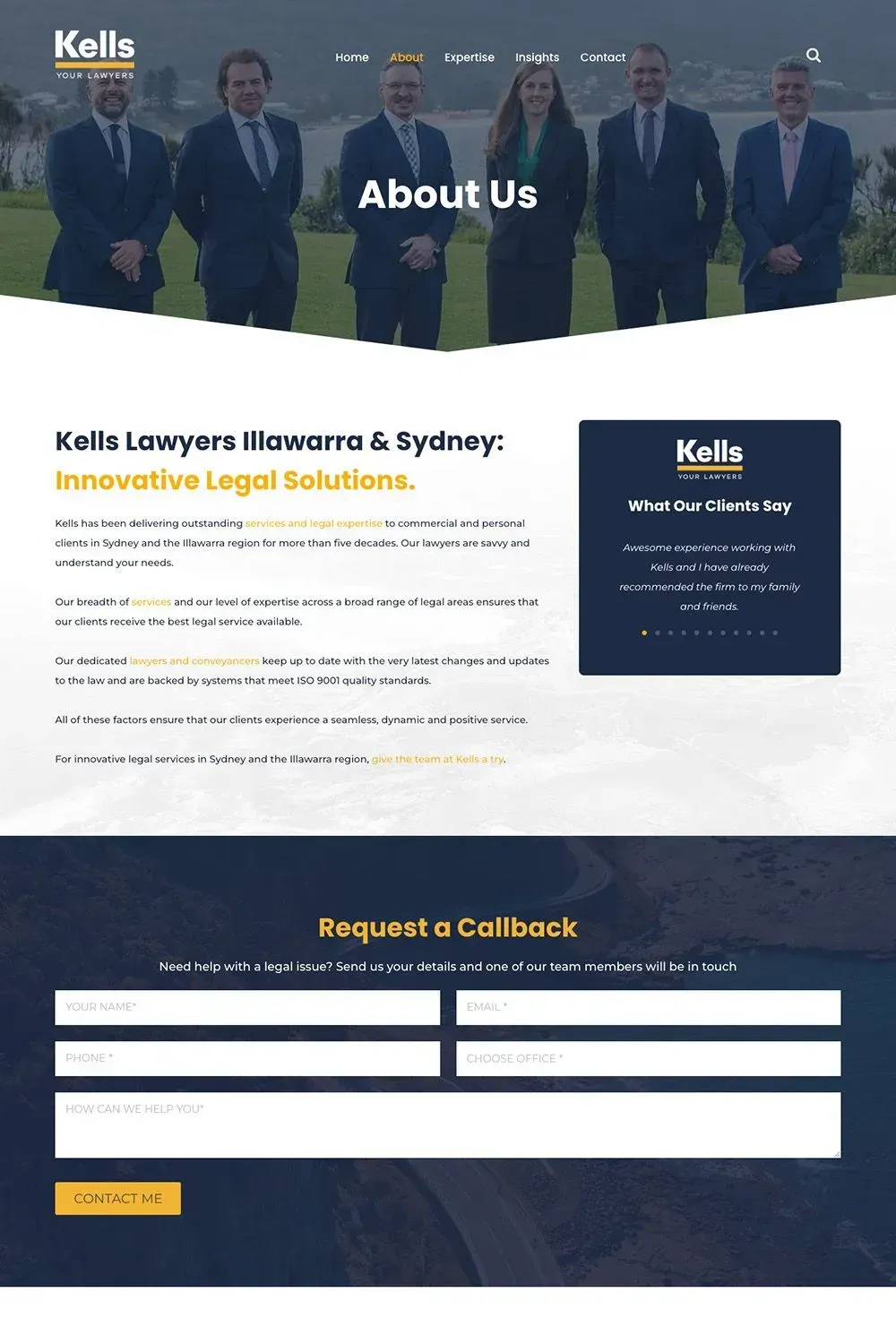
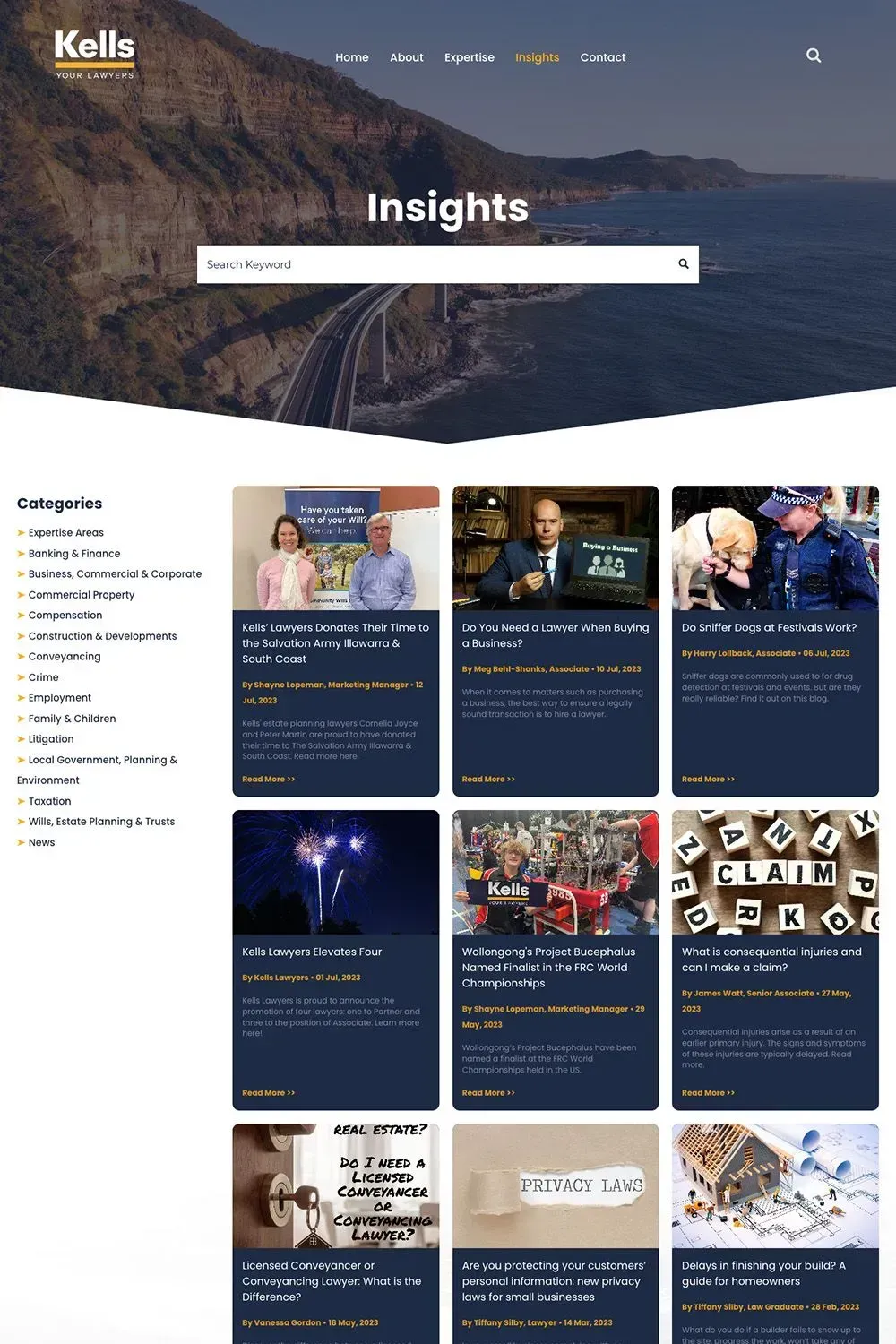
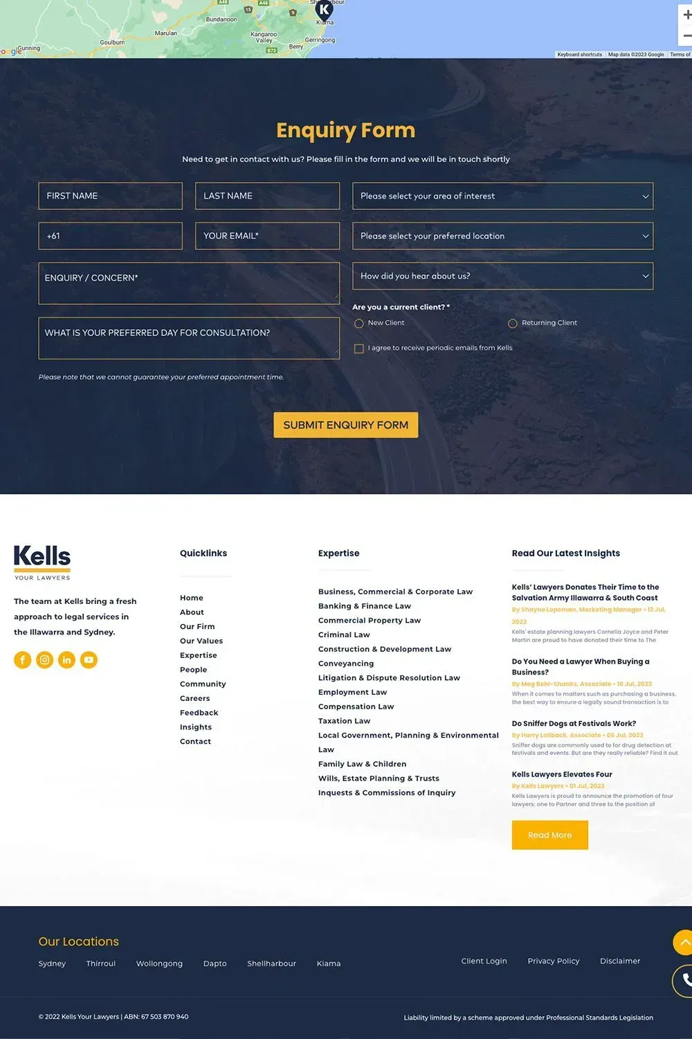
One of our top priorities was to enhance the layout and appearance of the website. The law is a serious business that requires utmost professionalism, but that doesn’t mean your website has to be boring. You can look professional and trustworthy with the right layout and design. But the problem is that the pages of their previous website had a very lacking look and feel, like if you tried to browse around you’d feel very underwhelmed and wouldn’t realise it’s a website that belonged to a top-tier law firm in the region. Now, the overall layout and appearance of Kells’ website looks absolutely stellar and screams professional, credible and trustworthy. We improved all of their pages, including their Expertise and People pages.
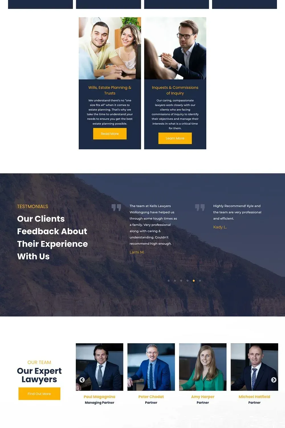
Another major thing we improved was the lack of information problem on the home page. On their old website, you wouldn’t be able to find any valuable information about Kells on it. Most of the information was generic. And if there was any good info, it wasn’t presented correctly. For instance, their Areas of Expertise were just enumerated in a sentence and didn’t come with any useful information that would help visitors to understand what that specialty was about with just a quick glance. If they wanted to learn more, they had to click on the hyperlinked text of the expertise area to know what’s covered under Taxation Law, for example. We solved this problem by dedicating a tile-based section for their Areas of Expertise that contained brief but informative write-ups about each expertise area so that site visitors have a general idea what a service is about without having to click anything. We also added calls-to-action buttons that links to their respective expertise page. Moreover, we made sure that the qualities that set Kells apart from the competition are properly highlighted on their home page.
We also added a Mega Menu to improve site navigation for a better user experience. With each menu item having a brief 1-2 sentence write-up, the Mega Menu helps to give the user an idea of what a menu item is about without requiring them to click on it. It’s a feature that’s especially helpful if you have many service pages and you’d like to enhance the browsing journey of your site visitors.
Our team also added more images to pages where necessary in order to improve user experience. For instance, we added more engaging images to their home page because their old home page only had a few boring images, such as landscape shots and abstract photos.
Lastly, we made sure that their new website delivers a consistent experience across all devices, from PC to mobile. Whether you use a desktop, laptop, tablet, or smartphone, Kells the Lawyers’ website will be easy to use and will look stunning all the same.
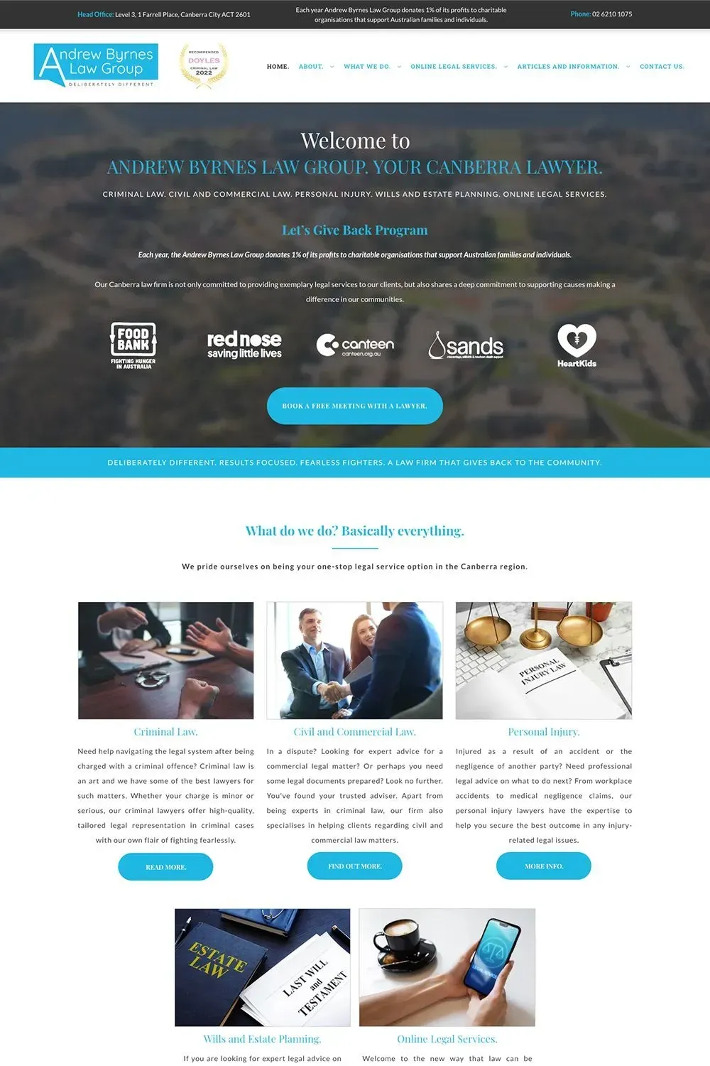
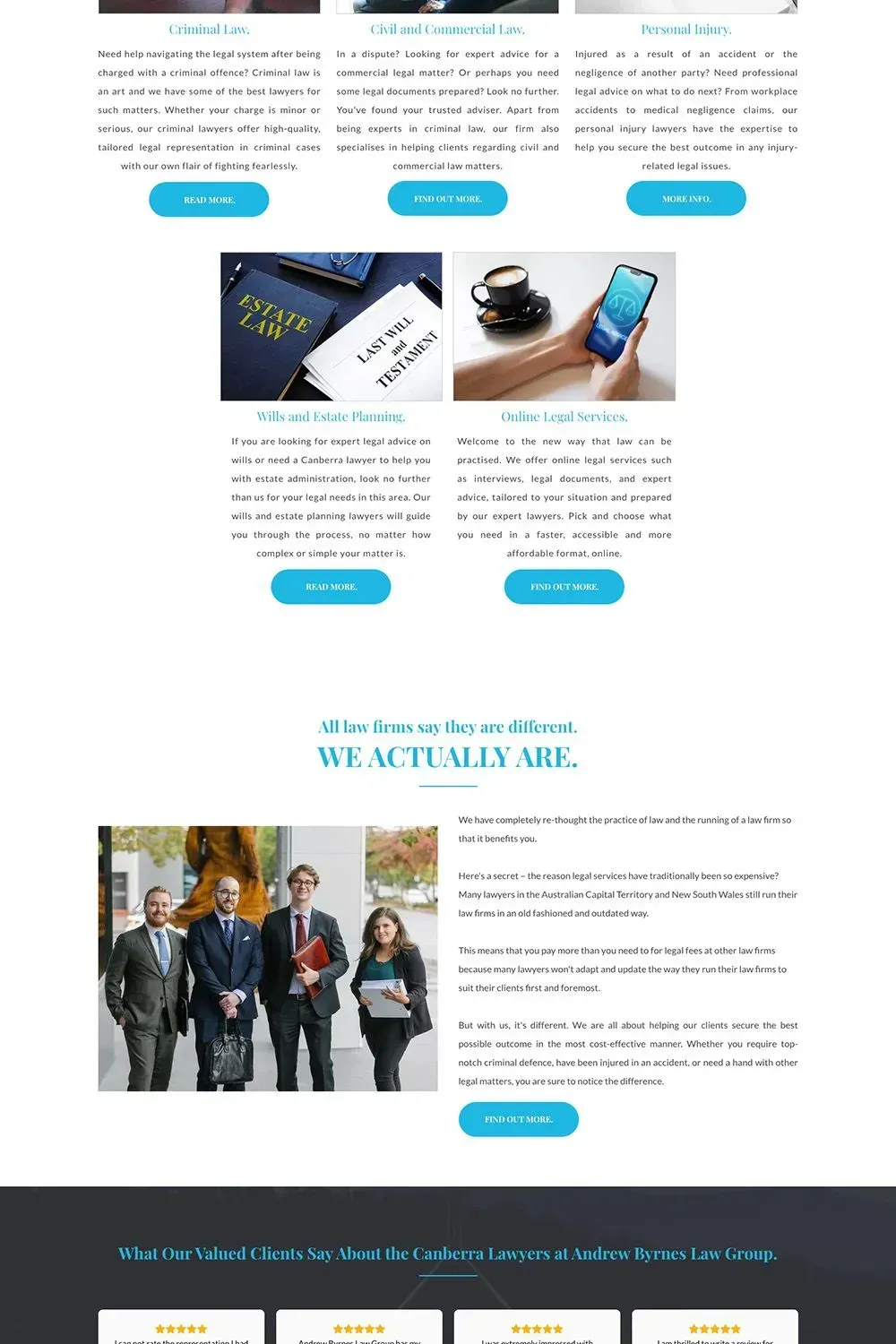
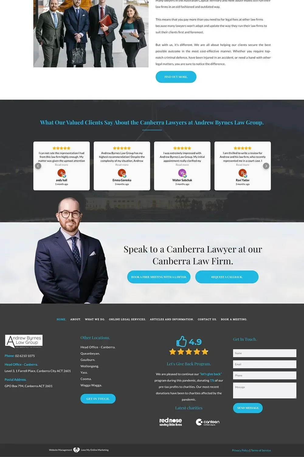
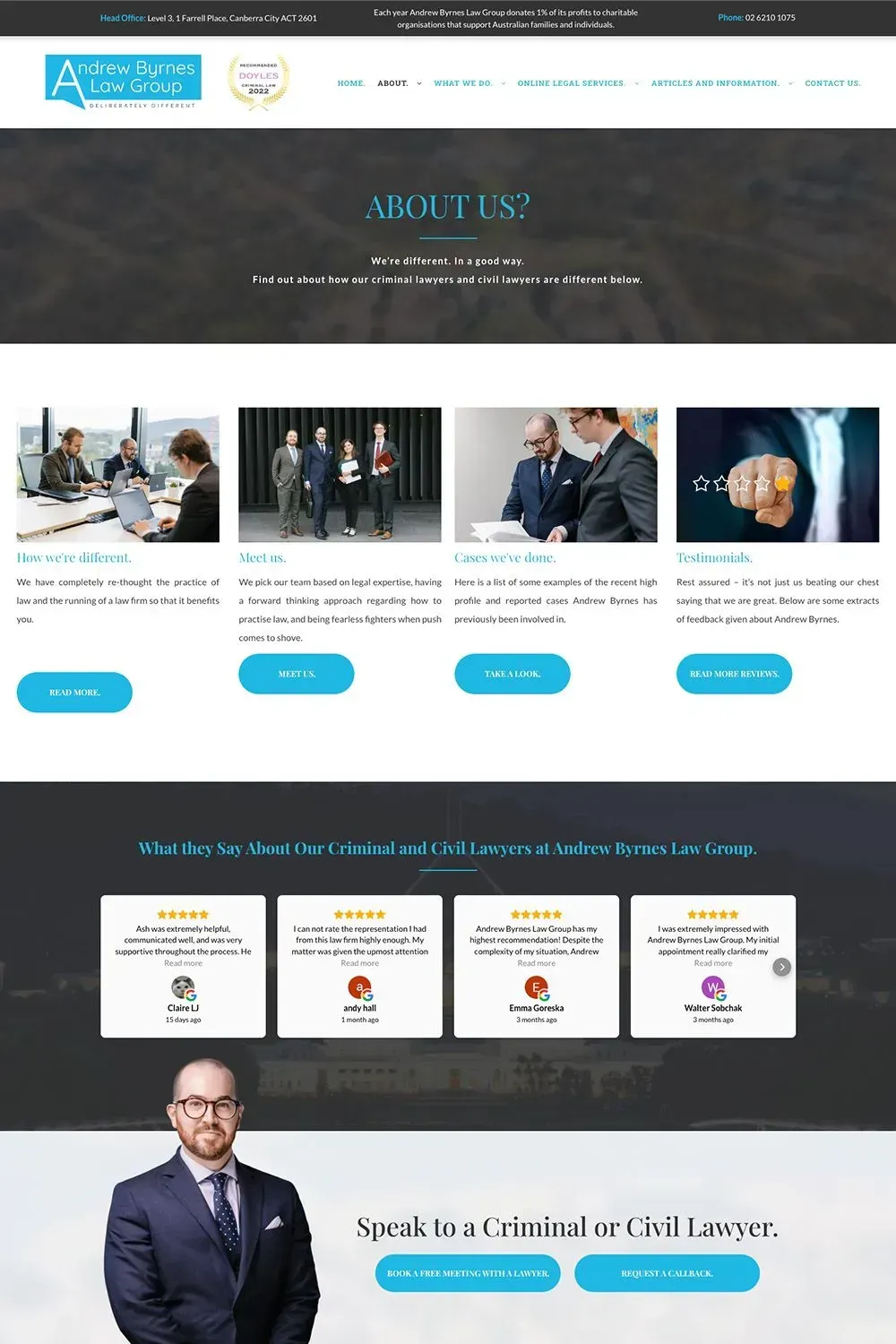
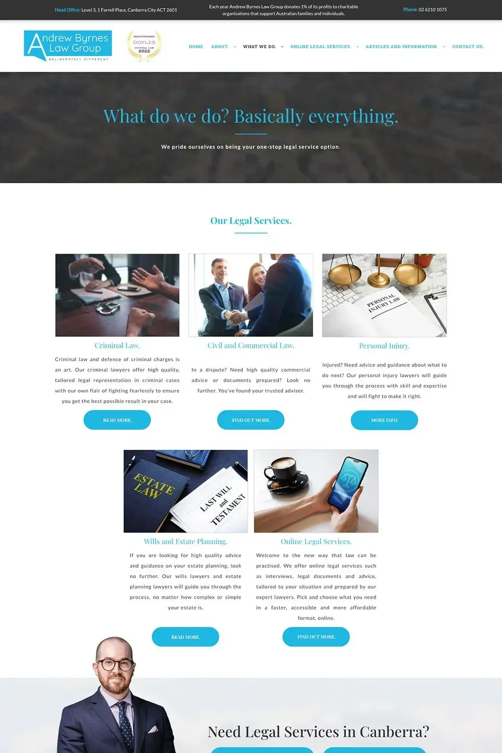
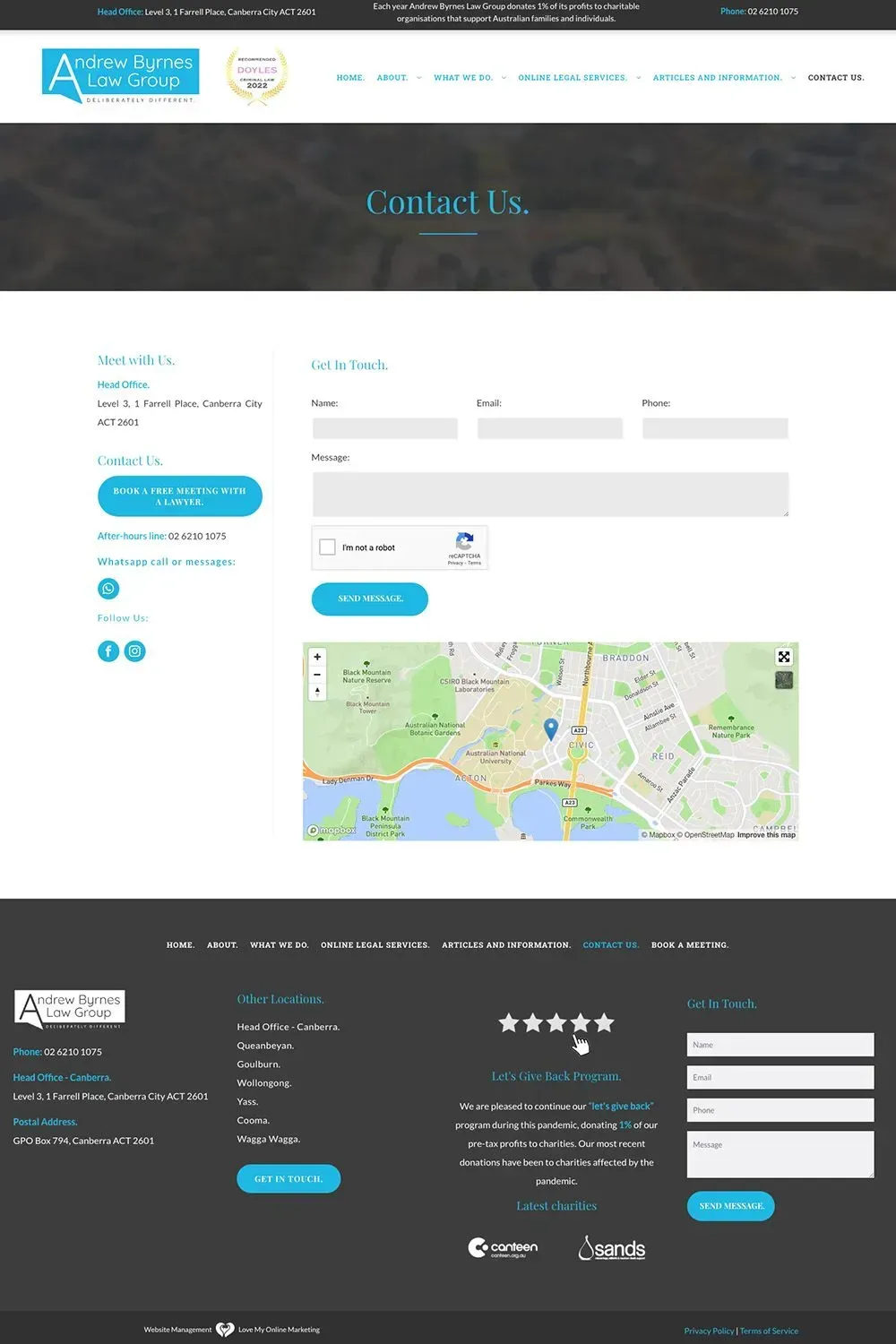
Andrew Byrnes Law Group

Love My Online Marketing created specialist Criminal Lawyer in Canberra - Andrew Byrnes Law Group - a fast, responsive and clean website design.
Since being in business, we've worked with a number of lawyers and legal firms across Australia.
Our copywriting team can also help explain any complex legal processes in a jargon-free, easy to understand way.
We are also an internet marketing company that is proud to represent over 200 client campaigns that cover various practice areas, helping them with SEO (search engine optimisation), PPC (pay-per-click), content writing, and other marketing services.
And as part of our ongoing partnership with Andrew Byrnes Law Group, we recently made some improvements to their already good website. We added a Mega Menu to enhance the site's navigability. Users can now move around the site with ease and access the information they need in just a few clicks or taps.
Foundation Law Group
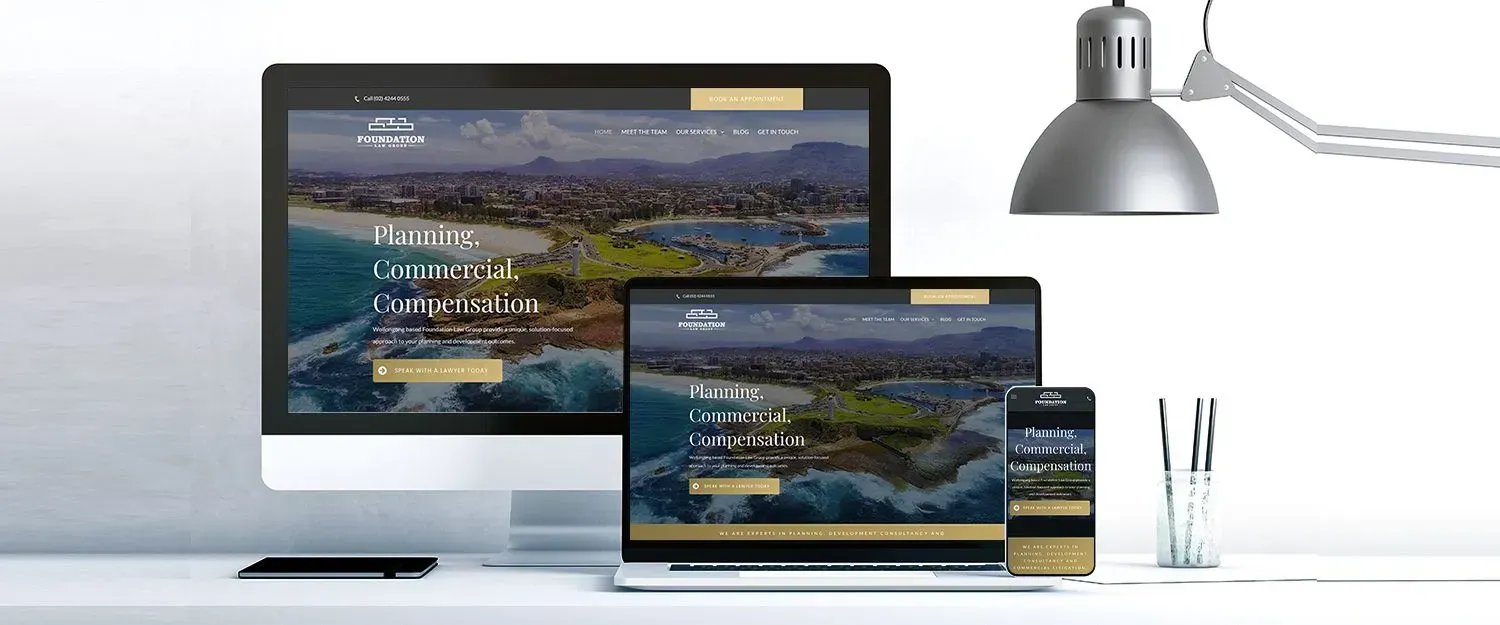
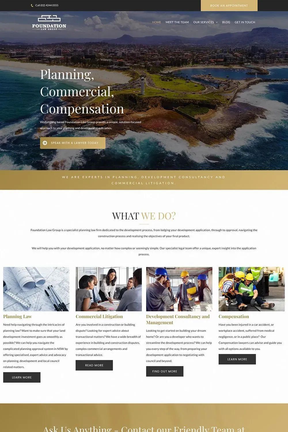
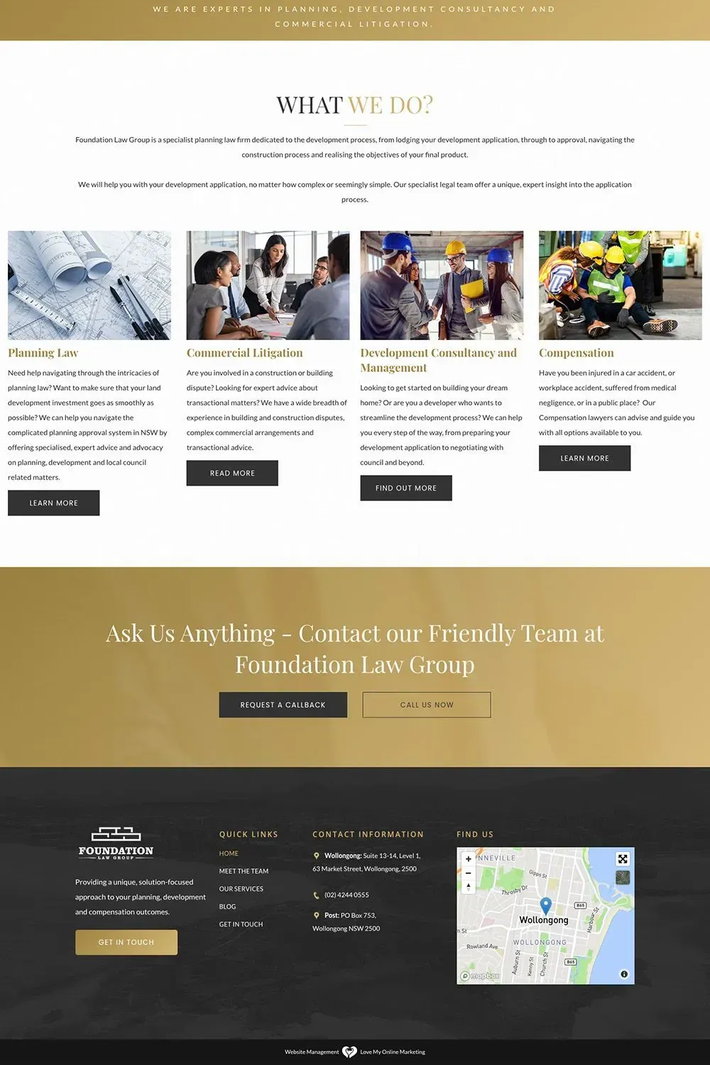
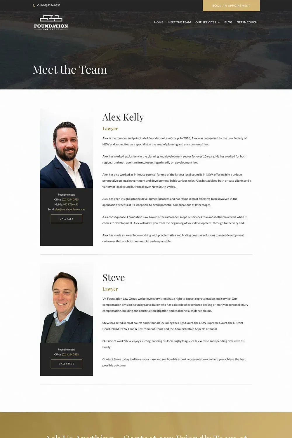
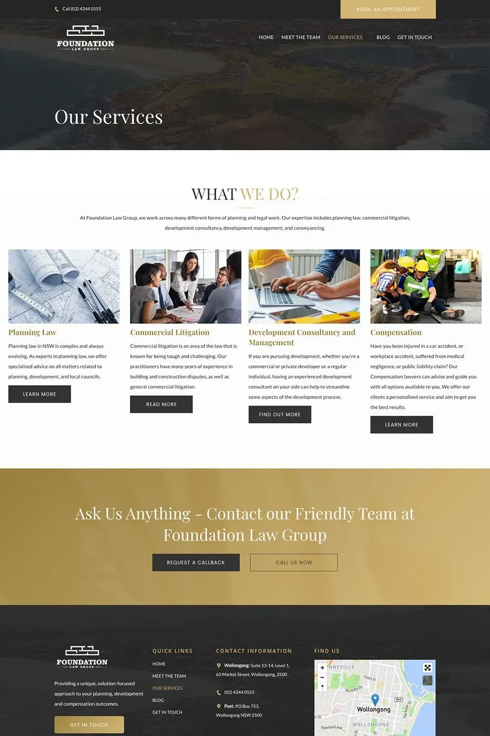
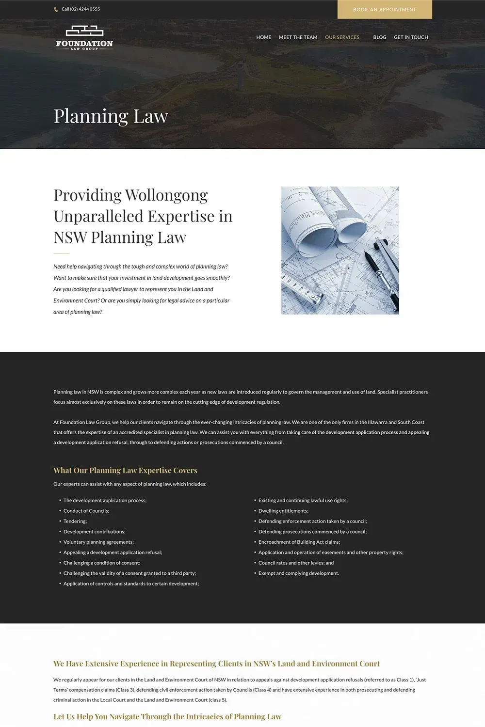
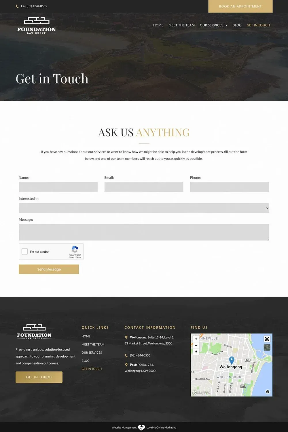
This Wollongong-based law firm is one of the best at what they do. We were approached by them to build a website that showcased the exemplary qualifications, capabilities and skills of their law firm.
With the help of our web design specialists, Foundational Law Group now has a web presence that does exactly that – and more.
For starters, their website is mobile-friendly. Any visitor who requires legal expertise can access their website using a smartphone, tablet, or any mobile device.
Their site also has clear and strong calls-to-action (CTAs) all throughout each major page. This makes navigation much easier for the visitor.
The content, both written and visual, is well-dosed. The images are striking and convey a sense of trust and professionalism. The web copy isn’t littered with confusing legal jargon and instead is written in a way that anyone without legal knowledge can easily understand it.
Lastly, the site’s overall design and layout are clean and simple.
Whiteacre Legal
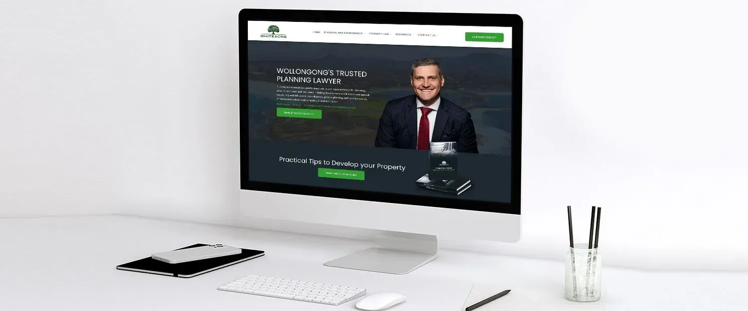
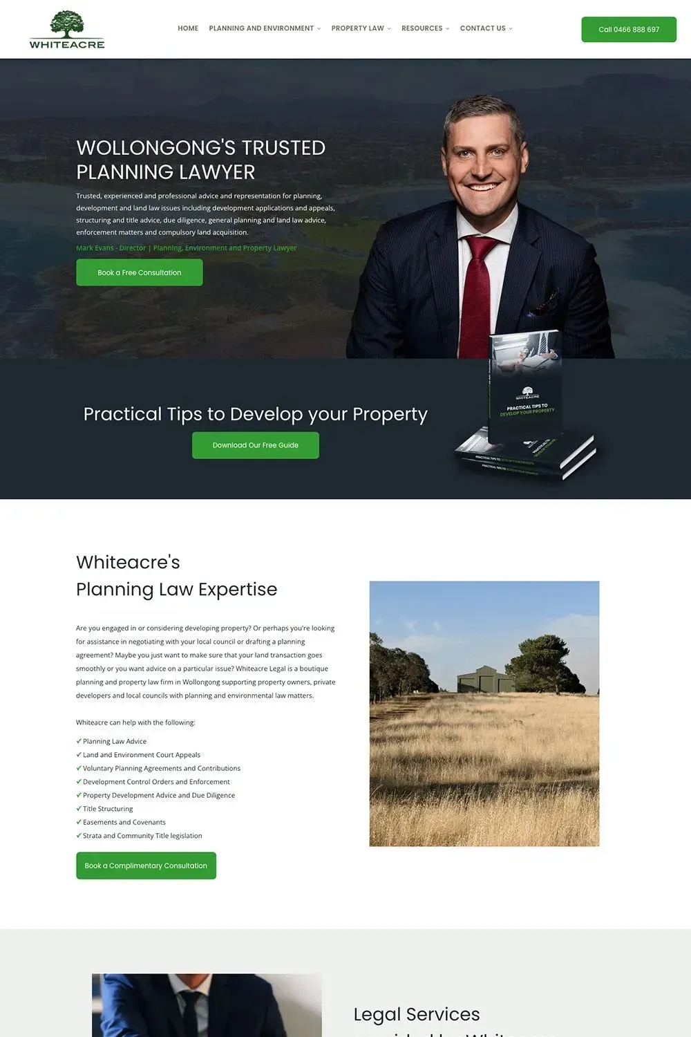
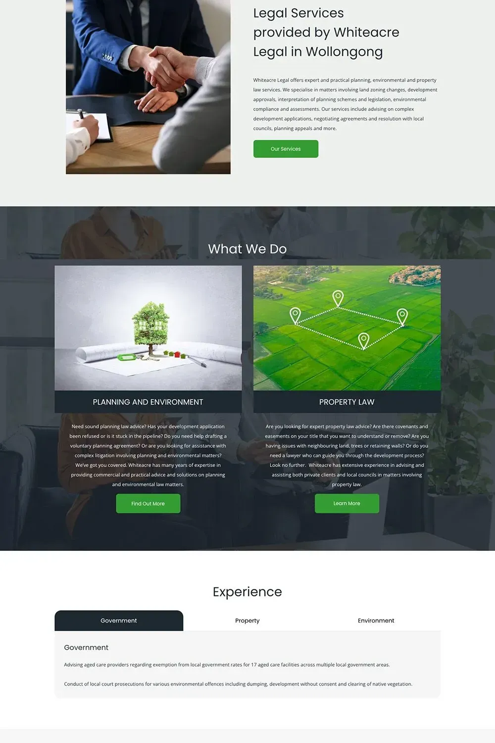
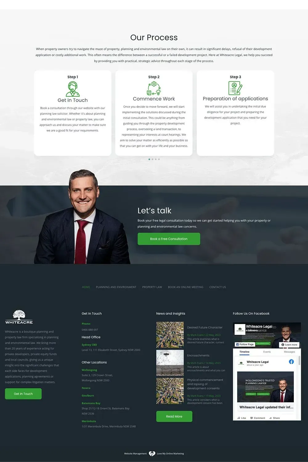
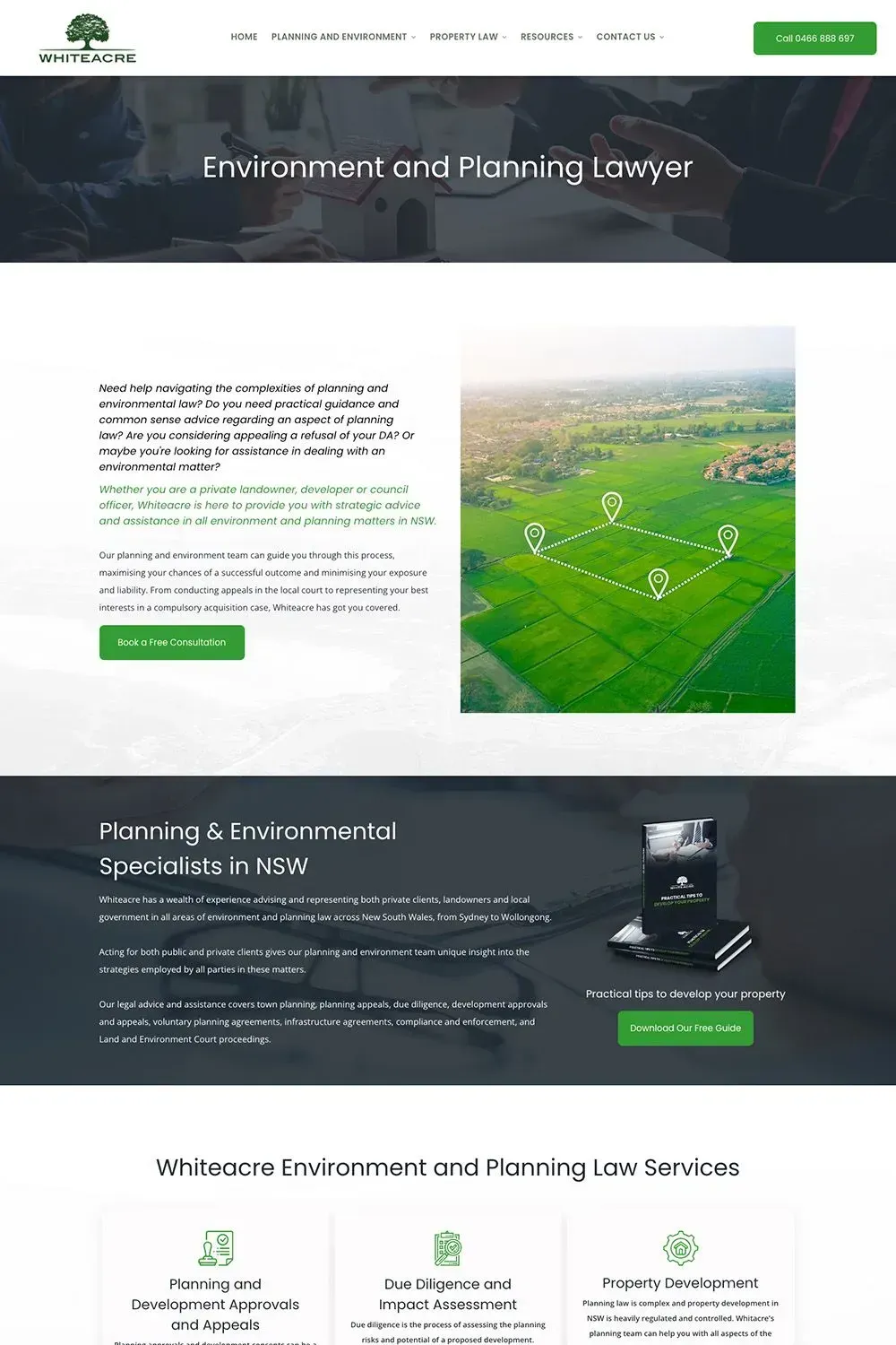
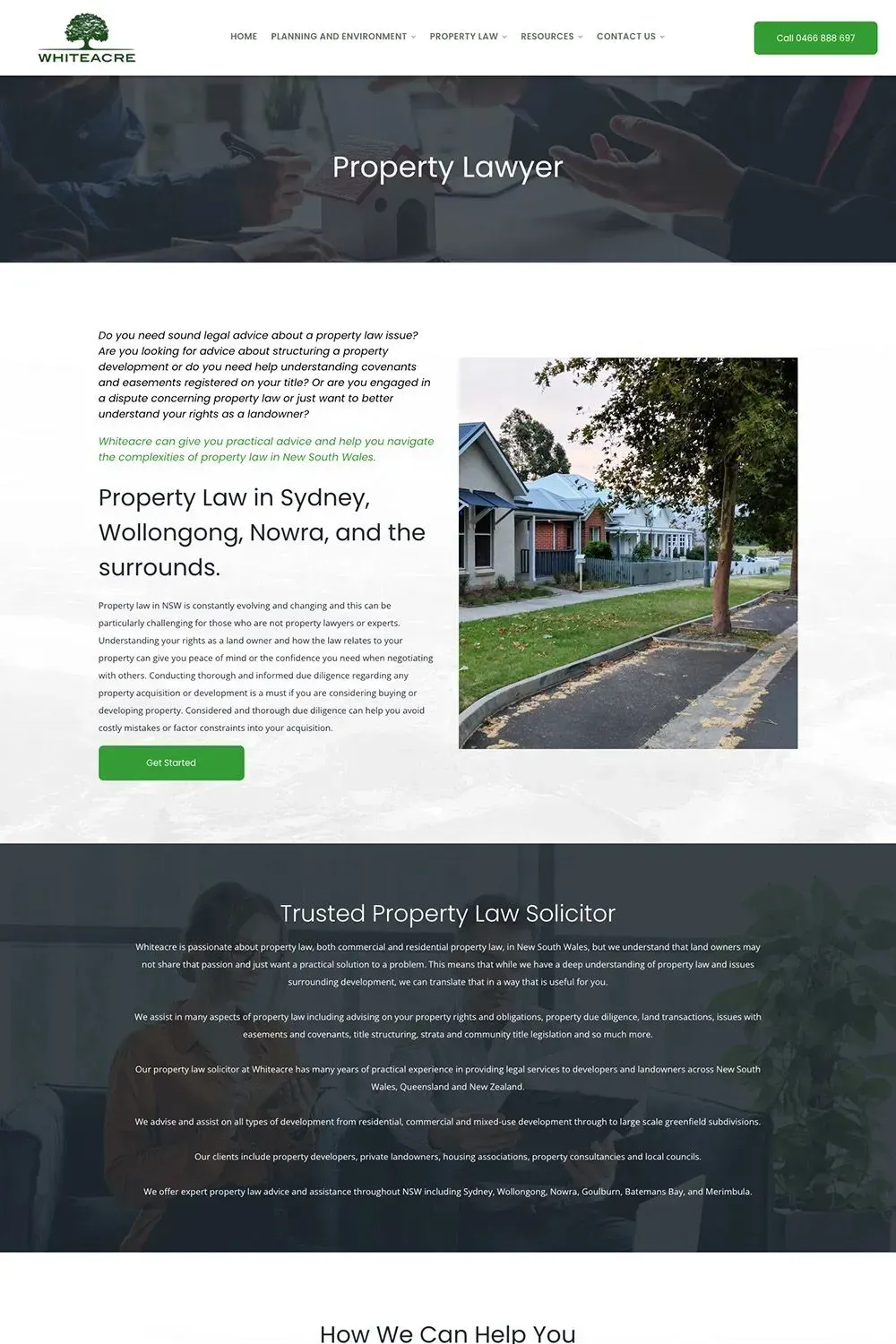
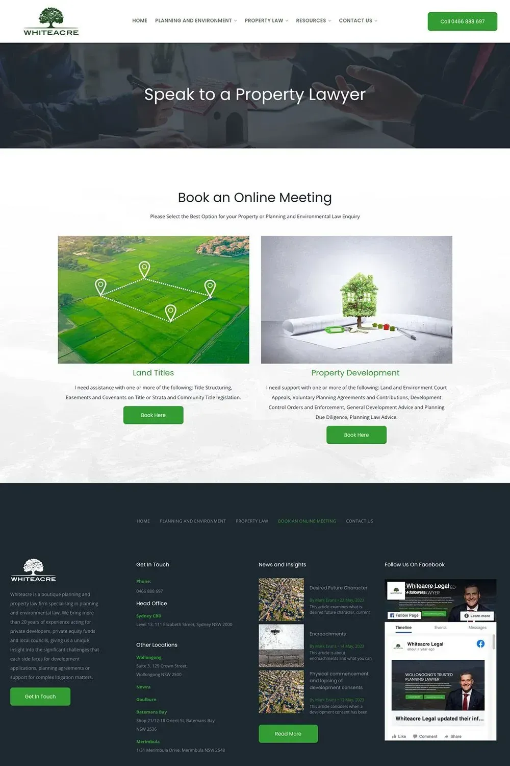
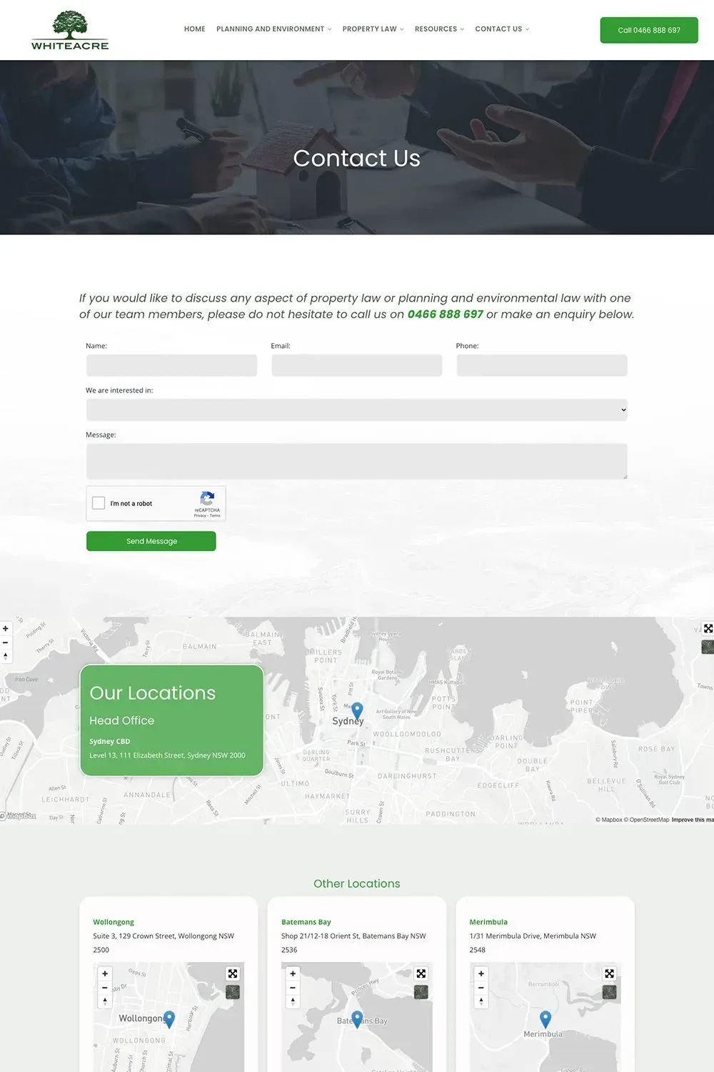
Whiteacre Legal is another Australian law firm that trusted Love My Online Marketing with their Lawyer Web Design needs. They are a boutique planning and property law firm led by a highly accomplished lawyer in the field of property law. We are proud to showcase this website transfer and redesign project to all our potential clients who are looking for a professional website.
Whiteacre Legal approached us to give their website a refresh in terms of design and content. Their old website not only had aesthetics and functionalities that were not relevant to today’s standards, but the information in it was problematic as it no longer accurately represented what their law firm does.
Our team helped solve all these issues by ensuring their new website was designed with modern and professional aesthetics and style, and also by crafting web copy that isn’t riddled with legalese but at the same time meets our client’s quality standards. We also optimised their content for local and regional searches so that anyone who’s looking for a planning, environment and property lawyer in NSW can find them without any fuss.
And just like all of our other web design projects, this website is perfectly compatible with desktop, laptop, smartphones, and tablets.


