Crown Street, Wollongong, 2500

Crown Street, Wollongong, 2500
Small Business Website Design
Beautiful Websites We’ve Designed for Small Businesses
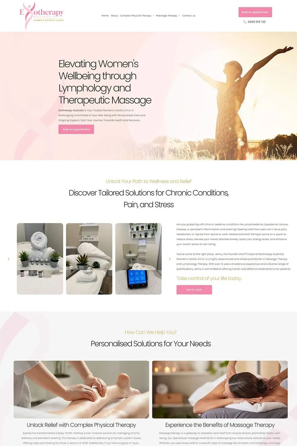
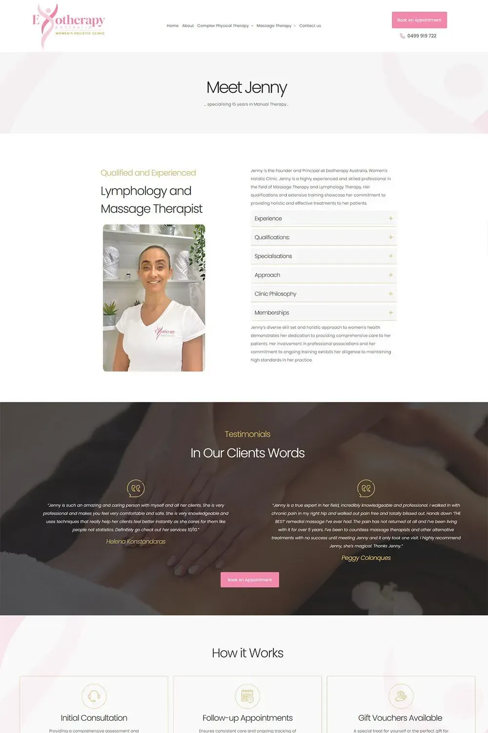
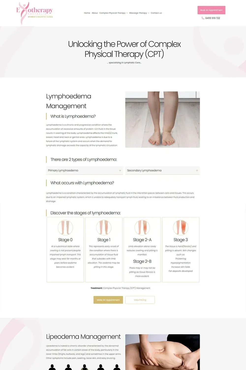
Exotherapy Australia
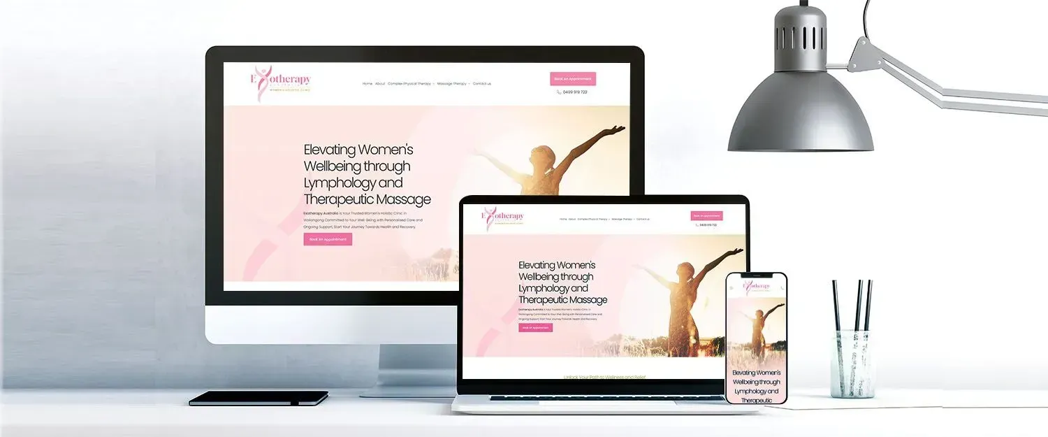
Founded and led by Jenny, a professional in massage therapy and lymphology therapy, Exotherapy Australia is dedicated to providing comprehensive and effective treatments for women's holistic health.
Our team at Love My Online Marketing is proud to present our beautifully designed website for Exotherapy Australia, reflecting the essence of care and expertise that Jenny brings to her practice.
The website's design seamlessly integrates the soothing and nurturing atmosphere of Exotherapy, with a carefully chosen pink colour palette that embodies warmth, compassion, and femininity.
To enhance user experience, we incorporated a mega menu, strategically curated to provide comprehensive insights into the clinic's services. Opening the services section unveils a wealth of information, from detailed diagnoses to treatments and transparent pricing. We believe that informed decisions lead to empowered choices, and our design reflects this ethos.
Immersive visuals, icons, images and strategically placed call to actions guide users through a visual journey that complements the clinic’s holistic approach. Clients are not just visitors; they are companions on a healing expedition, and our design ensures that every step is met with comfort and clarity. Testimonials from satisfied clients also grace the website, adding a layer of authenticity to the user experience.
In essence, our website design for Exotherapy Australia is more than just pixels and code; it's a digital embodiment of the clinic's commitment to holistic healing, empowering women to embark on a journey of self-discovery and well-being.
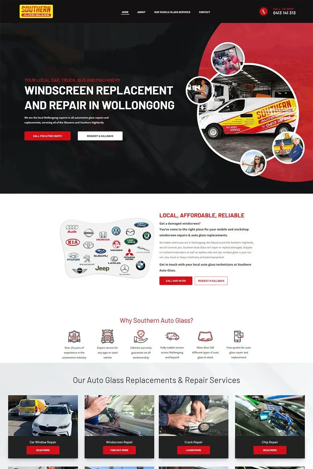
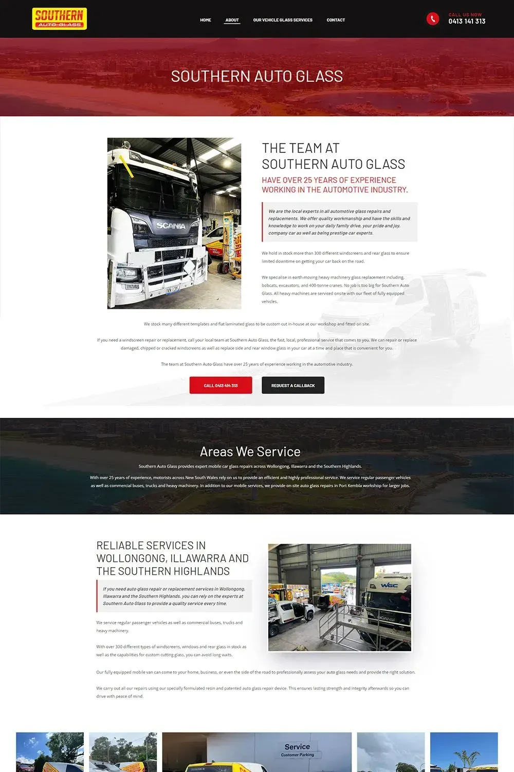
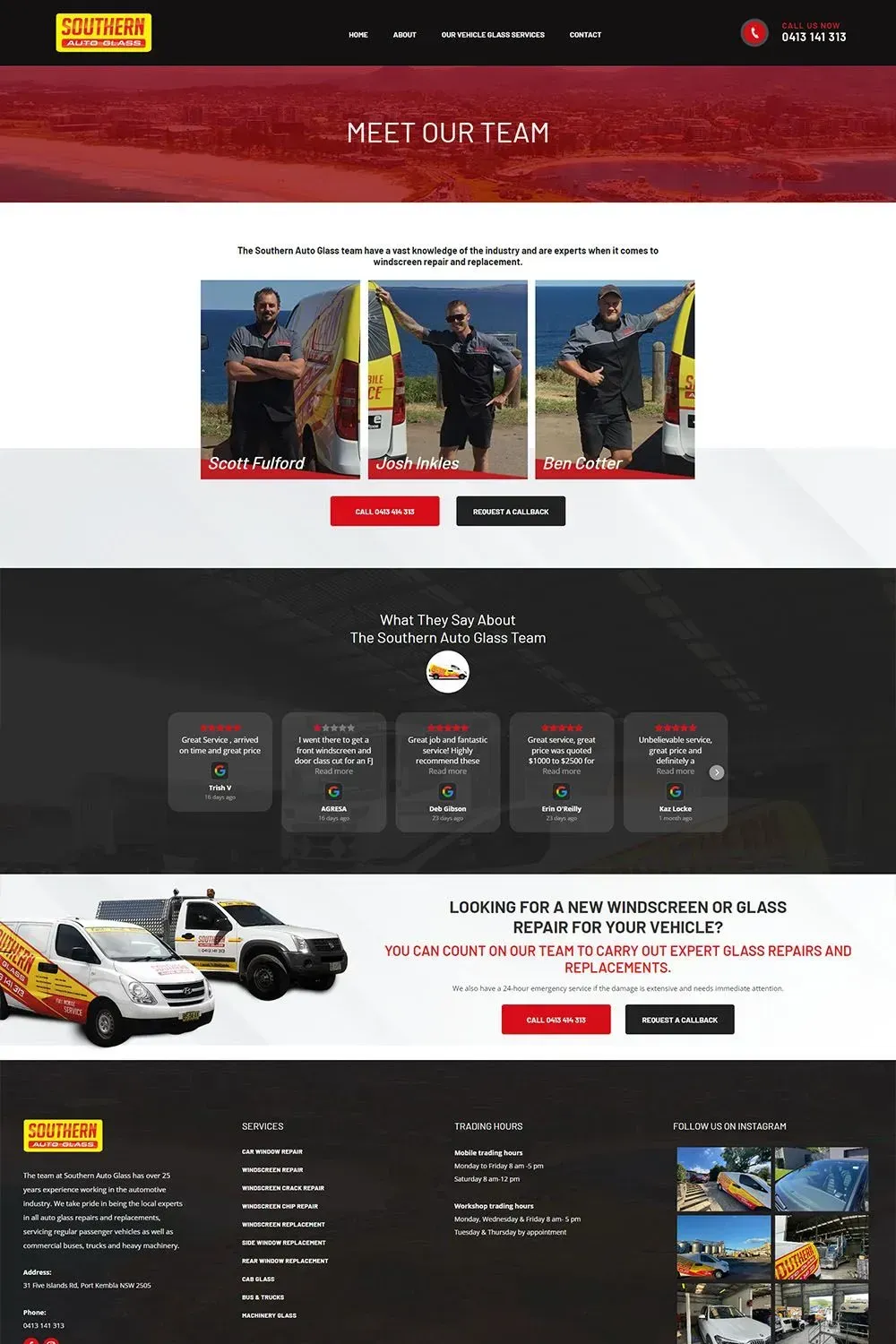
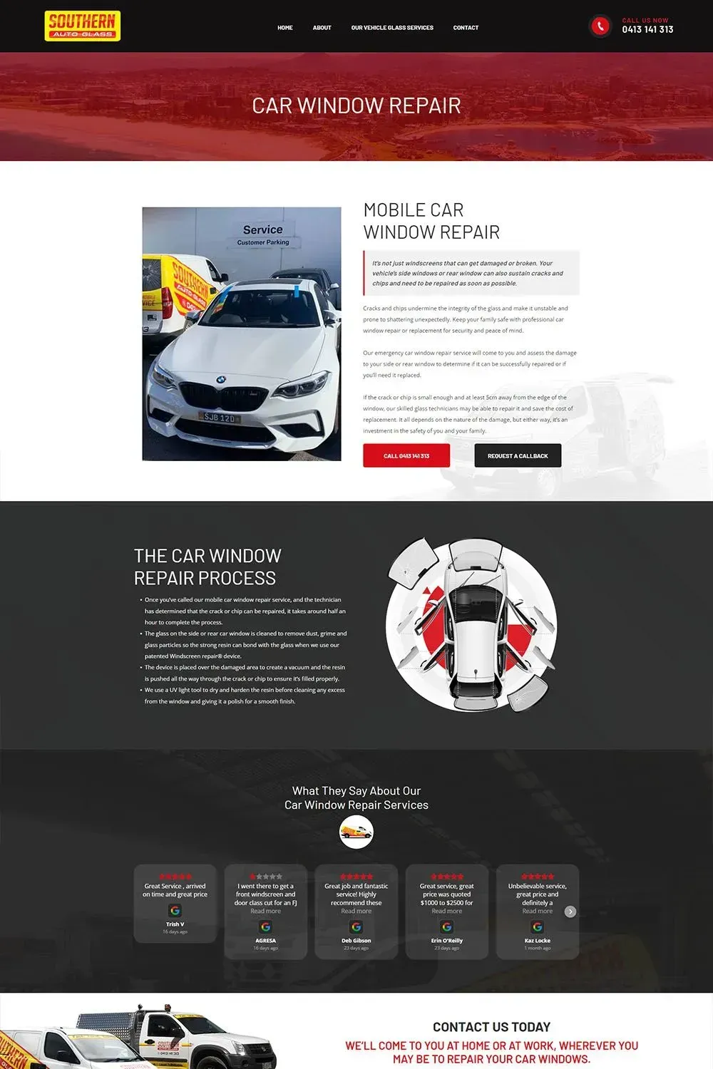
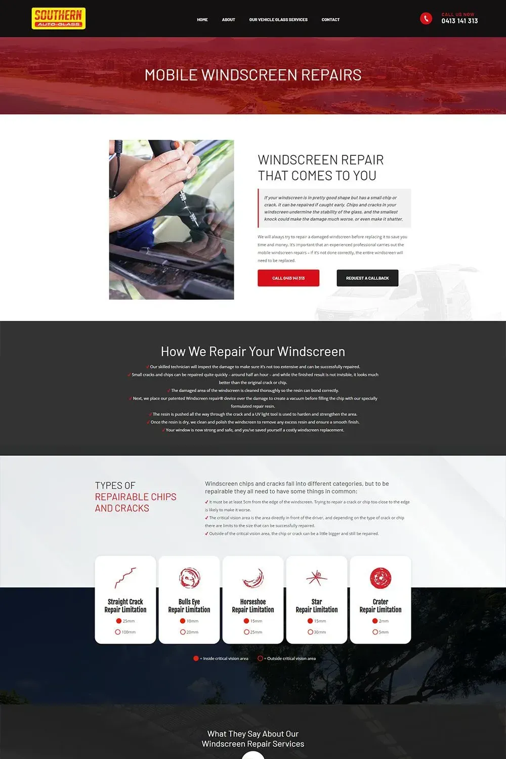
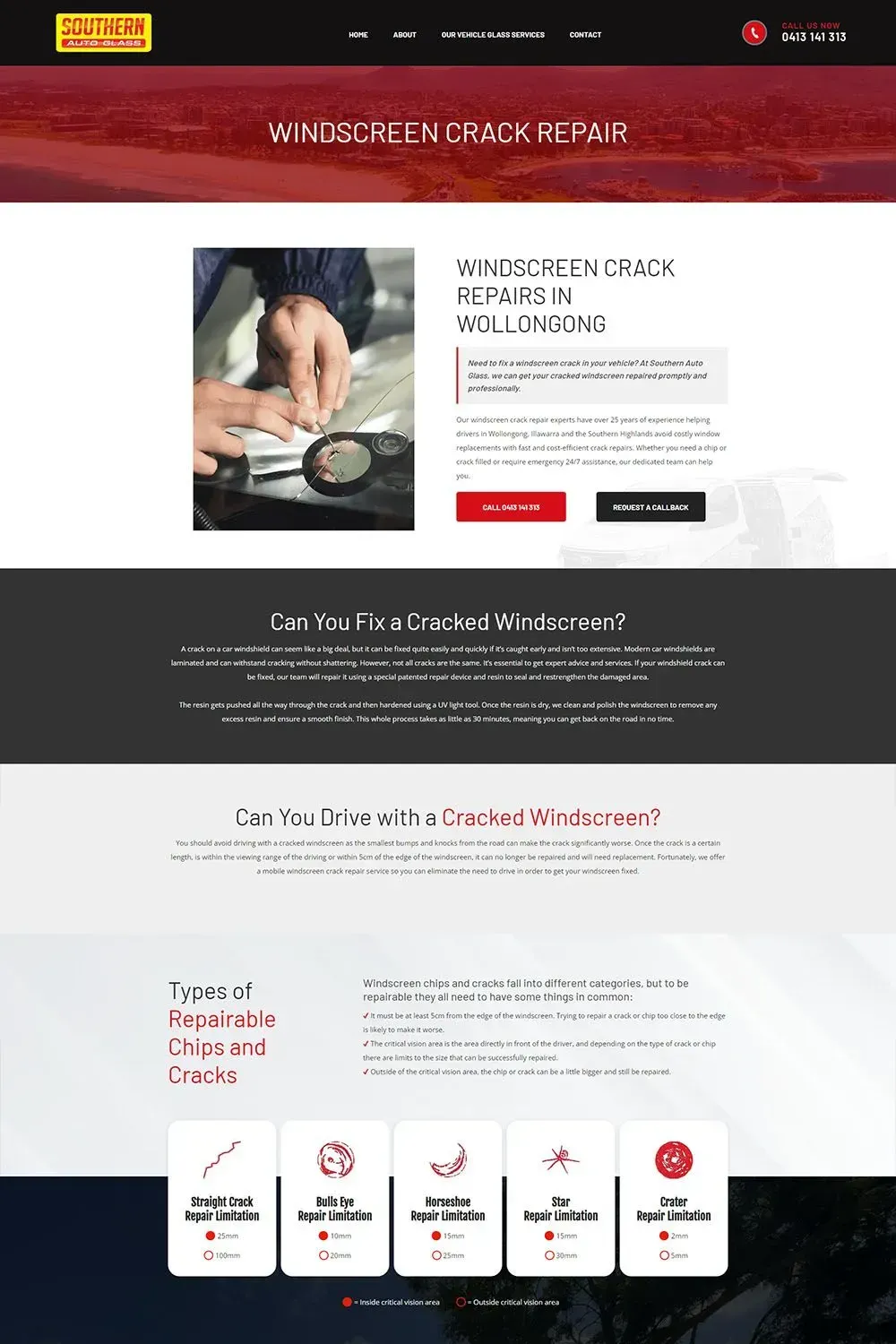
Southern Auto Glass
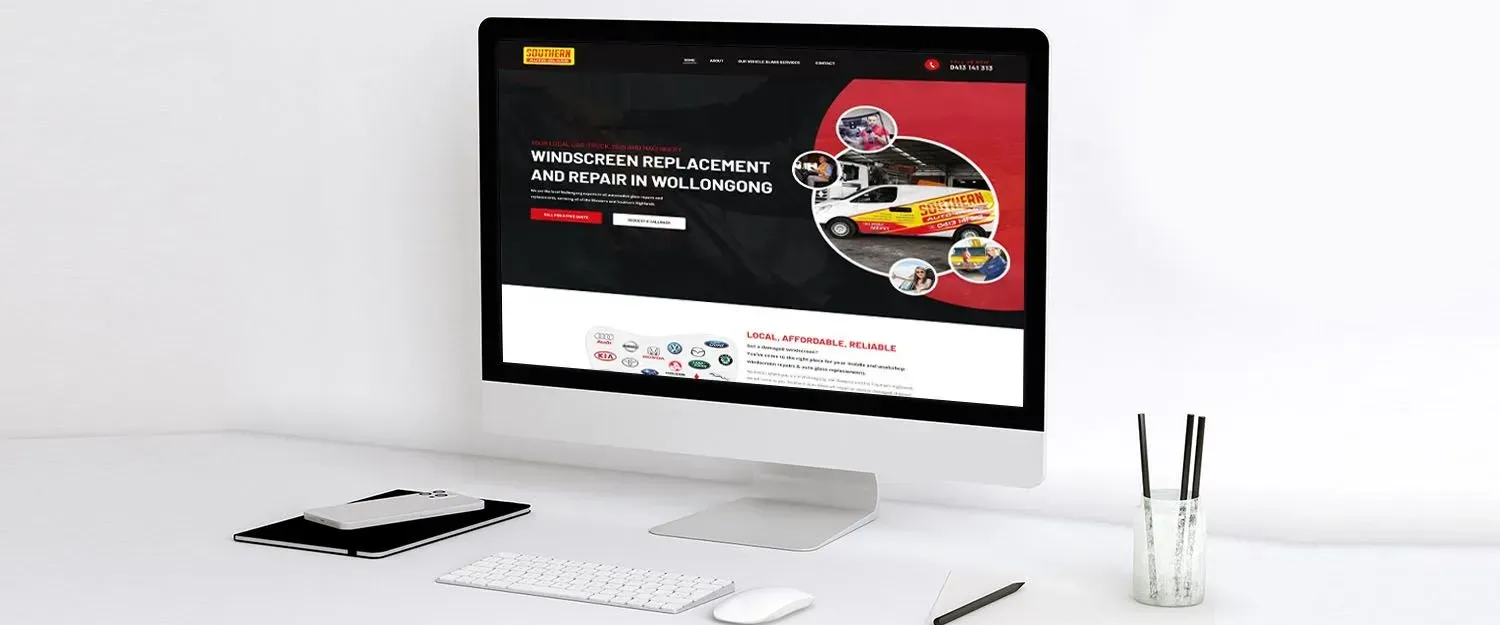
With a harmonious blend of black and bright red, we brought sophistication and vibrancy to every corner of their website. Our goal was to create a clean and professional layout that, highlighting the content to without overwhelming the user. This simplicity in the new website design significantly improved the overall user experience, ensuring smooth and enjoyable navigation.
Additionally, we integrated a mega menu to elegantly showcase their services. This dynamic feature allows users to easily explore their offerings, such as repairing or replacing damaged, chipped, or cracked windscreens, as well as replacing side and rear window glass in a wide range of vehicles, from cars and vans to buses, trucks, and heavy machinery.
We made sure that Southern Auto Glass's website was filled with high-quality images that showcased their team's expertise and the excellent work they do. To add a personal touch and create a connection with the users, we featured car logos that resonated with the automotive theme. These moving logos added a dynamic element to the website, making it more enjoyable to explore.
For those seeking a quick overview of their services, we placed prominently featured descriptions for both replacement and repair services. This helped visitors understand the depth of their expertise and offerings at a glance.
We ensured that customers could easily get in touch by incorporating a user-friendly contact form. This feature simplified the process of enquiries, making it convenient for clients to connect with Southern Auto Glass. We also seamlessly integrated their Instagram feed to provide users with a glimpse of their recent work and to help them in building an active social media presence.
Last but not least, we optimised the website for search engines, making sure that it ranked well and attracted potential customers. This involved fine-tuning the site's structure, content, and meta-tags for improved visibility.
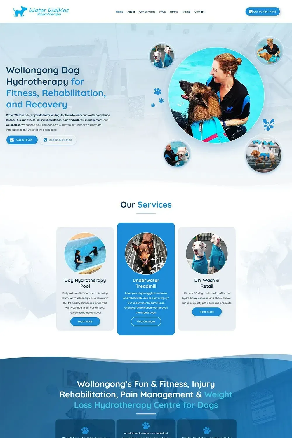
Water Walkies
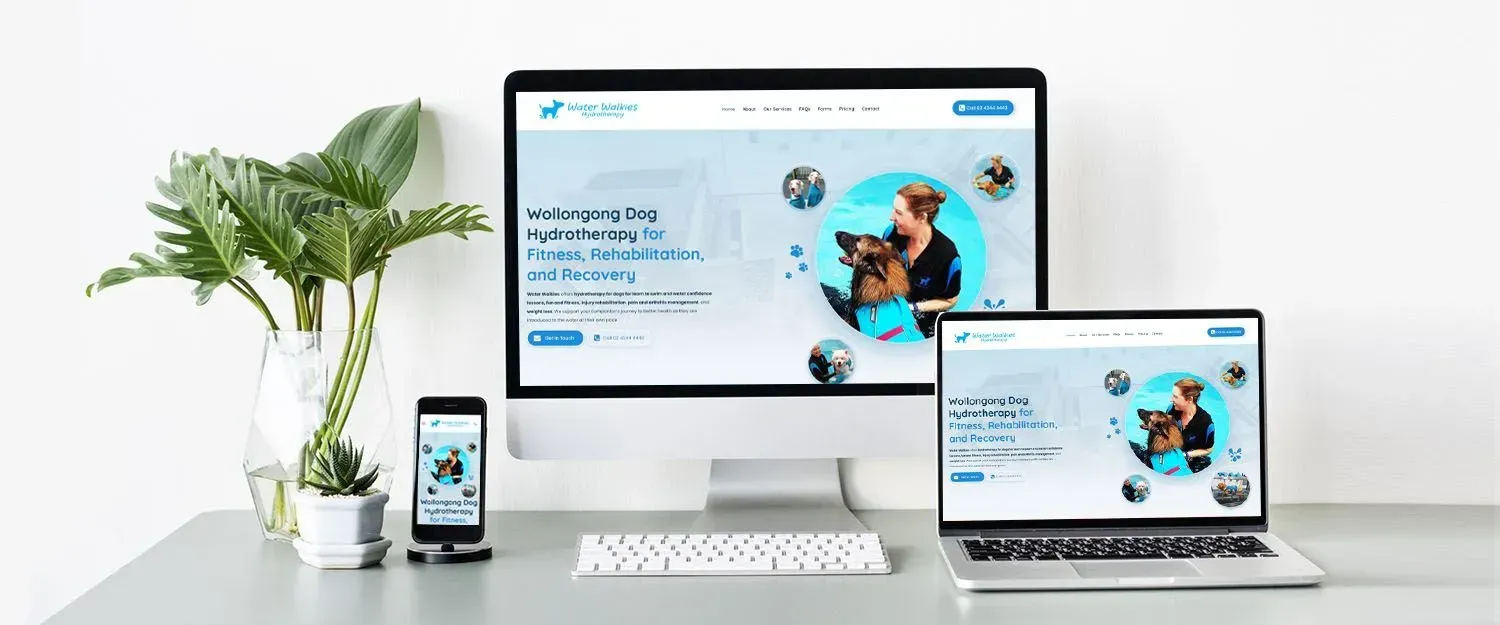
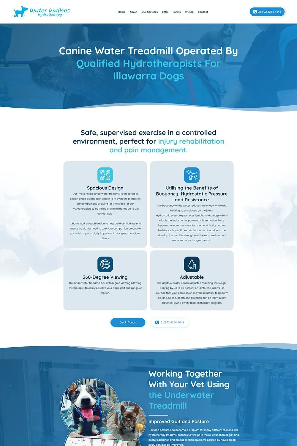
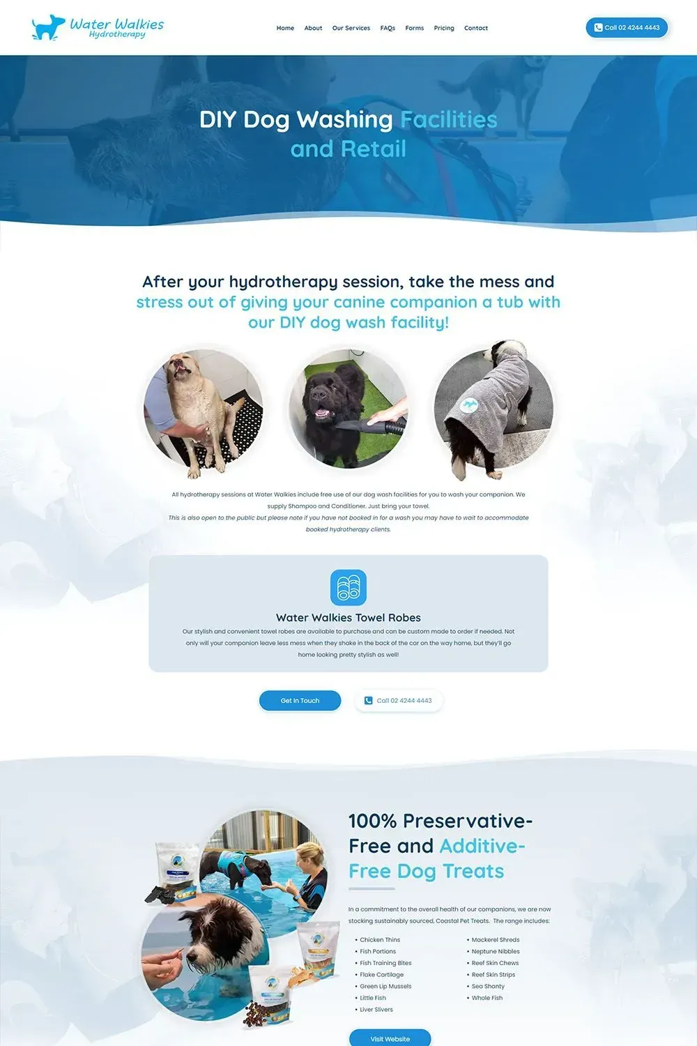
The redesigned website for Water Walkies presents a calming blue colour scheme that evokes the soothing nature of water. This sets the ideal atmosphere for visitors to explore the benefits of hydrotherapy for their pets.
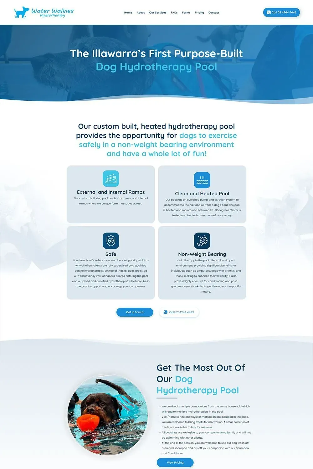
Our team of skilled copywriters has meticulously described their services and strategically placed call-to-action buttons to make it easy for visitors to take the next step, whether that's booking a session or getting more information. Throughout the site, you'll find icons that highlight the key benefits of Water Walkies' services, accompanied by engaging content that emphasizes the positive impact of hydrotherapy on dogs.
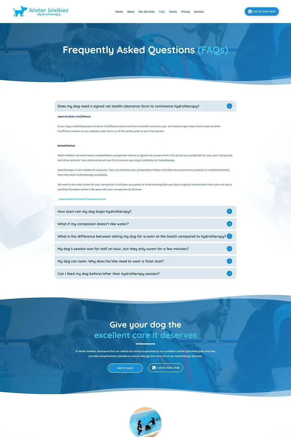
The website is informative and user-friendly, offering comprehensive information about the various sessions available. Prospective clients can quickly assess the services that best suit their dogs' needs, and transparent pricing details are provided to aid in decision-making.
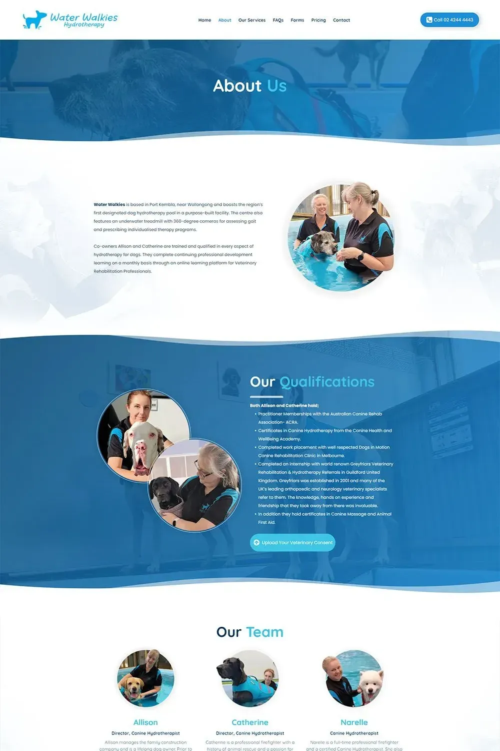
To provide a genuine sense of their therapeutic sessions, the website incorporates images and videos from rehabilitation sessions. These visual testimonials showcase Water Walkies' dedication and care in their treatment of dogs, reinforcing their commitment to healing and well-being.
For convenience, the website offers an easy-access feature for uploading veterinary consent, ensuring a smooth and safe experience for dogs and peace of mind for their owners.
For those curious about Water Walkies' daily activities, the website provides a direct link to their Instagram account. This allows you to follow along, viewing more images and stories of happy dogs on their journeys to health and happiness.
The website exudes tranquility, trust, and expertise, offering a wide range of features to meet the needs of both four-legged clients and their two-legged companions.
Love My Online Marketing's website redesign has turned Water Walkies' site into an inviting and informative platform that embodies the essence of canine wellness. With its soothing design, user-friendly experience, and dynamic multimedia, it's a digital oasis where dogs and their owners embark on a journey to happier, healthier lives.
RRS Online
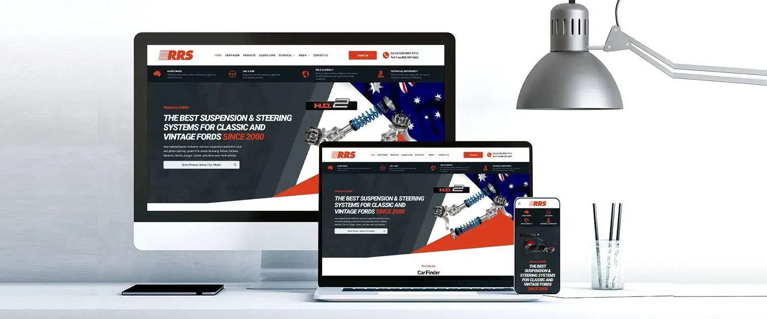
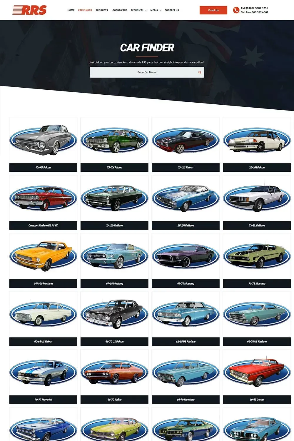
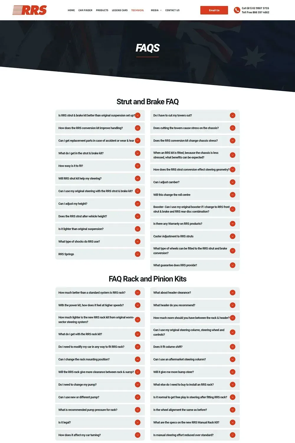
Have you ever come across a website that left you totally puzzled? Well, we did, and it was the old RRS Online website. It was a digital disaster zone, but we took it as a challenge, a chance to showcase our expertise in turning chaos into clarity.
When RRS Online approached us, they were fully aware that their website was in dire need of a makeover, and we were more than happy to accept the task.
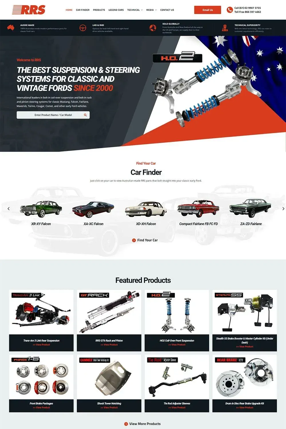
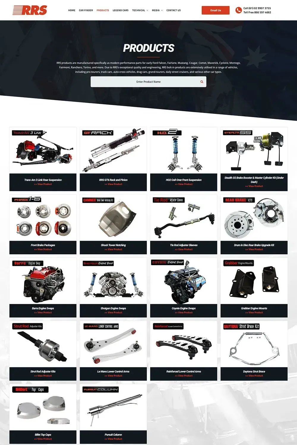
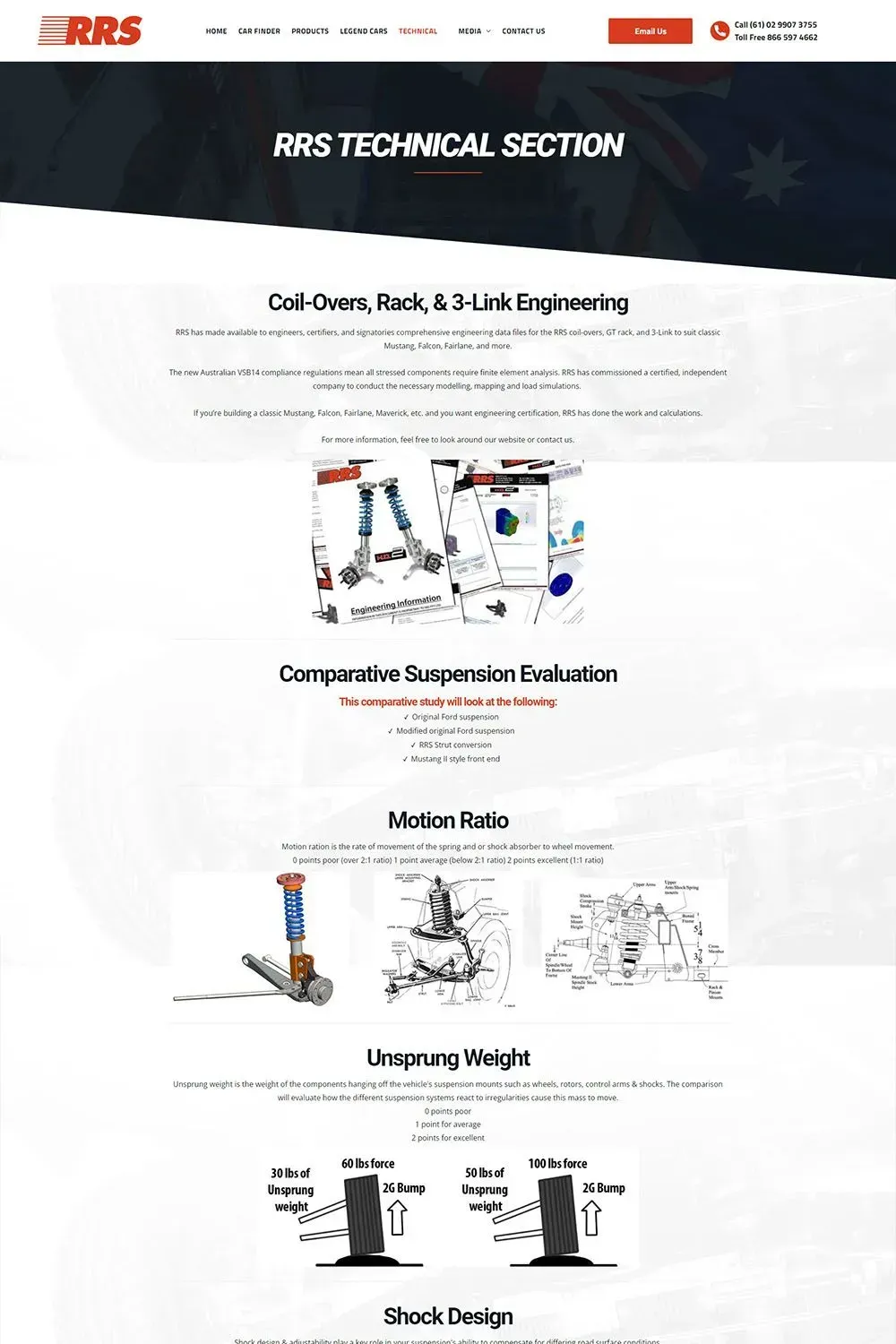
Given the structure and disorganised content of the old website, we conducted a thorough content audit of the old website. We kept important information and removed outdated or unnecessary pages. Afterward, we restructured and organised the content to improve accessibility and provide more informative content. As a result, RRS can now effectively demonstrate its leadership in bolt-in coil-over suspension and rack and pinion steering systems for classic vehicles to a worldwide audience.
To enhance RRS Online's visibility in search engines, we performed SEO optimisation. This included optimising meta tags, improving page load times, and ensuring all content was search engine-friendly.
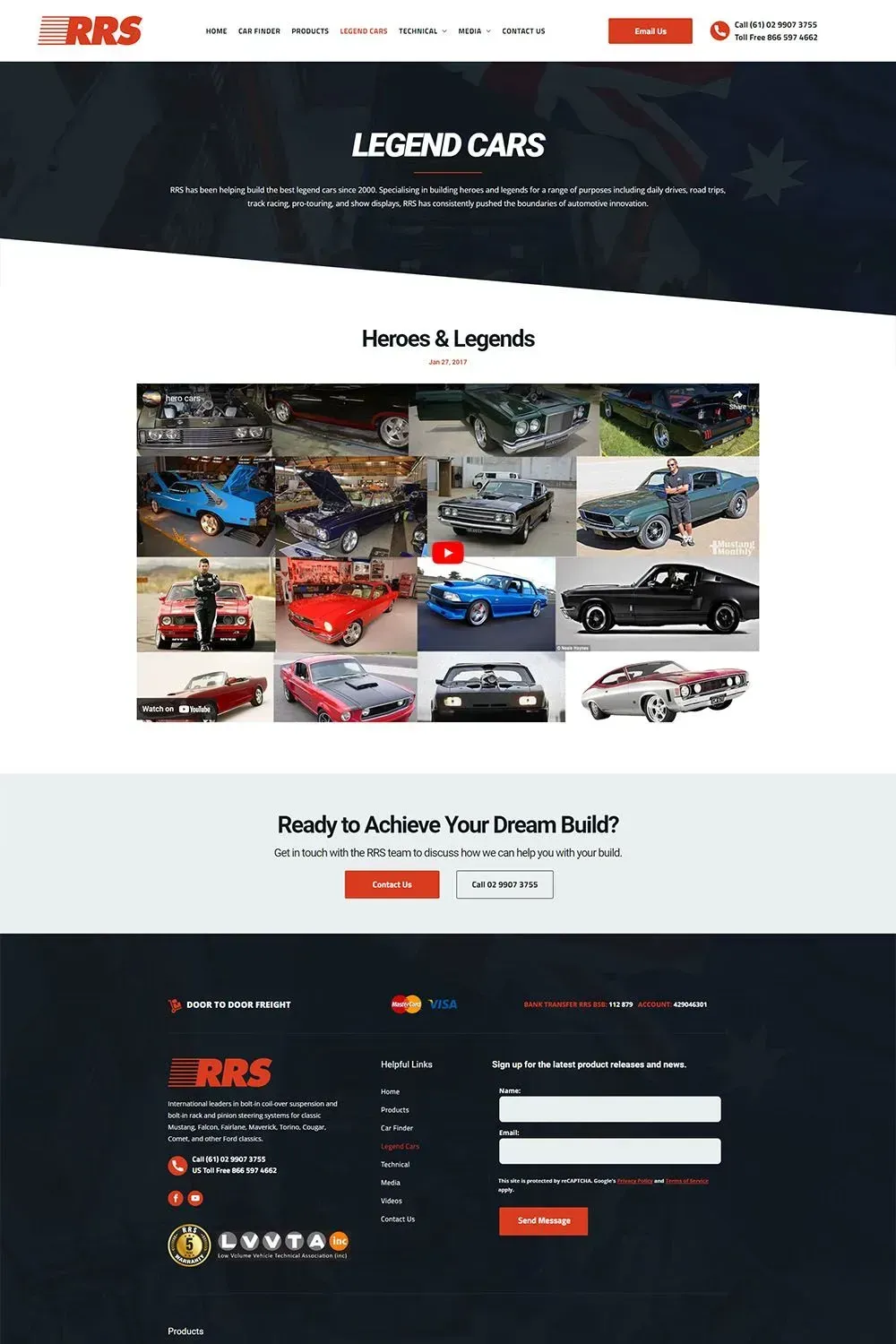
Our design team prioritised intuitive navigation, clear calls to action, an aesthetically pleasing layout to engage visitors. Bright red and black were chosen as the primary colour scheme, creating a visually striking and memorable look that aligned with their brand identity.
We also ensured that the new website seamlessly adapted to different screen sizes and devices, providing a consistent and engaging experience for all users.
Our partnership didn't end with the website launch. We continued to provide ongoing support, monitored website performance, and offered recommendations for improvement to ensure RRS Online's online presence remained strong and effective.
Through these solutions, we were able to turn RRS Online's old website into a modern, user-friendly digital platform that aligned with their business goals and engaged their target audience effectively.
Meg Maguire Art
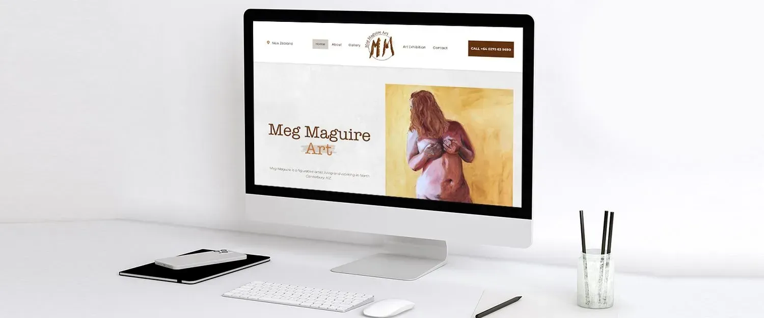
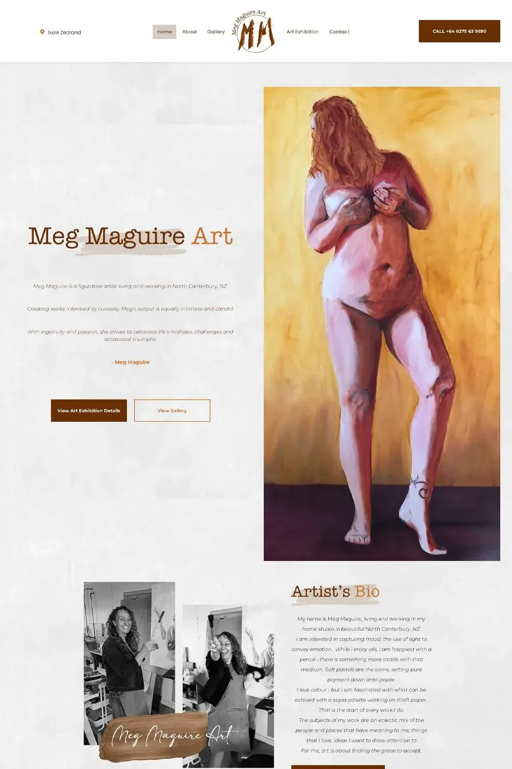
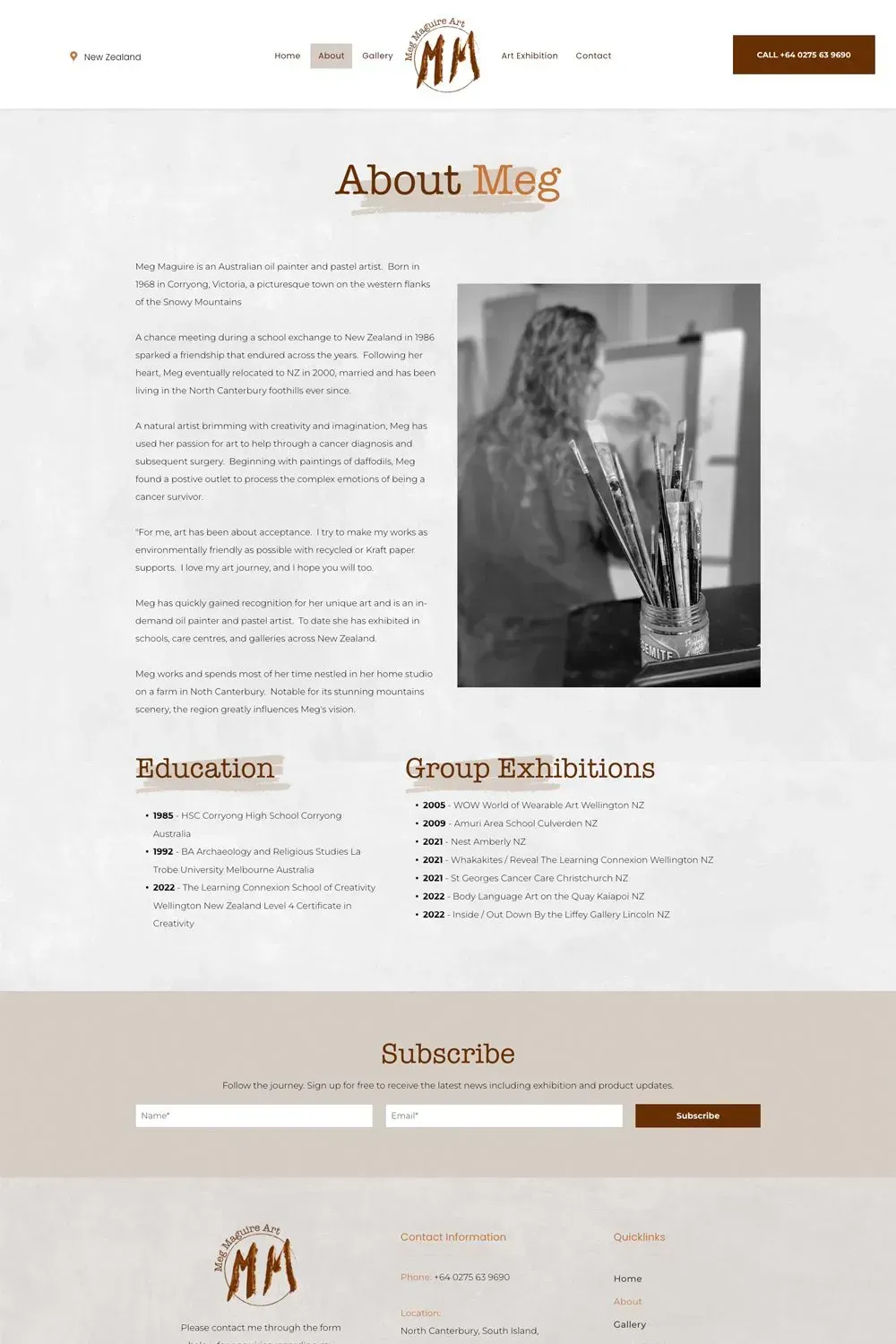
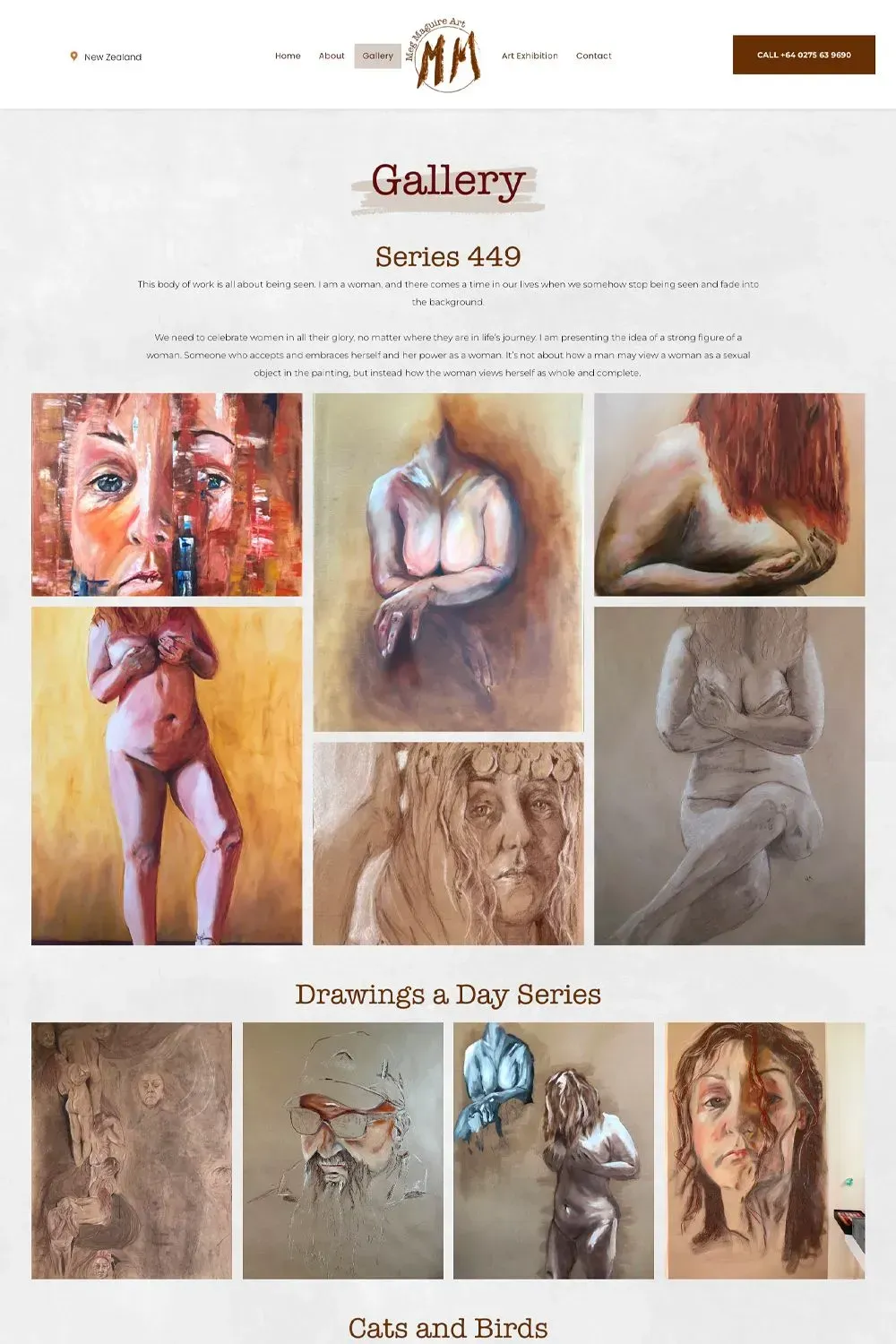
The website design we created for artist Meg Maguire serves as a digital gallery that highlights her exceptional artwork, allowing the viewer to immerse themselves in her creative world. The website is designed with a clean, minimalist approach, which ensures that the focus remains on the art pieces. The navigation is user-friendly, making it easy for visitors to explore different sections and discover more about the artist and her work.
The colour scheme is carefully chosen to complement Meg's art without overpowering it, creating a harmonious visual experience. Interactive elements are subtly integrated, encouraging visitor engagement and providing a dynamic browsing experience. The website also includes a dedicated section to view her art exhibition details, keeping the fans informed.
The inclusion of Meg's personal biography adds an intimate touch, allowing visitors to connect with her on a deeper level. It gives them a glimpse into her journey as an artist, her influences, and her artistic philosophy.
Each artwork featured on the site comes with an engaging description, providing insights into Meg's inspiration and creative process. Clear and compelling call-to-action (CTA) buttons have been strategically placed throughout the site, guiding visitors towards desired actions such as signing up for updates, or reaching out for enquiries or request for commissions.
In essence, the website we designed for Meg Maguire is more than just a showcase of her artwork; it's a comprehensive and engaging platform that brings her art to life and connects her with her audience.
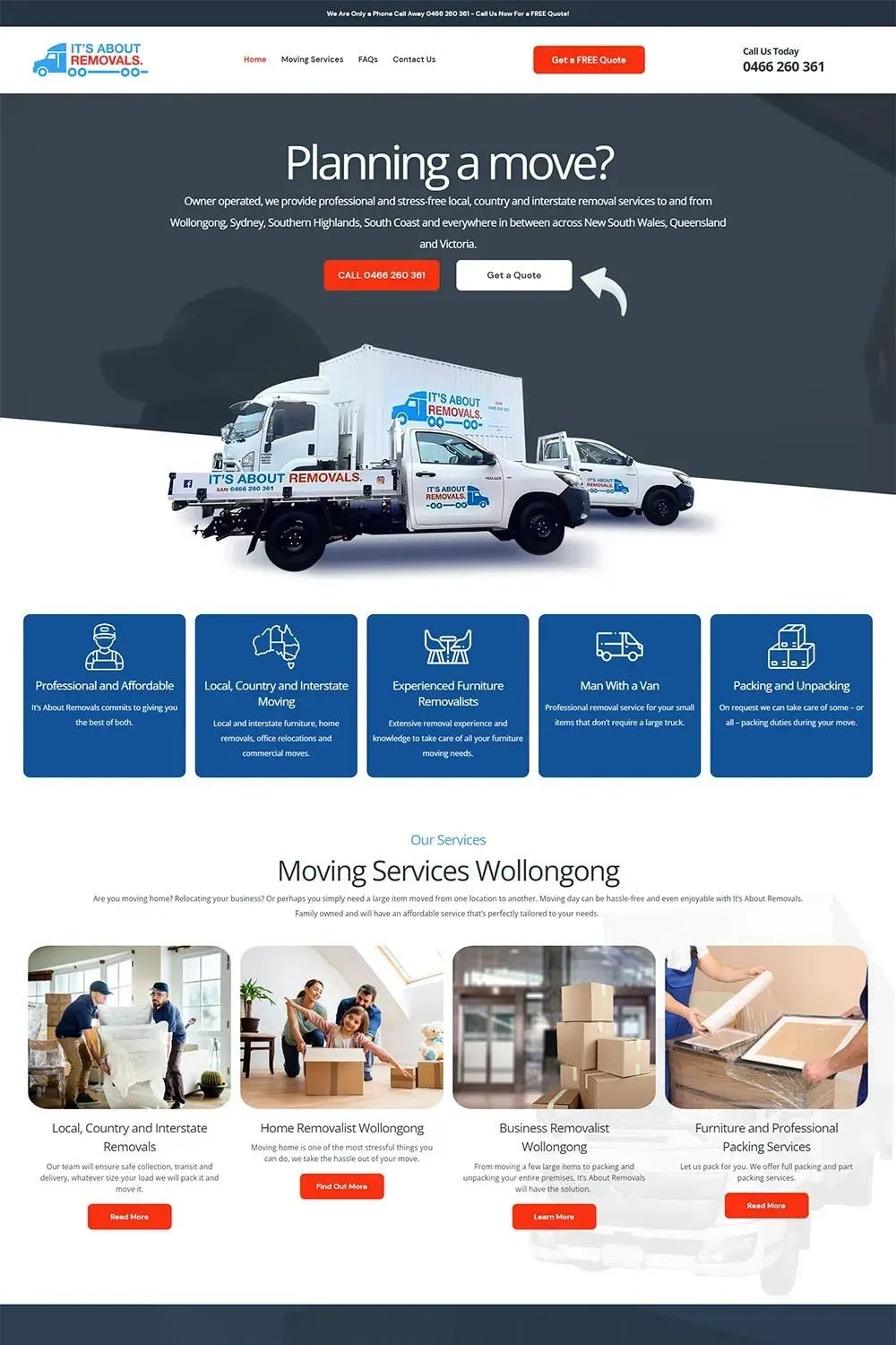
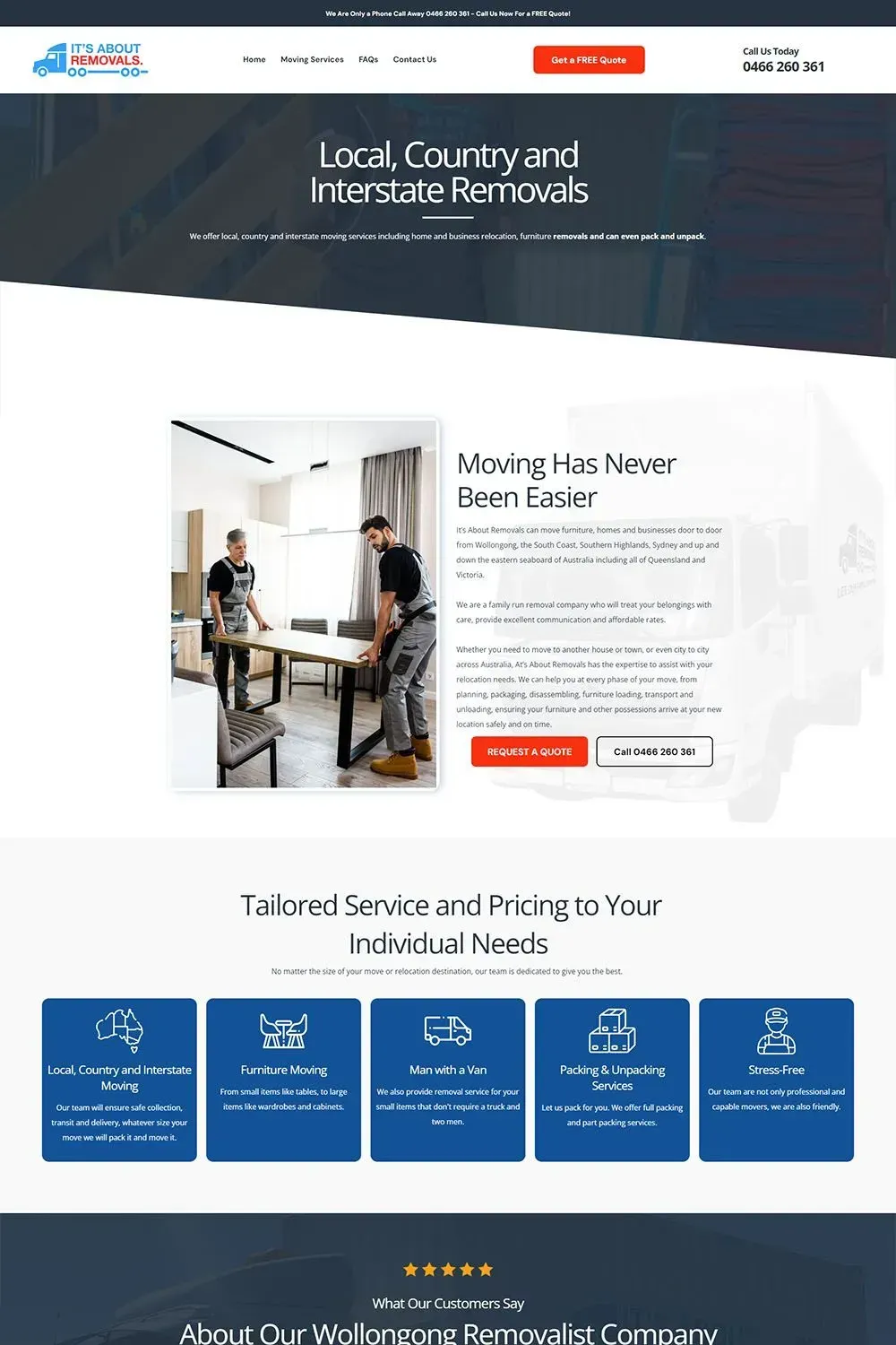
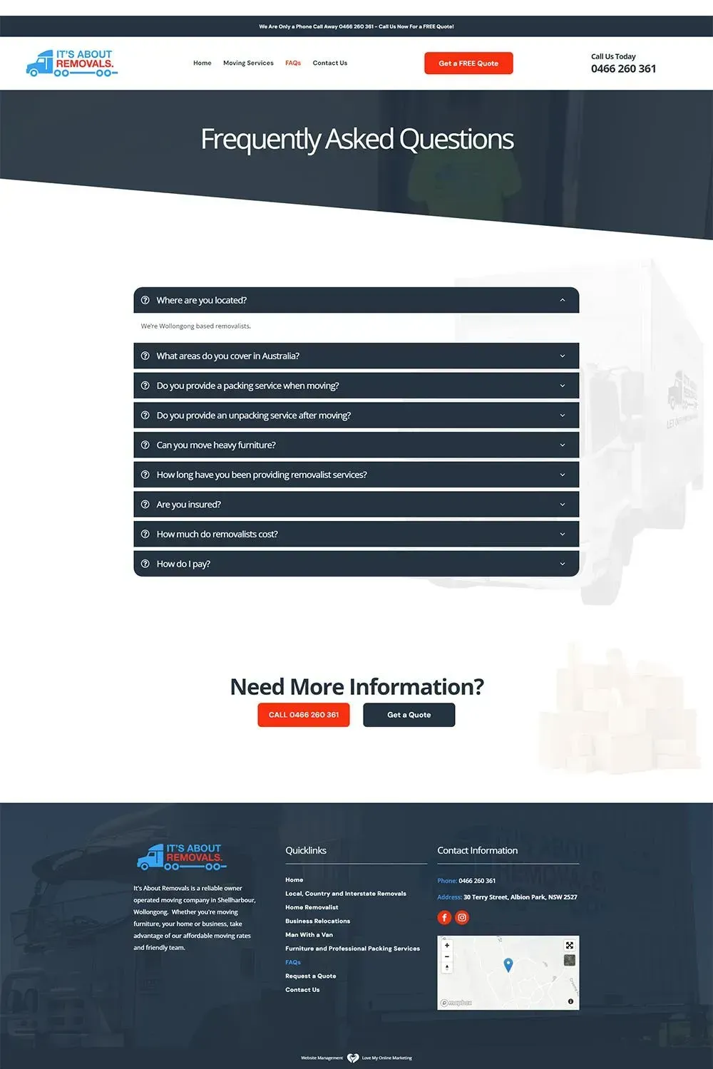
It's About Removals
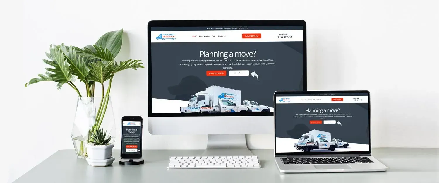
We couldn't help but notice that their old website looked quite plain and a bit boring. The design seemed outdated, lacking any modern flair or visual appeal. The font choices and text formatting are conservative, contributing to an overall lack of excitement. The absence of any dynamic or interactive features could deter users from actively engaging with the content and exploring the website further.
By leveraging modern design practices and catering to user expectations, we transformed their website from its previous appearance into an inviting and immersive online platform.
The revamped website now boasts a modern and visually striking design, providing visitors with an engaging and delightful browsing journey. The process of finding required information has been made effortless due to a well-structured menu that smoothly navigates users through the diverse services, customer testimonials, and helpful resources.
The site showcases captivating imagery that truly embodies the hassle-free nature of their removal services. From pictures of satisfied families packing their possessions to skilled movers handling valuable items with care, these visuals vividly portray their services. They effectively create a sense of trust and dependability in the brand, assuring visitors of their dedication to delivering exceptional service.
We wanted to simplify the process for visitors to take the next step. To achieve this, we have placed Calls-To-Action (CTAs) that prompt visitors to request a quote, schedule a consultation, or connect with their friendly customer support team.
This enhances the aesthetic appeal of the website but also boosts its functionality, turning it into a potent tool for transforming casual visitors into dedicated clients.
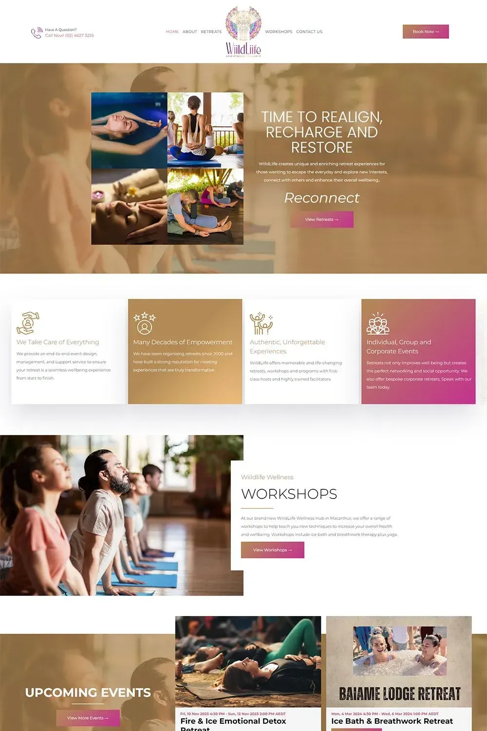
WiildLiife
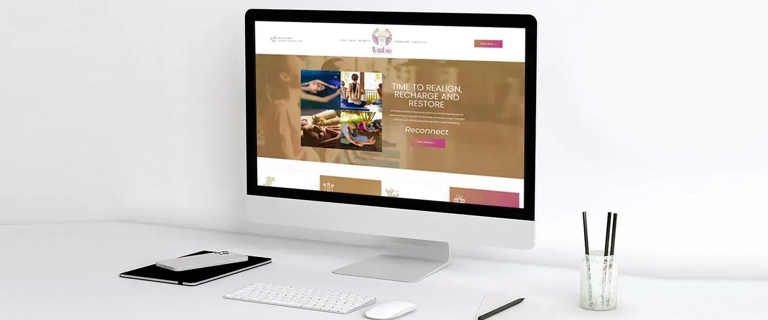
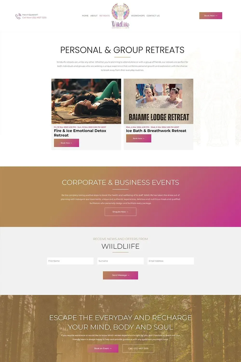
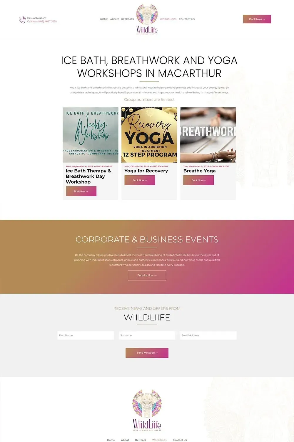
Inspired by the captivating beauty of nature and the sense of adventure WiildLiife offers, we crafted a web design concept that combined aesthetics and functionality. The design centered on creating a welcoming and immersive experience for visitors, encapsulating the essence of the retreats.
The hero section of the website features serene environment and happy participants, invoking an immediate emotional connection to visitors. We also included detailed overviews of each retreat, workshop and upcoming events, presenting concise yet informative descriptions that give visitors a clear idea of what they can expect from the experiences. The immersive design, coupled with seamless navigation, encourages users to explore the retreats, register for workshops, and connect with WiildLiife for their next life-enriching adventure.
Our web design team at Love My Online Marketing are proud to have played a pivotal role in showcasing WiildLiife's unique offerings to the world and helping them create lasting connections with individuals seeking to embark on transformative retreat experiences.
G Walking
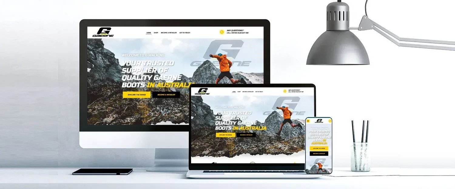
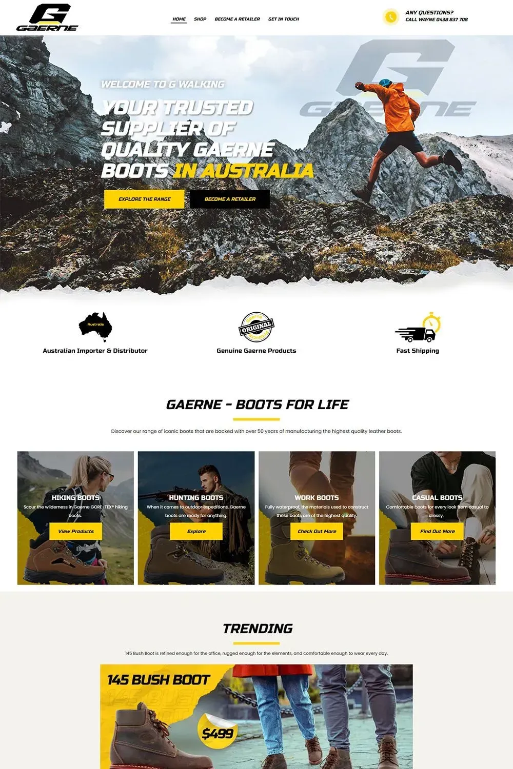
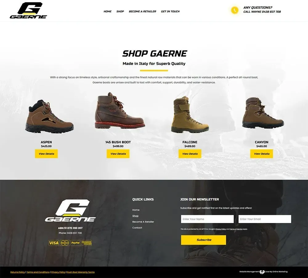
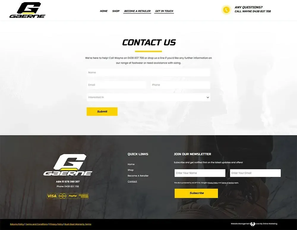
G Walking takes pride in being a trusted supplier of Gaerne boots in Australia, and we wanted the website to reflect that trust. By creating a website that exudes reliability, captivates the senses, and leaves a lasting impression on anyone who visits, we helped reinforce their brand reputation.
We implemented intuitive menus and CTA buttons, making it effortless for visitors and potential retailers to find exactly what they need. However, our work didn't stop there. We knew that G Walking's range of Gaerne boots deserved special attention. These iconic boots are a testament to quality and style, and we wanted to highlight them in the best possible light. Through strategic content placement and visually captivating designs, we made sure that these top-notch products were featured front and centre so they can catch the eyes of potential customers right away.
The results exceed our expectations. The revamped website not only looked fantastic but also delivered outstanding performance. The user engagement increased, conversion rates soared, and the overall brand perception reached new heights.
Our hearts overflow with gratitude for the incredible opportunity to collaborate with G Walking on this project and we are proud to have played a role in their continued success.
Chipmasters
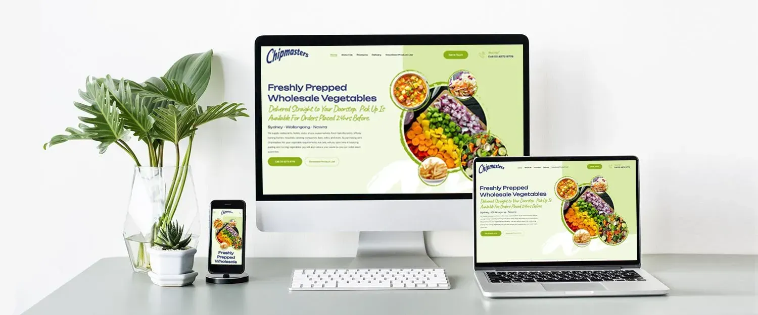
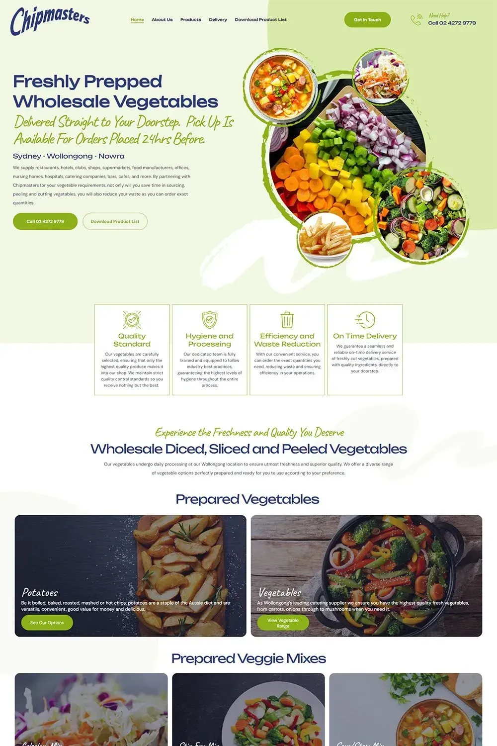
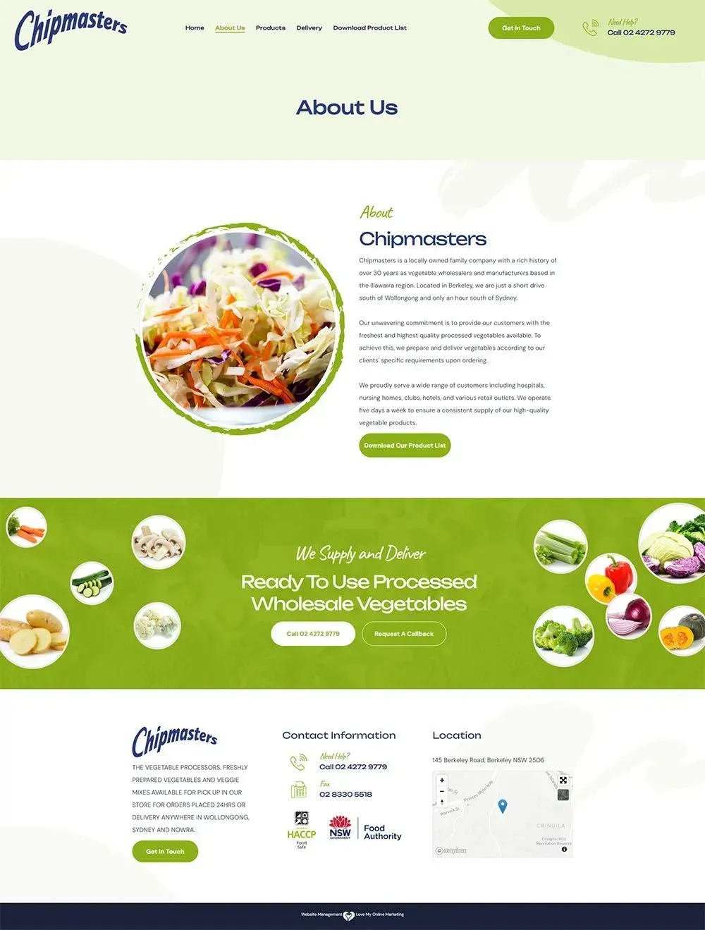
The website redesign process for Chipmasters was approached with a clear goal in mind - to create a responsive and visually appealing website that would address the shortcomings of the previous version.
The old website was lacking in several aspects, including being outdated, lacking compelling content, and having unclear calls-to-action. As a result, it provided an uninviting user experience, leaving potential clients feeling confused and frustrated.
We followed a systematic approach to achieve our goal. Initially, we conducted a thorough analysis of the old website, identifying areas that needed improvement. Working closely with Chipmasters, we sought to understand their brand identity, target audience, and business objectives. This allowed us to tailor the redesign to meet their specific needs and preferences.
The redesign process involved optimising the website's structure and navigation, making it easier for visitors to find relevant information and take desired actions. We also ensured that the website adapts seamlessly to various devices and screen sizes, providing an optimal browsing experience for users on desktops, tablets, and smartphones.
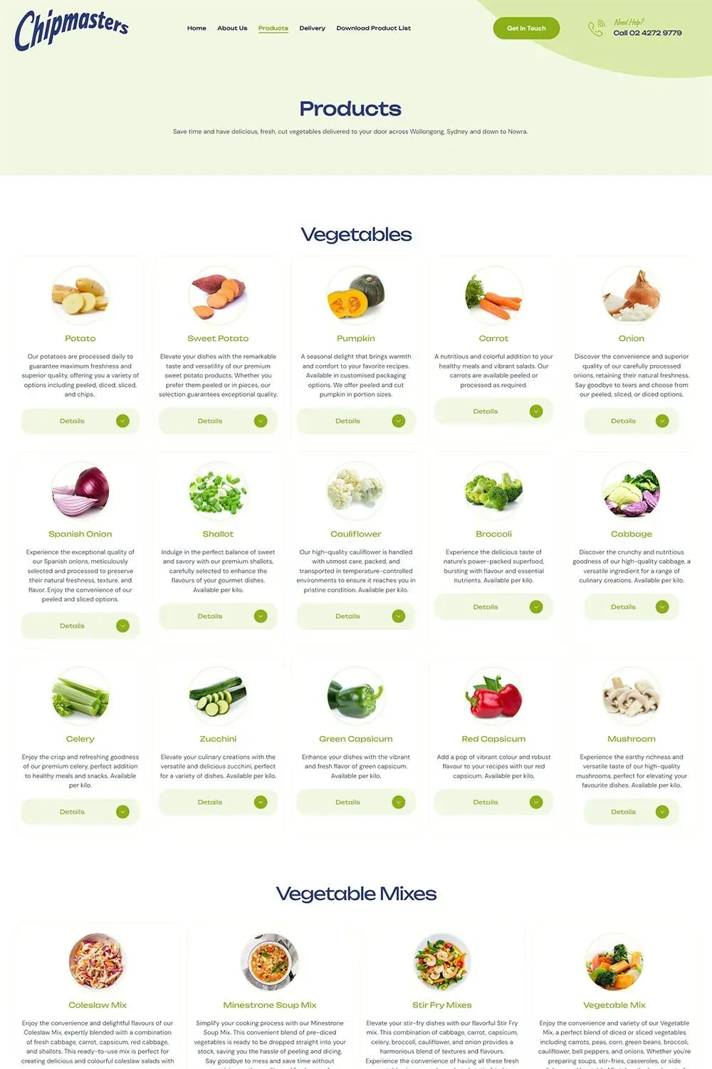
Among the key features we implemented was the categorisation of products, enabling visitors to quickly access the products they were interested in without feeling overwhelmed by information. Additionally, we used captivating images of fresh vegetables to convey the quality and freshness of Chipmasters' offerings, leaving a lasting impression on potential customers.
Our team of web design experts at Love My Online Marketing, successfully addressed the challenges faced by Chipmasters' old website. The redesign has positioned Chipmasters to attract more business opportunities, engage potential clients, and ultimately achieve their growth objectives. We are genuinely proud of our work with Chipmasters and are eager to continue supporting them as they thrive in their industry.
Southern Highlands Distillery
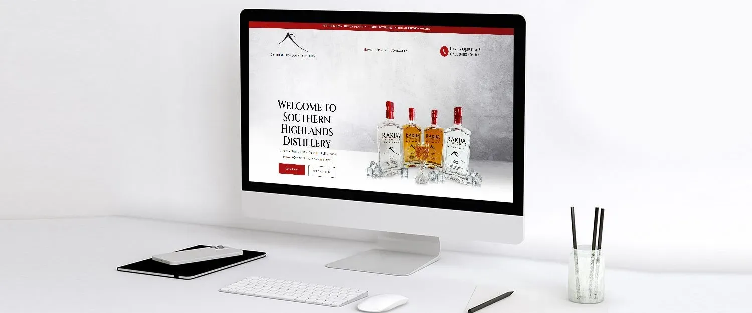
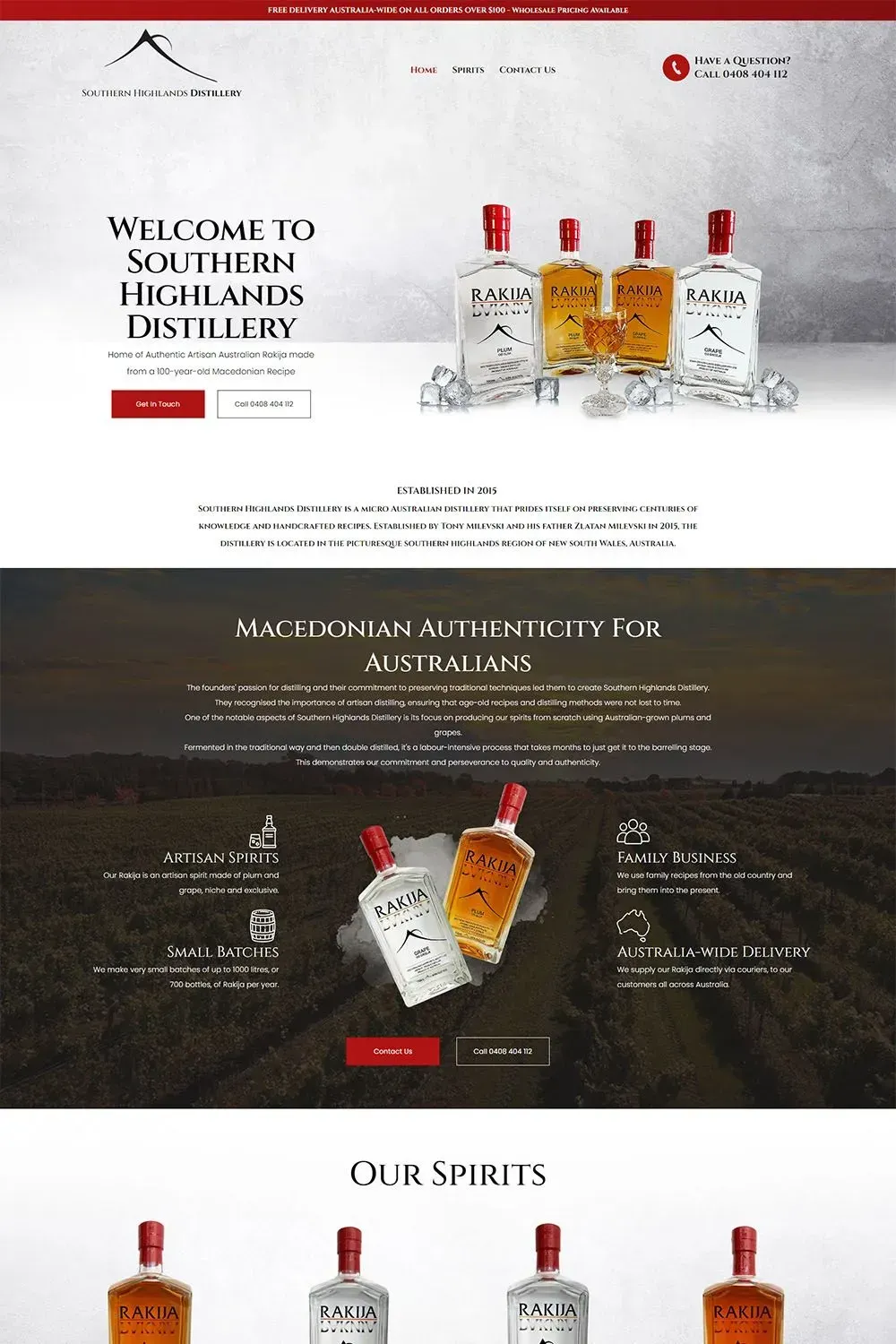
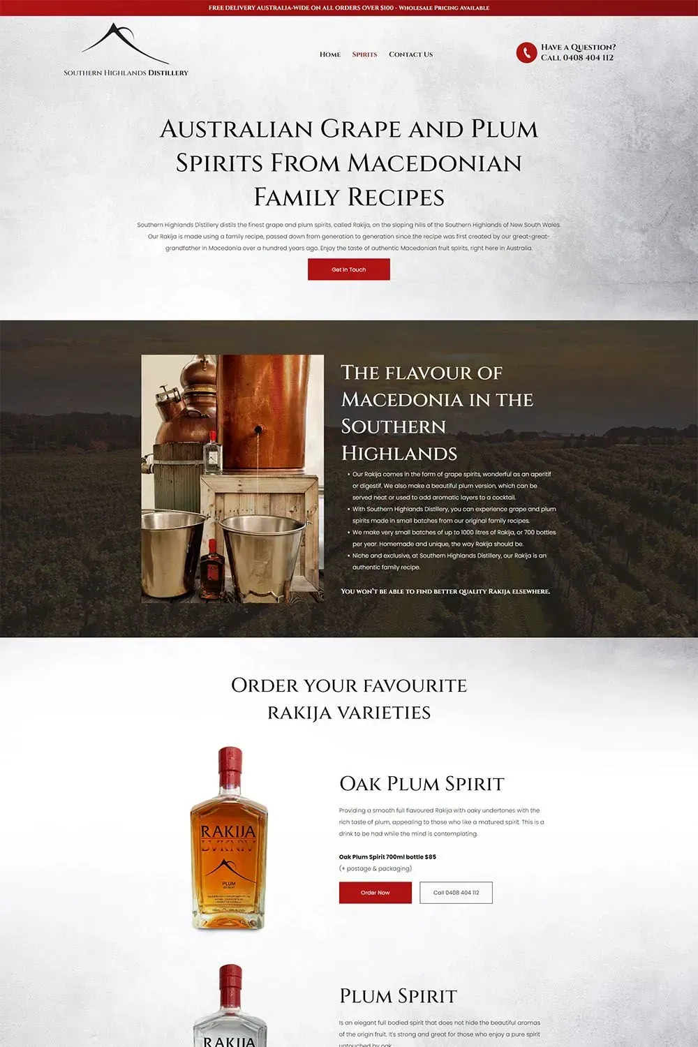
Southern Highlands Distillery has established itself as a distinguished producer of authentic Australian Rakija, following a traditional Macedonian recipe that spans over a century. Despite their prominence among micro distilleries in Australia, their previous website lacked the sophistication needed to properly showcase their brand. Although informative, it failed to capture the charm and unique narrative that defined them.
Recognising the need for a transformative web presence, Southern Highlands Distillery sought our expertise to redesign their website. We wanted to create a responsive website that does justice to the brand's legacy and elevates its digital identity.
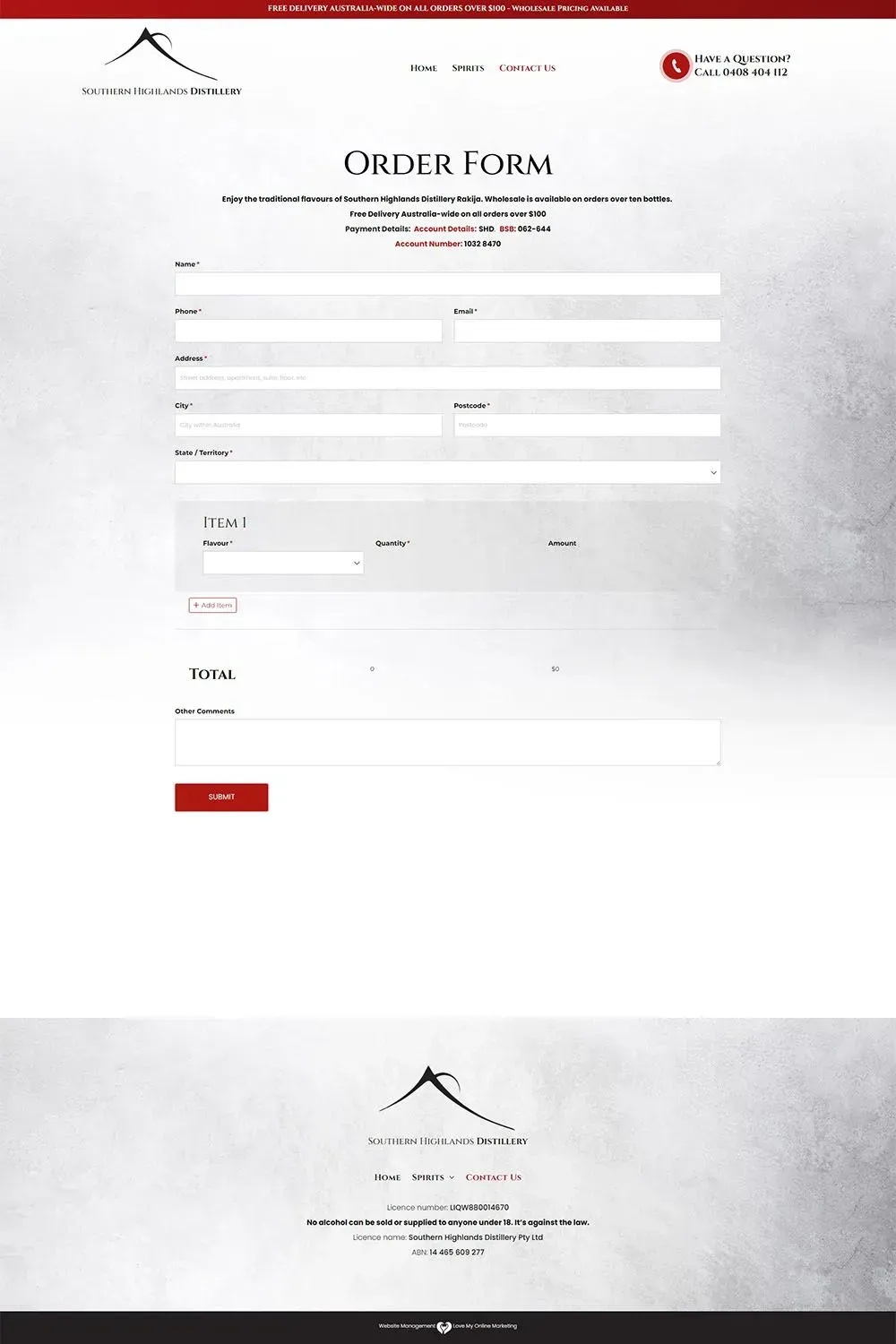
To achieve this, our expert web designers undertook a comprehensive approach. We completely revamped the website's look and feel, crafting a contemporary, user-friendly interface that tastefully highlights the brand's elegance. Ensuring seamless user experience, we made sure the website was responsive across various screen sizes and devices.
The visual aspect of the website was of utmost importance. We carefully selected and integrated high-resolution images that captured the essence of the distillery's craftsmanship. Moreover, we meticulously aligned the content and design to cohesively reflect the brand's identity and core message.
Now, Southern Highlands Distillery has successfully acquired a digital platform that impeccably embodies its rich history and authenticity. Our involvement in their journey has been a source of immense pride, and we are delighted to have played a role in helping them showcase their legacy.
Latest Online Marketing Posts
All Rights Reserved | Love My Online Marketing Pty Ltd. I ABN 58 627 183 037

