Crown Street, Wollongong, 2500

Crown Street, Wollongong, 2500
Cosmetic Clinic Website Design
Sleek, Sophisticated Websites for Cosmetic Clinics
Aesthetic
Artistry
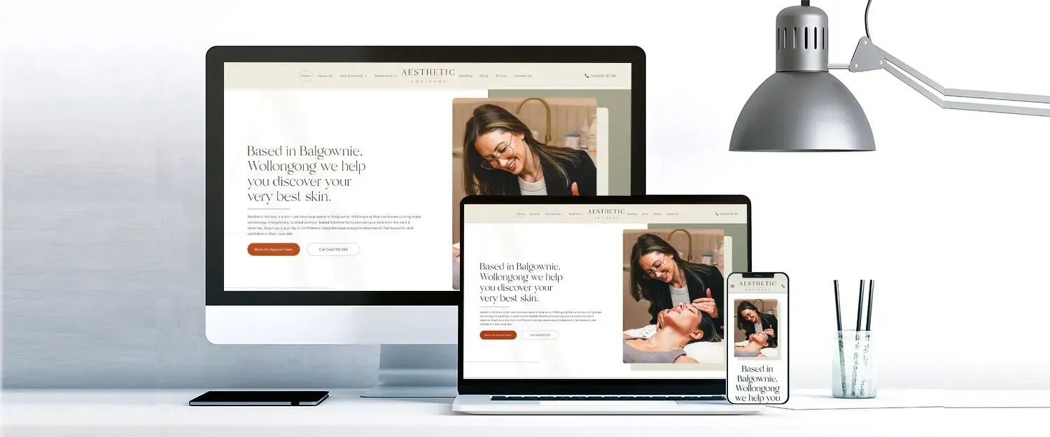
Our goal was to infuse a new sense of life into Aesthetic Artistry's online presence, matching their focus on natural beauty and self-care. We wanted to create a calm and welcoming online space for their clients.
The revamped website is not just a feast for the eyes; it also provides valuable information on skin care. We've loaded it with articles and resources that empower visitors to make informed choices about their skincare journey.
It's a one-stop shop for all things beauty. Visitors can find all the details about their handpicked products, making it a breeze for clients to discover the perfect solutions for their skin. And, of course, we've made sure that the pricing and services are crystal clear. We know how important it is for potential clients to quickly find the information they need to make their decisions.
We understand the importance of trust in the world of skincare, and that's why we'll prominently feature client testimonials on the website. Real stories and experiences from satisfied customers will offer reassurance and build credibility, further establishing Aesthetic Artistry as a trusted destination for skincare solutions.
When you visit the newly designed website, expect an inviting, visually stunning, and effortlessly navigable website that encapsulates the boho spirit, inviting visitors to explore a world of beauty and rejuvenation.
Love My Online Marketing is grateful for being part of this transformation and looks forward to the continued success of Aesthetic Artistry in the skincare industry.
Grace's
Lashes
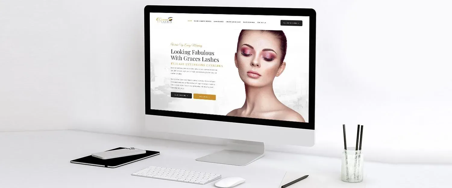
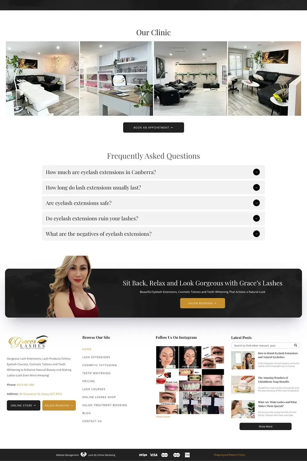
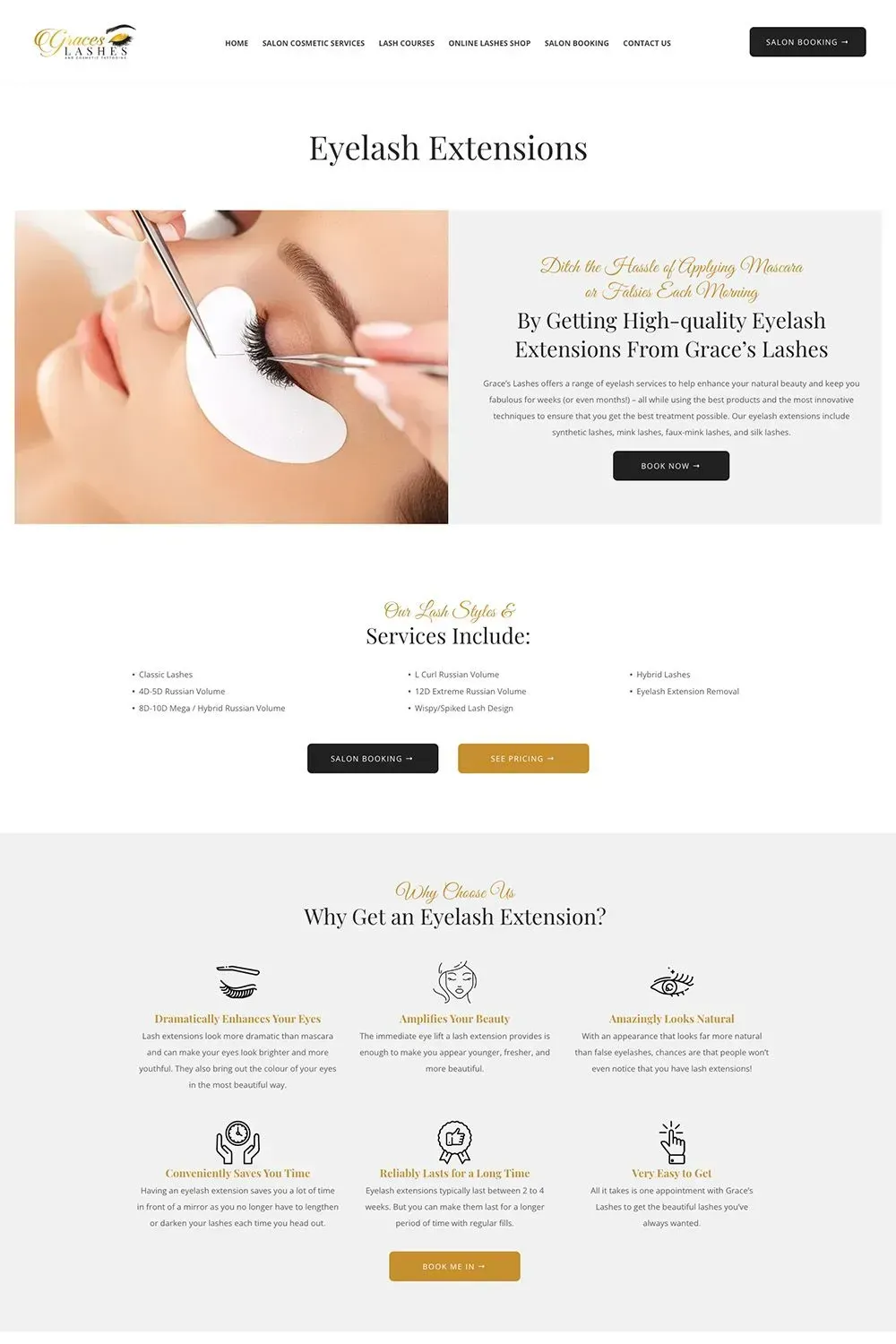
The Love My Online Marketing team is always up to the challenge when it comes to web design. Proof of this is our work for Grace's Lashes.
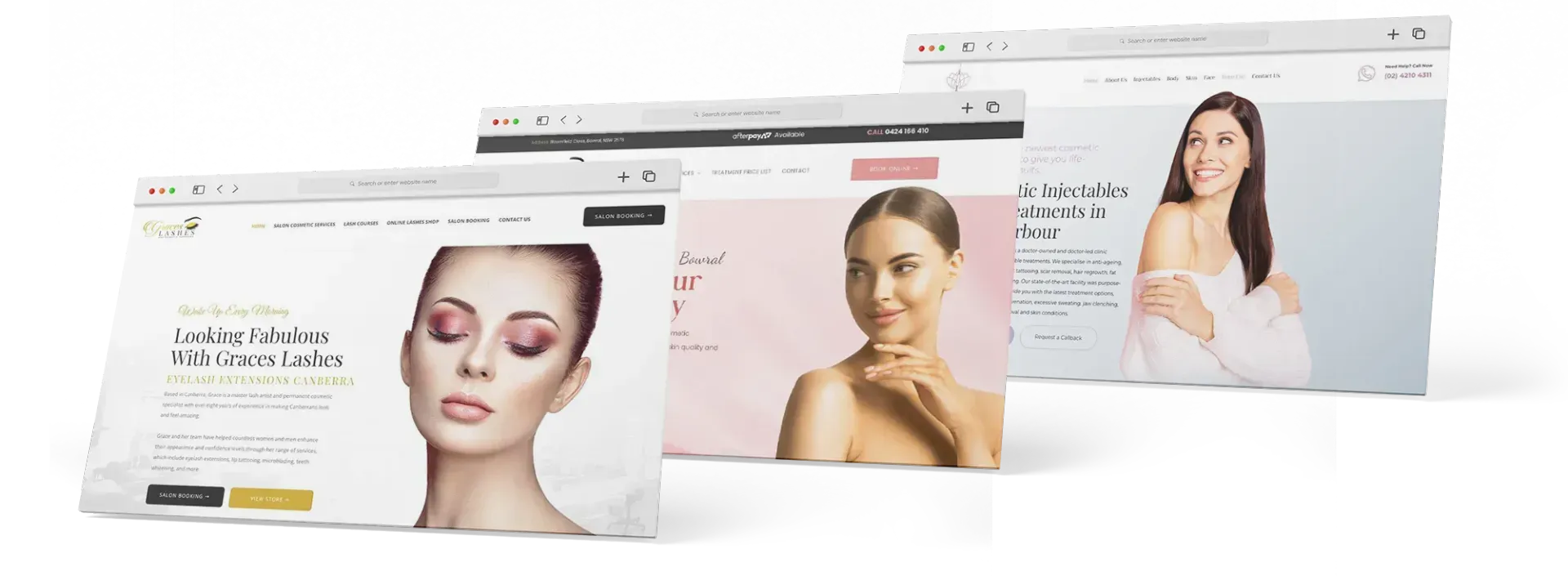
This cosmetic clinic was looking for a website that was clean, modern, and informative without overwhelming the visitor with too much content. We gave the client exactly what they wanted.
Immortal Cosmedical
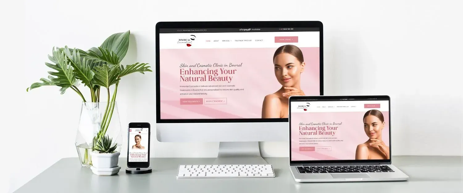
When Immortal Cosmedical approached us for a website, they knew that they wanted something modern and sleek to showcase their brand. They have been in business for a few years, but their old website was in dire need of an upgrade.
Their old website was riddled with heaps of issues that impacted their ability to attract and convert customers online. For starters, the design was outdated and didn’t reflect the quality of their brand. The user experience was also poor owing to the confusing navigation, making it hard for visitors to find what they were looking for. Another issue was the content, as it wasn’t well written or engaging enough to capture the attention of visitors. Lastly, their old website wasn’t designed to be responsive, so it didn’t look good on mobile devices.
We wanted to create a website that would be an asset to their business, and help them attract new clients. We also wanted to make sure that the website would be optimised for search engines so that Immortal Cosmedical could attract more organic traffic.
The first thing we did was create a stunning design that would reflect the quality of their brand. We used a clean and modern layout with plenty of white space to give the website an upscale feel. We also included high-quality images to show off their services in the best light possible.
When it came to the user experience, we made sure that the navigation was easy to use and that all the important information was easy to find. We also wrote compelling content that would capture the attention of visitors and make them want to learn more about Immortal Cosmedical.
We also included testimonials from satisfied clients to help build confidence in potential patients. Moreover, we made good use of the colour pink, which is often associated with femininity and beauty, to appeal to their target audience.
Lastly, we made sure that the website was responsive so that it looked good on all devices. We also took care of all the technical aspects of the website so that it would be optimised for search engines.
The end result was a stunning website that Immortal Cosmedical can be proud of. It’s already helping them attract new clients and grow their business. If you’re looking for a website for your cosmetic clinic, the Love My Online Marketing team would be happy to design one for you.
Secret Skin
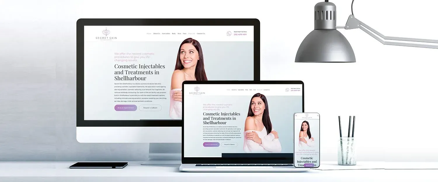
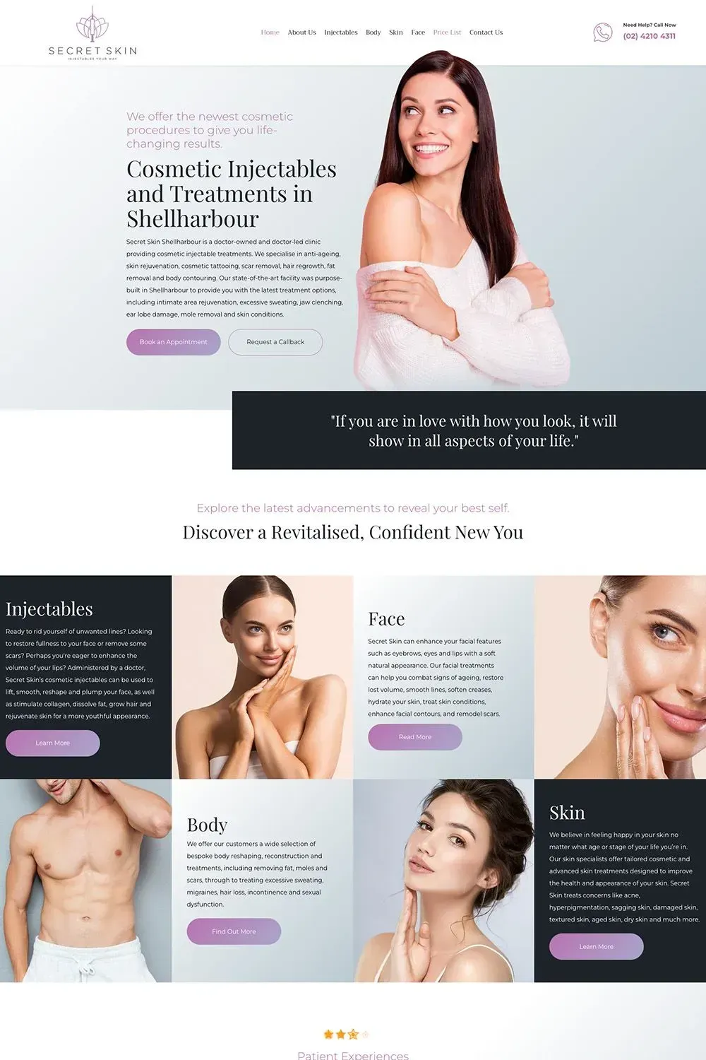
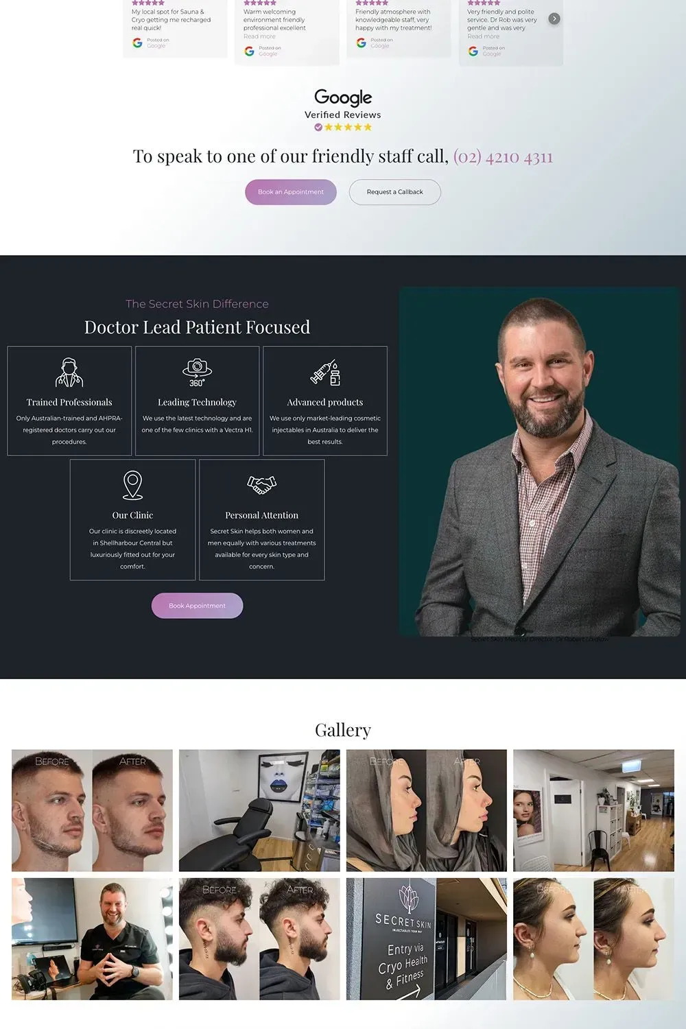
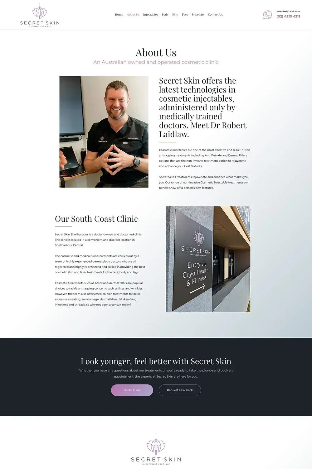
We are excited to present one of our latest web redesign projects: a cosmetic clinic website design. Secret Skin is a high-end cosmetic clinic offering a variety of injectables and treatments to their clients. They came to us because they didn't like the look of their previous website, which, to be fair, was modern but lacked personality and impact.
Our team approached this project with the primary objective of creating a website that was visually stunning, user-friendly, and organised. The existing website was cluttered, lacked a clear structure and had sub-standard visuals, ultimately failing to showcase the Secret Skin brand in its best light.
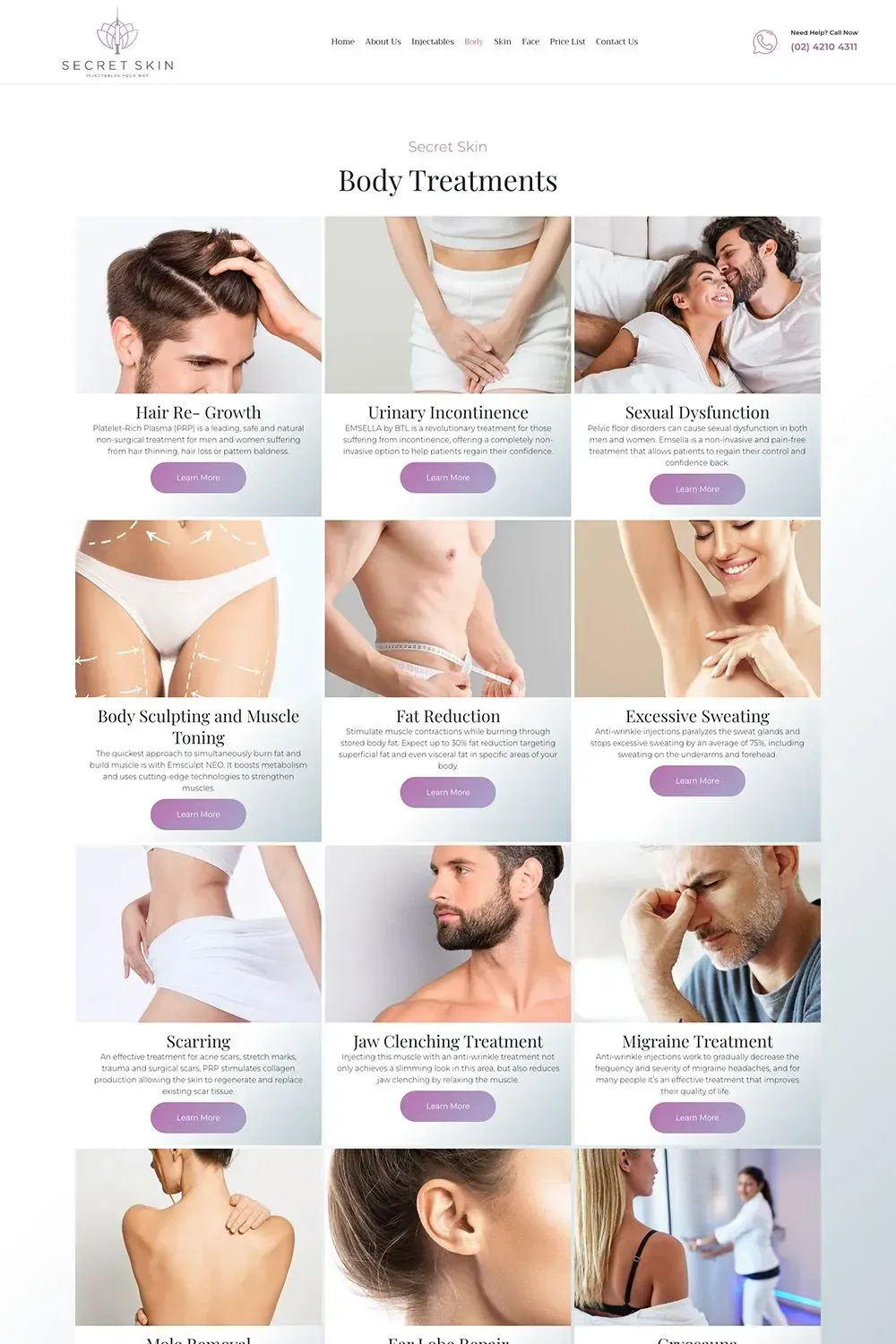
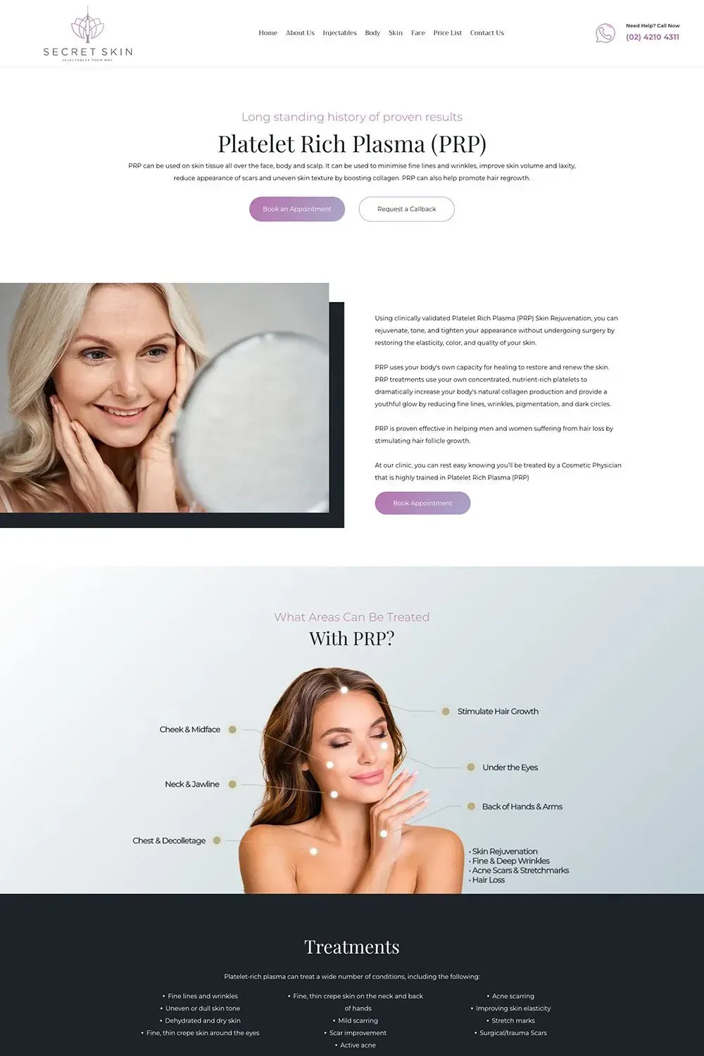
To tackle this challenge, we created a fresh and innovative aesthetic that spoke to the clinic's luxurious and elegant brand. We chose a neutral colour palette with accents of lavender and incorporated high-quality visuals that showcased the various treatments and outcomes beautifully.
We also improved the content, which was previously a mouthful and all over the place, to make it easy for clients to navigate and find the right treatments that would suit their needs. We focused on presenting the different offerings, including injectables and treatments, in an organised manner that would be informative to potential clients. We included detailed descriptions of each treatment, including the benefits and expected outcomes.
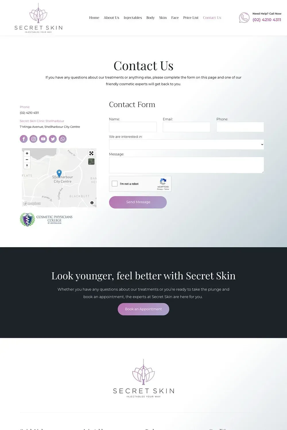
Our team also restructured the website's navigation to make it more seamless and user-friendly, allowing visitors to find the information they need with just a few clicks and scrolls.
All in all, the website redesign we delivered for Secret Skin is a massive improvement compared to the previous website. We created a sleek, professional design that provided a clear and concise explanation of the clinic's offerings. The website now perfectly matches the high-end services Secret Skin provides to their clients.
Latest Online Marketing Posts
All Rights Reserved | Love My Online Marketing Pty Ltd. I ABN 58 627 183 037


