Flex Terminology (1.0)

Melody Jaimon • December 5, 2022

The definitions that follow are for terminology specifically related to Flex and Flex Mode.
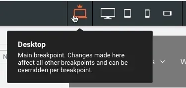

  • Breakpoint. The width at which the design adjusts to fit a certain screen width. Breakpoints allow responsive design since they scale up and down. In Flex mode, the default breakpoints are desktop, widescreen, tablet, mobile, and mobile landscape. By clicking the corresponding view at the top of the page, you may switch between breakpoints. See Flex Overview (1.0) for further details.
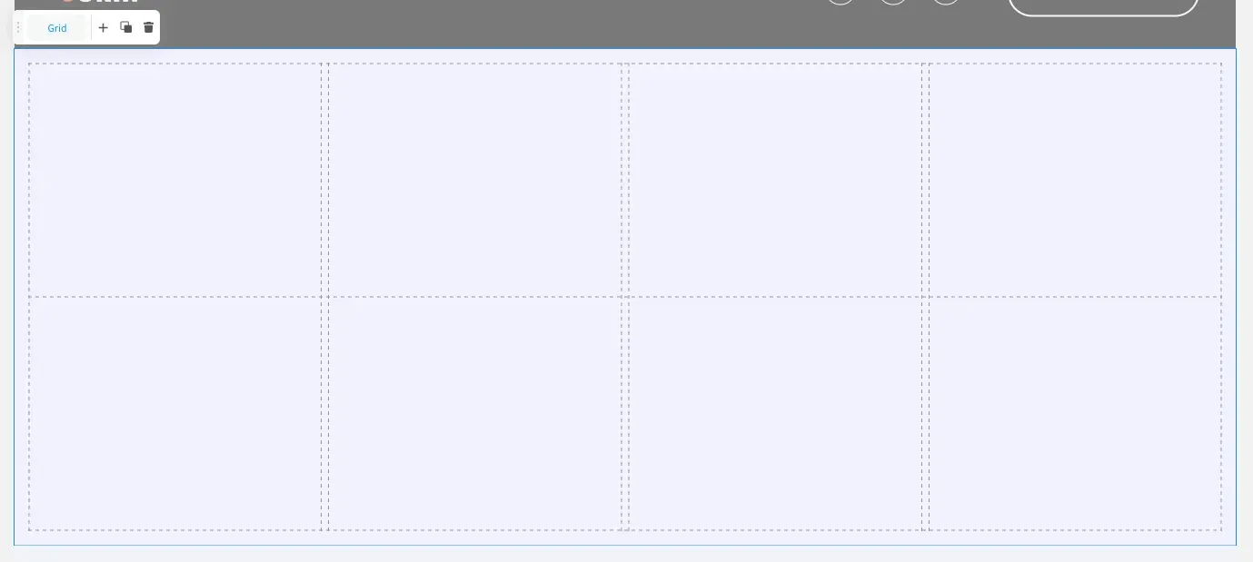
  • Grid. The vertical and horizontal lines provide the page structure. The grid does not include any material, but it allows you to organise it.
  • Cell. These are the gaps generated by the grid's vertical and horizontal lines, and they are all the same size. Cells are formed by arranging rows and columns in a grid. These serve as suggestions for more precisely inserting items across breakpoints.

Container. An object that can include other objects and has freestyle editing capabilities (including widgets, inner containers, flexbox, and so on). In addition, like an inner grid, you can add columns and rows to a container. Placing elements in a container allows you to change all of them at once, such as relocating, changing the backdrop, and duplicating. See Containers and Flexboxes (1.0) for further information on when to use them.
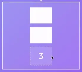
Flexbox. A container has elements that are automatically arranged vertically or horizontally. The design panel is where you can guide the layout. Flexboxes distribute elements equally on their own. While this can be accomplished by utilising a container and adding rows and columns, this is a simpler technique to guarantee that objects are uniformly distributed across the section. For various breakpoints, multiple layouts may be used. See Flex Breakpoints (1.0) for further details. See Containers and Flexboxes (1.0) for further information on when to use a flexbox.

Rows. See Row Editor and Arrange Content for additional information on editing rows inline.


Columns. See Arrange Content for additional details on using columns inline.

See How Our Agency Can Drive Massive Amounts of Traffic to Your Website

Website Design designed for your audience and to be found on Google Searches
SEO - unlock relevant and increased SEO traffic. 

Paid Media - effective paid strategies with a clear ROI.

Get Started

Love My Online Marketing has 10+ Years of working alongside businesses and helping them grow. Discuss your options for online success from website Design and Development through to Google Marketing.

Get in Touch

Do you want more traffic and business leads?

Love My Online Marketing is determined to make a business grow. Our only question is, will it be yours?

Let's Chat
A notebook with the words call to action written on it
By Melody Jaimon April 8, 2025
Effective CTAs guide users through your site and drive action. Learn best practices for creating clear, visible, and persuasive CTAs that actually convert.
A woman is stacking coins on top of each other on a table.
By Melody Jaimon April 8, 2025
In 2025, pro websites in Australia range from $3.5K to $10K+. Learn what you’re paying for, and how to avoid undercutting your business goals.
A person is holding a cell phone with a collage of pictures on it.
By Melody Jaimon April 8, 2025
Posting regularly but still getting low reach? Instagram's rules have changed. Learn what’s hurting your posts — and how to fix it fast. Read the full blog.
A person is holding a cell phone in their hand with social media icons coming out of it.
By Melody Jaimon April 8, 2025
Integrating social media with your website boosts traffic and SEO. Learn smart ways to align both for better visibility and engagement. Read the full blog.
A woman is looking at a laptop with a Google logo on the screen.
By Melody Jaimon March 31, 2025
Boost local visibility with 11 expert tips for Google Business Profile (formerly GMB) optimisation. Learn how to rank higher and attract more customers.
A desk with a computer , laptop , tablet and phone on it.
By Melody Jaimon March 31, 2025
Learn how to create visually appealing websites in Australia that balance creativity and functionality. Explore tips to keep designs simple yet effective. Read more.
A group of people are sitting on a couch looking at their phones and laptops.
By Melody Jaimon March 29, 2025
Learn how to grow from zero on social media in 2025 using Viplikes’ tips on content, trends, and smart promotion tools. Read more to level up your game.
Businessman using a laptop with floating digital marketing icons
By Melody Jaimon March 28, 2025
Learn the key types of digital marketing, their benefits, and the best practices for 2025. Find the right strategy to grow your business online.
The word design is on a piece of paper on a table.
By Melody Jaimon March 25, 2025
Stay ahead with the latest 2025 web design trends. Get expert tips and learn how to make your site stand out. Read more now.
The word seo is written on scrabble tiles on a wooden table.
By Melody Jaimon March 20, 2025
Over 56% of Oscars-related content was blocked due to keyword filters, limiting brand reach. Learn how excessive blocklists impact marketing campaigns.
More Posts