Crown Street, Wollongong, 2500

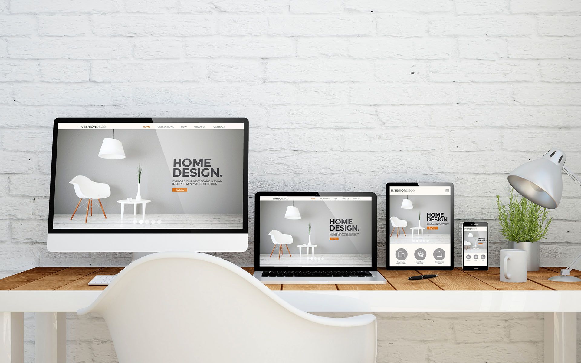
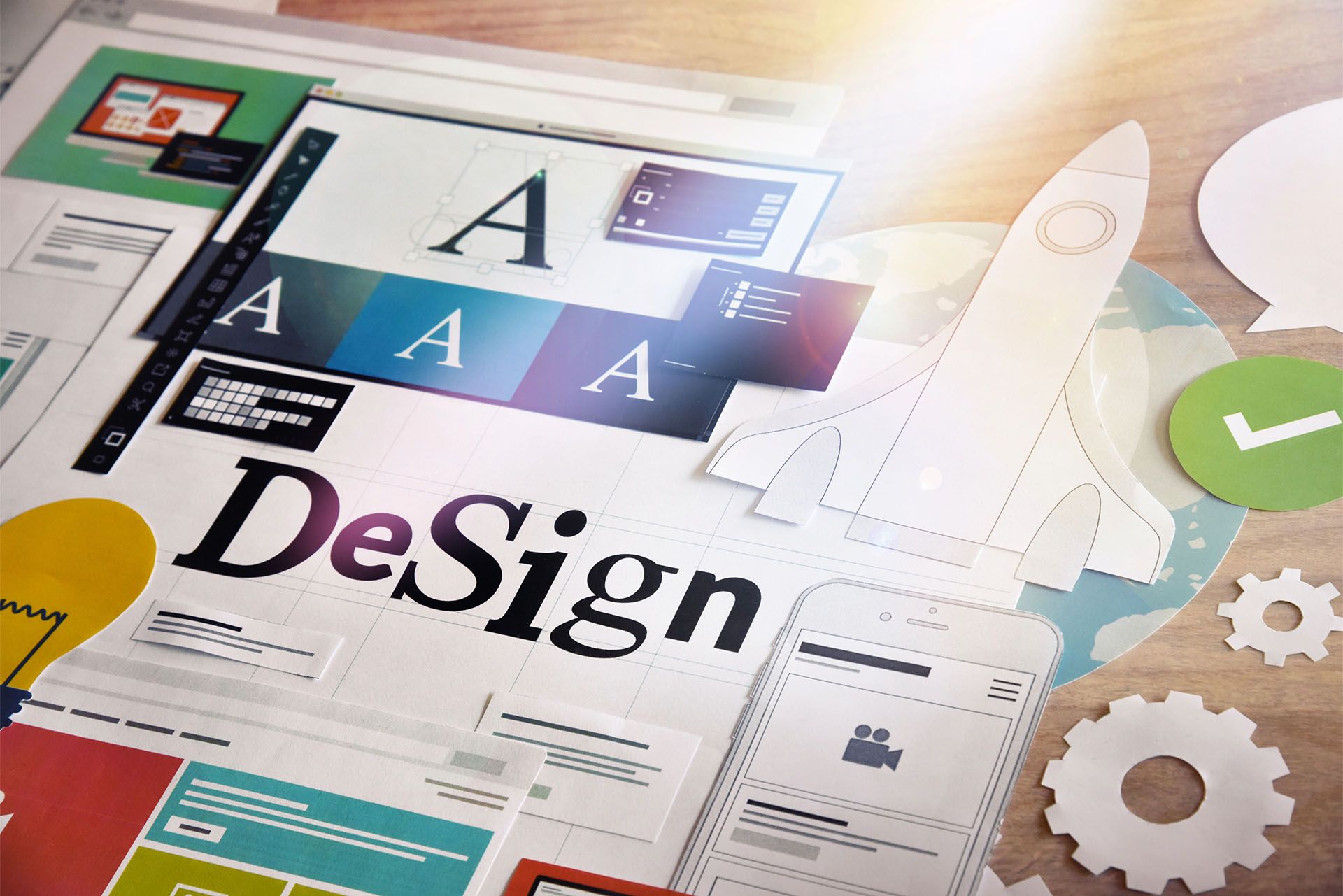
Responsive Tablet
Melody Jaimon • September 6, 2022
The iPads display the same view as desktops due to Apple’s release for iPads (iPadOS). But you can switch to a responsive desktop-tablet layout to make sure that all of your changes are visible on live sites.
When the screen size is 1024px or less, the responsive layout automatically changes from the top navigation header to the hamburger menu header. If needed, the layout of the small screen can be changed.
To use responsive site layouts:
- Click Design in the editor's sidebar, then click Site Layout.
- Click the Responsive Layout switch under Desktop.
- Choose a site layout for 1024 pixels or more.
- Choose a site layout for 1024 pixels or less.
After switching to responsive site layouts, you may toggle between Large Desktop (above 1024px), Small Desktop/Tablet (1024px and below), and Mobile views in the top menu. See Switch Views for further details.
The CSS for the Large Desktop and Small Desktop/Tablet breakpoints is the same, and there is no Tablet CSS.
Elements may be hidden based on their size (Large Desktop and Small Desktop/Tablet). See Switch Views and Show Hidden Elements for additional details.
Transitions are smoother and are not dependent on User Agents.
The following tablet customisations automatically show the desktop layout and do not require customisation:
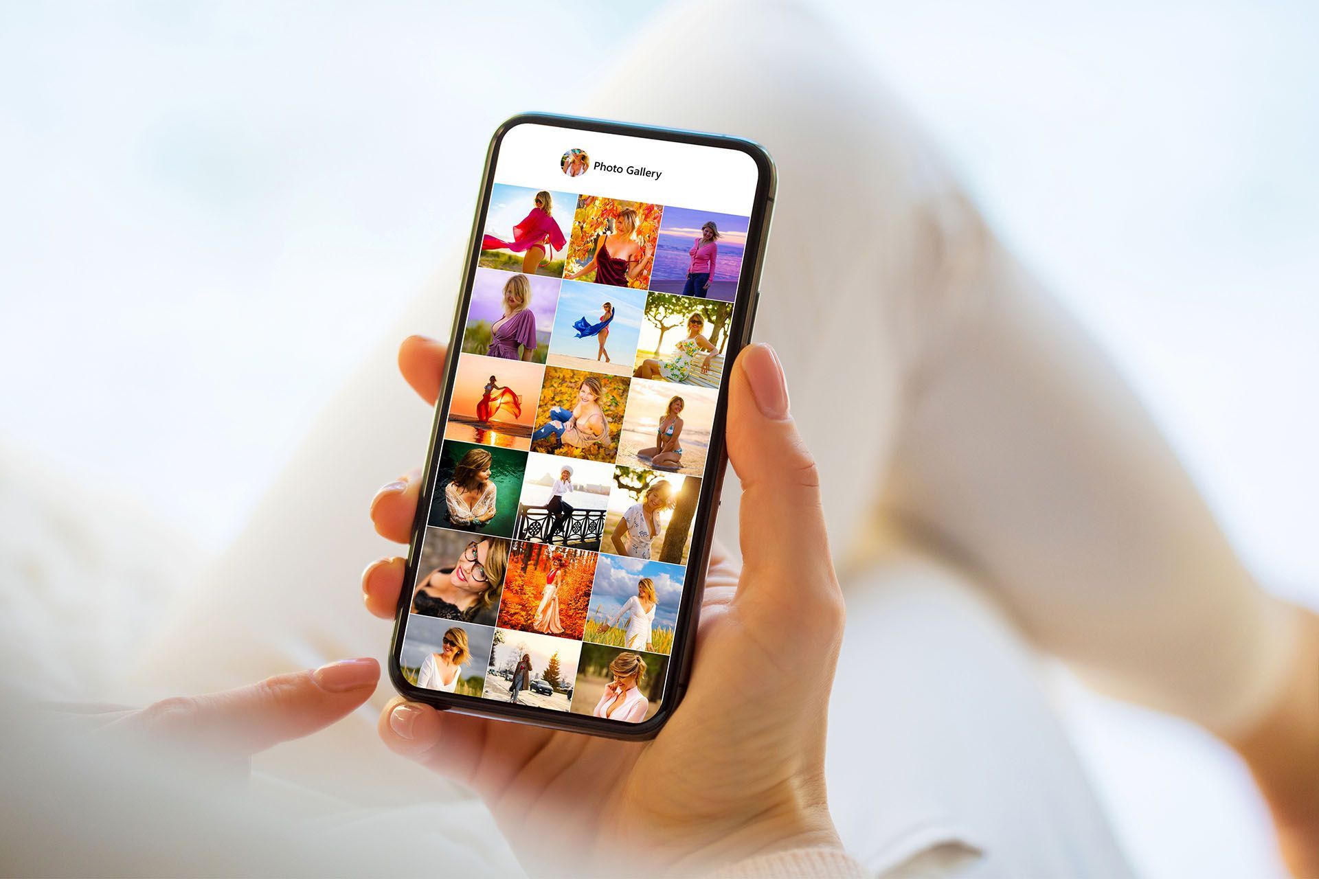
- Photo gallery layouts
- Tablet personalization rules
- Animations
Important Notes
- Before enabling a Responsive Layout, make sure that any hidden elements on your site are visible. To fix, disable Responsive Layout and unhide all hidden elements. Then you can enable Responsive Layout and re-hide any previously hidden items. See Show Hidden Elements for further details.
- The tablet device is no longer displayed in Personalisation. Selecting a desktop also has an impact on tablet views.


Love My Online Marketing has 10+ Years of working alongside businesses and helping them grow. Discuss your options for online success from website Design and Development through to Google Marketing.
Do you want more traffic and business leads?
Love My Online Marketing is determined to make a business grow. Our only question is, will it be yours?


