Crown Street, Wollongong, 2500

Colour Psychology Marketing: How to Use Colours to Influence People for Your Brand
Melody Jaimon • April 5, 2022
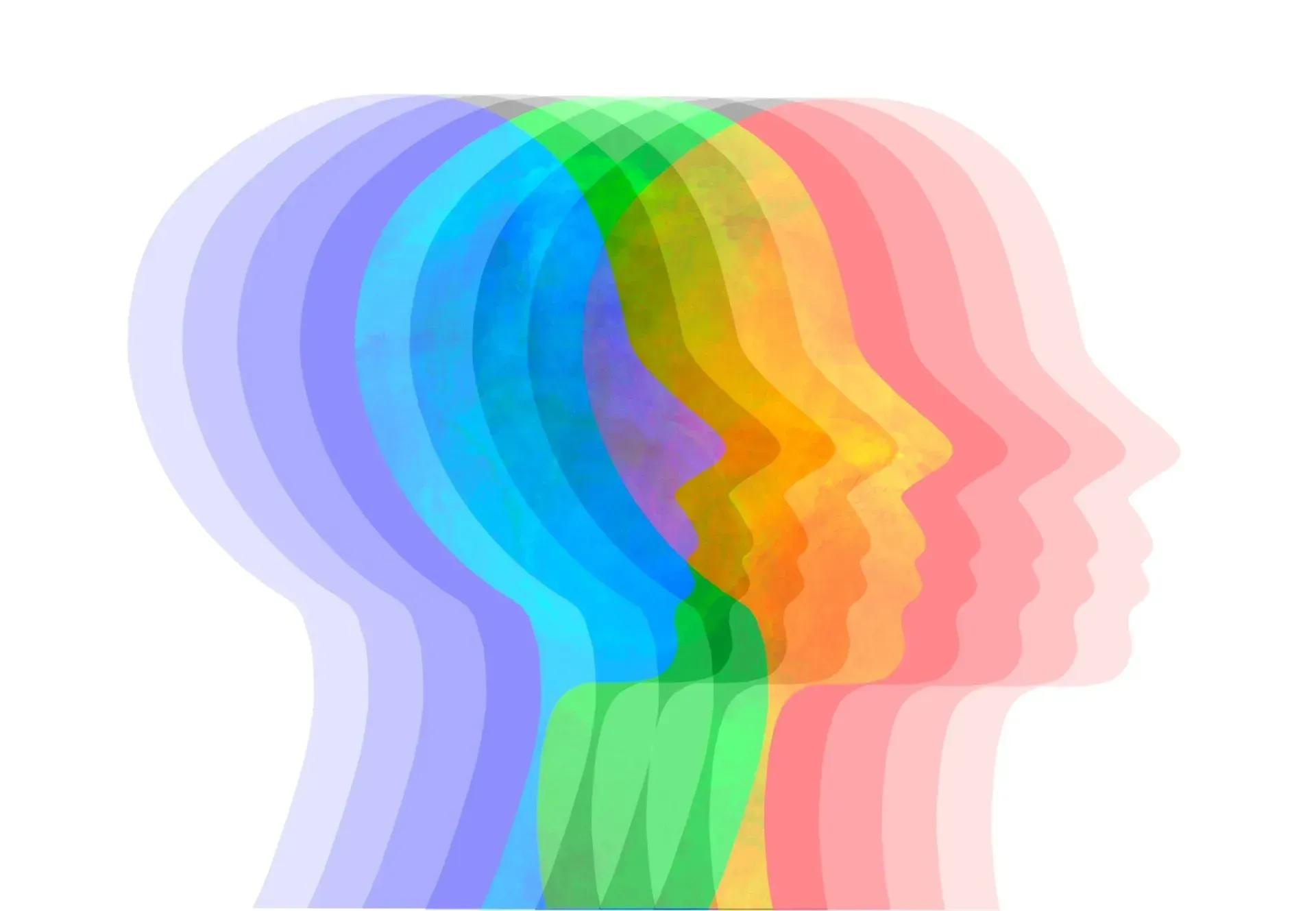
Colours, colours everywhere! Colours are a powerful tool for marketing. They evoke emotions and can be used to evoke certain behaviors. As such, they’re important when it comes to branding. Color psychology is the study of how people are influenced by different colours. They have power over our moods, feelings, and even behaviors. But what does that mean for your brand?
This article will teach you how to use colour in your marketing strategy to influence your customers and make more sales.
You’ll learn about the basics of color psychology as well as how to incorporate colour into choosing a colour palette for your campaigns. With these simple steps, you’ll be able to find the perfect palette for your brand and create an effective campaign that will boost sales.
What is Color Psychology?
Color psychology is the study of how colours affect our moods, behaviors, and even thoughts. It’s a branch of marketing that looks at the effects of different colours on people. The goal is to use colours to influence customer behavior and ultimately boost sales. One research study found that colour can increase brand recognition by up to 90%.
There are a few key things to keep in mind when it comes to color psychology:
- Colours can be associated with certain emotions. For example, blue is often seen as calming, while red is seen as exciting.
- Different colours can have different effects on people. What one person finds calming, another person might find energizing. It’s important to consider your target audience when choosing colours for your brand.
- Colours can also be associated with certain behaviors. For example, yellow is often seen as happy and optimistic, while black is seen as powerful and authoritative.
Now that you know a little bit about color psychology, let’s talk about how you can use it in your marketing strategy.
The Importance of Colours in Marketing
Visual appearance is one of the most important factors in marketing. It’s no secret that colours play a big role in marketing. But what many businesses don’t realize is just how important color scheme can be.
Colours can influence people’s moods, thoughts, and even behaviors. Color meanings makes them a powerful tool that you can use to boost sales and create more effective campaigns.
Think about the last time you saw a commercial or advertisement. What colours did it use? Was it mostly black and white or was there a lot of colour? Did the colours make you feel any certain way?
Now think about your favorite brands. What colours are they using in their branding? Do those colours make you feel any certain way?
Chances are, the answers to these questions are not a coincidence. Companies use colours very deliberately in their marketing. They know that colours can influence people and they use that to their advantage.
So, if you’re not using colours in your marketing, you could be missing out on a big opportunity to boost sales and create more effective campaigns.
Choosing the Right Colours for Your Brand
Basic color theory is a complex topic, but there are a few basics that you should know. Colour has a direct effect on human behavior. Different colours can evoke different emotions in people.
When it comes to choosing colours for your brand, there are a few things you need to consider. First, you need to think about the emotions and behaviors you want to evoke. Different colours can have different effects on people.
Here are a few tips for using primary colors, secondary colors and tertiary colors in your marketing:
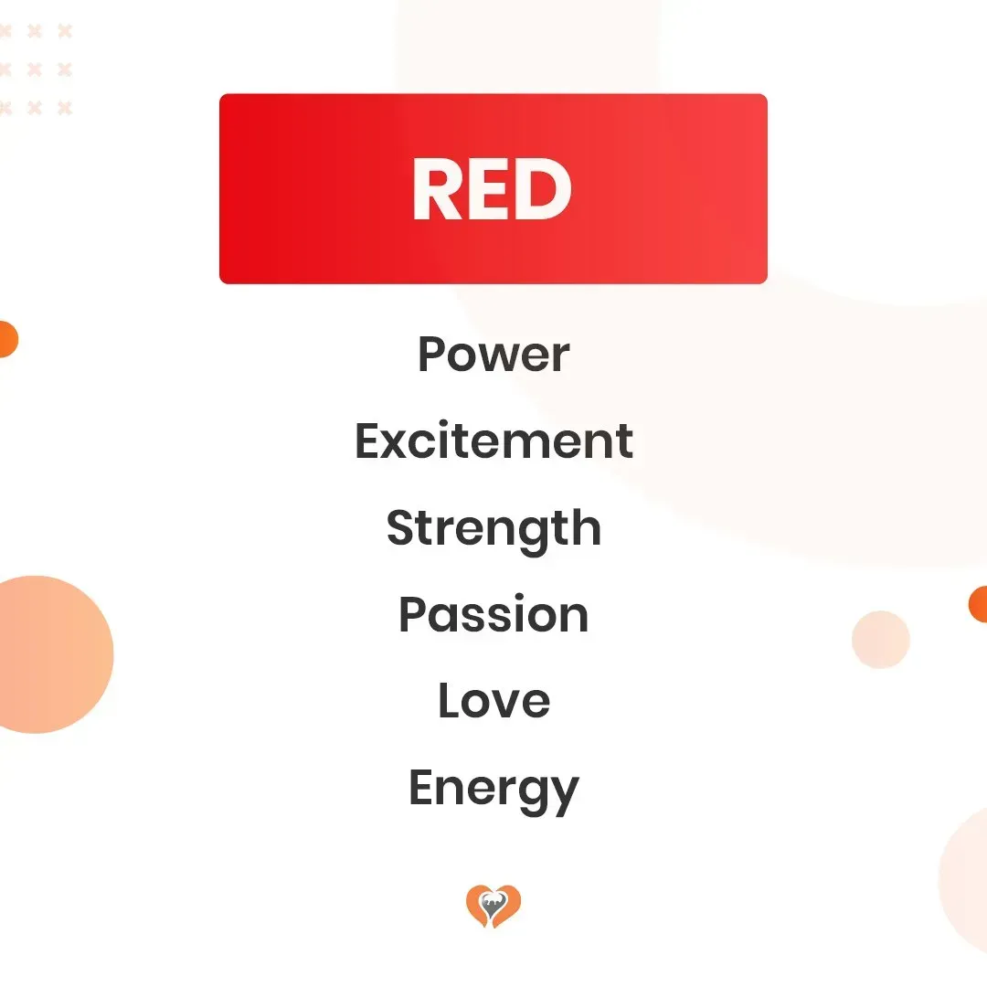
Red Color Psychology
Red is a hot, sexy colour. It’s passionate, intense and has the power to excite those around it. Red can be used to promote excitement, passion, and love.
With that said, red is an excellent colour that is complementary color to green for campaigns that are trying to sell something related to these concepts. Hot cars or clothing would be a good example of this.
But color red isn’t just a splashy, passionate colour. It also conveys the feeling of being powerful and in control. As such, it’s often used by law enforcement agencies as well as banks and other financial institutions when they want to convey confidence and trustworthiness.
This power makes it a great option for brands looking for a more serious or professional tone as well.
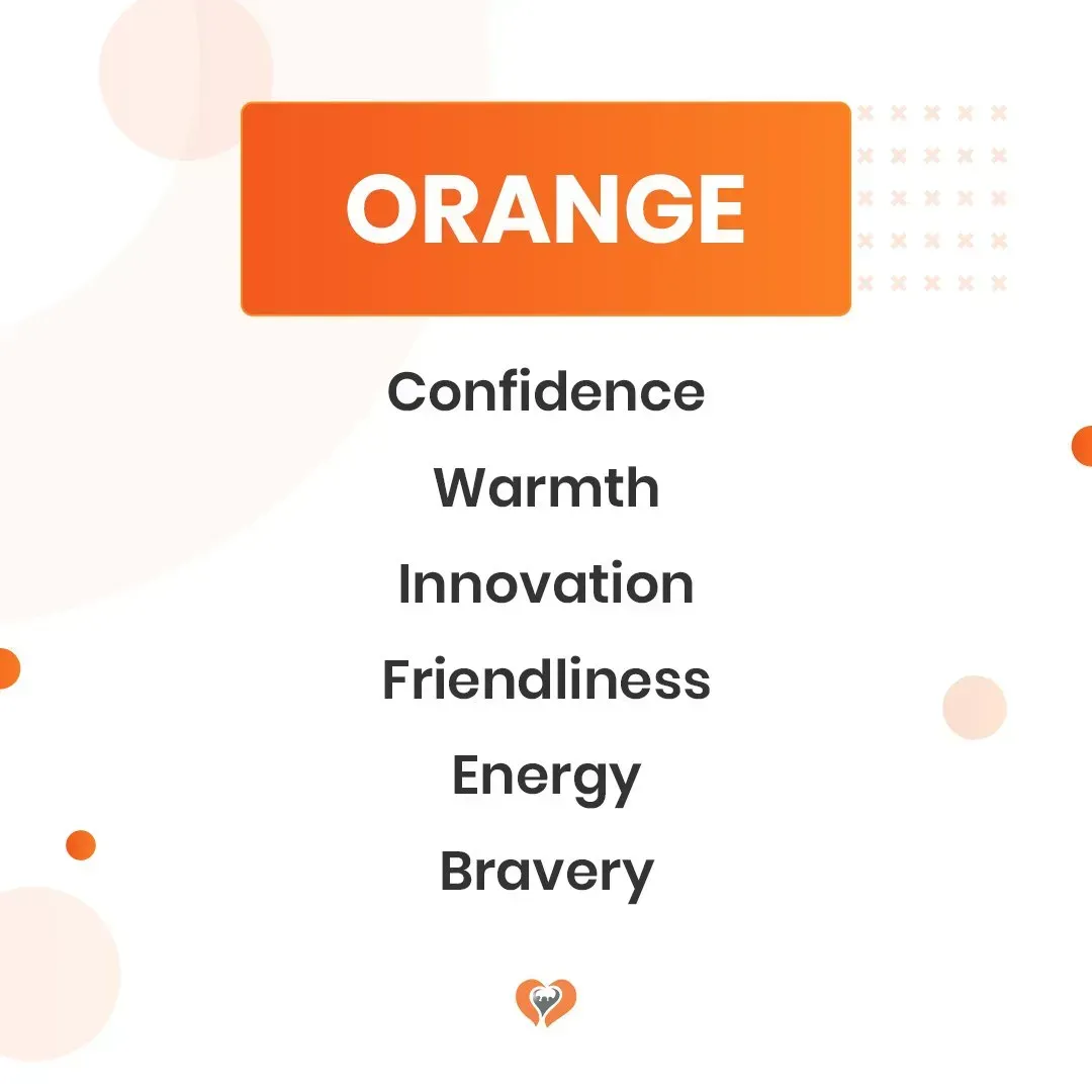
Orange Color Psychology
The color psychology behind orange is powerful. Orange is the colour of happiness and warmth. It makes people feel safe and secure. This can be used to draw customers into your store or fill them with a sense of warmth and comfort that will make them want to stay with your brand.
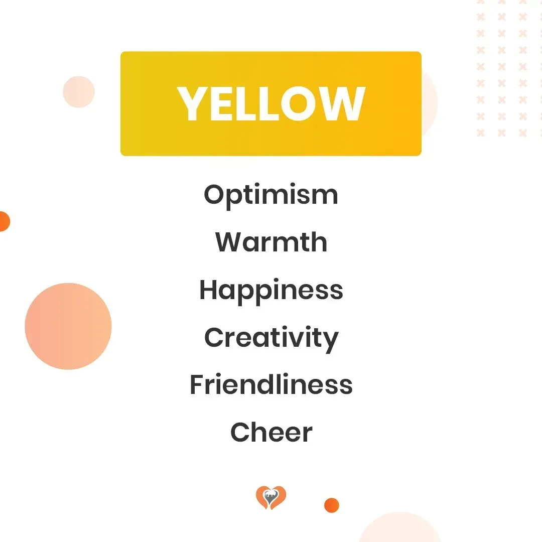
Yellow Color Psychology
Yellow is a bright, vibrant complementary colors that evokes feelings of warmth and happiness. It can be used as an attention-grabbing color in a design. Yellow is often linked to optimism and creativity, so it's a good color schemes for an ad campaign that wants to make people feel that way.
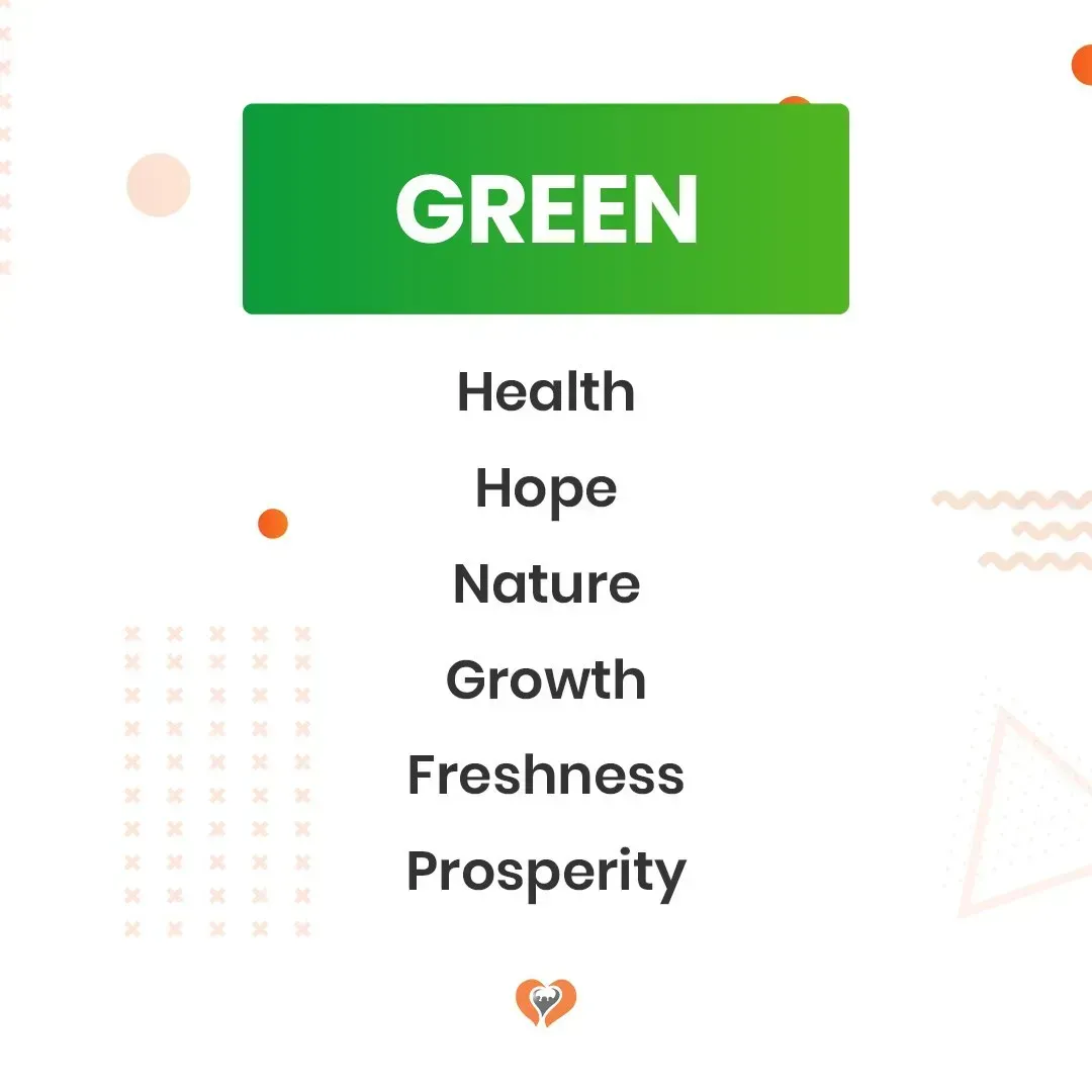
Green Color Psychology
The colour green has long had a reputation as the colour of tranquility. It’s the colour of nature and it color meanings often associated with growth and prosperity. When we see green, we see life, vigor, and freshness.
If you want to use this colour in your brand marketing to sell natural products, be sure to make it vibrant or rich to contrast the natural connotations. You can also pair green with other colours that have complementary meanings, such as red or purple, to add a sense of balance.
One potential way to use green in your marketing is by incorporating it into your logo design. If you were using another colour for your logo, like warm colors blue, you could even try using a lighter shade of green as an accent on your lettering to reinforce those associations without changing the entire image.
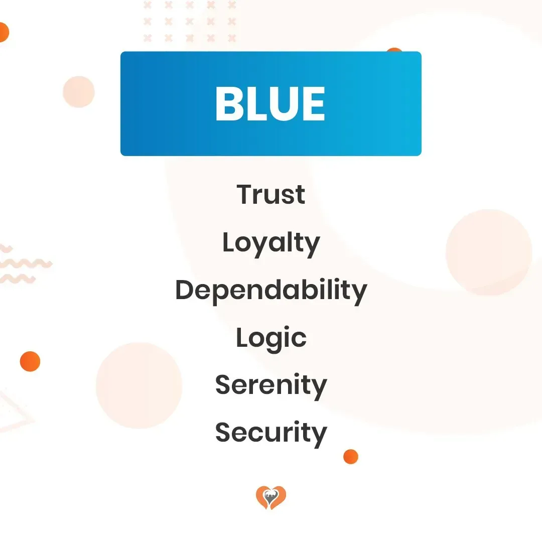
Blue Color Psychology
Color blue is the colour of calm, trust, and intelligence. It’s the perfect colour to use if your target audience is feeling anxious or uncertain about their purchase. The cool colors of blue also signifies stability and reliability.
You should use blue when you want to show that your company is trustworthy and reliable. It’s a great way for companies with a more traditional business model to differentiate themselves from competitors who are perceived as unreliable or untrustworthy.
If you want to make a great impression on your first-time customers, consider using blue in your marketing campaign to signify reliability and trustworthiness. This will help them feel more comfortable with your company and encourage them to buy from you again in the future.
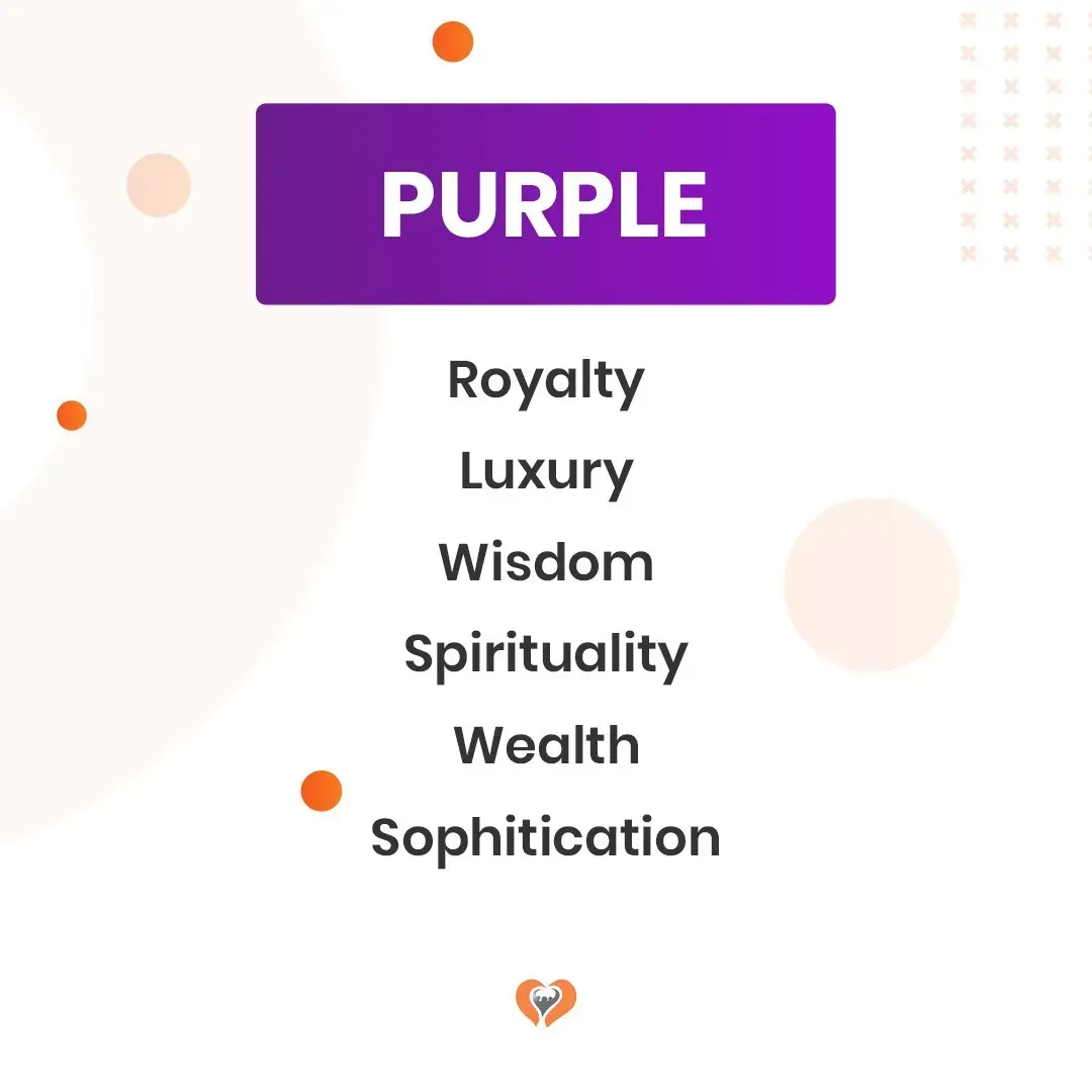
Purple Color Psychology
Purple is a colour that has a multitude of meanings depending on the shade. For example, purple can be seen as being regal and elegant or it can be seen as sad and depressing. The same is true for shades of purple.
The most commonly used shade of purple in marketing is lavender. This colour screams sophistication and class. It's perfect for luxury brands, hotels, or spas.
The next most common shade of purple is plum, which has warmer undertones than lavender and very intriguing colour. This colour is often associated with royalty because, historically, only royal families were permitted to wear this colour. Plum can also be seen as strong and confident in marketing materials but might evoke feelings of sadness in different settings, such as funeral homes or counselling centres.
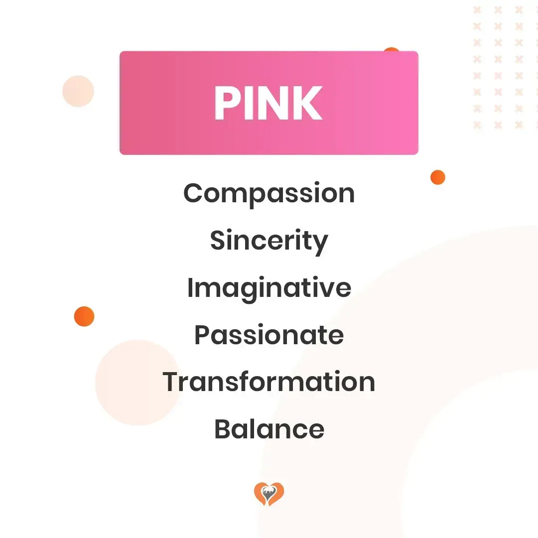
Pink Color Psychology
Pink is a great colour to use in your marketing, pink colours influence people to feel calm and refreshed. It’s also been shown that pink evokes feelings of love and caring. This means that it would be a good colour for an ad about your spa or clothing line, as it could evoke feelings of relaxation and comfort.
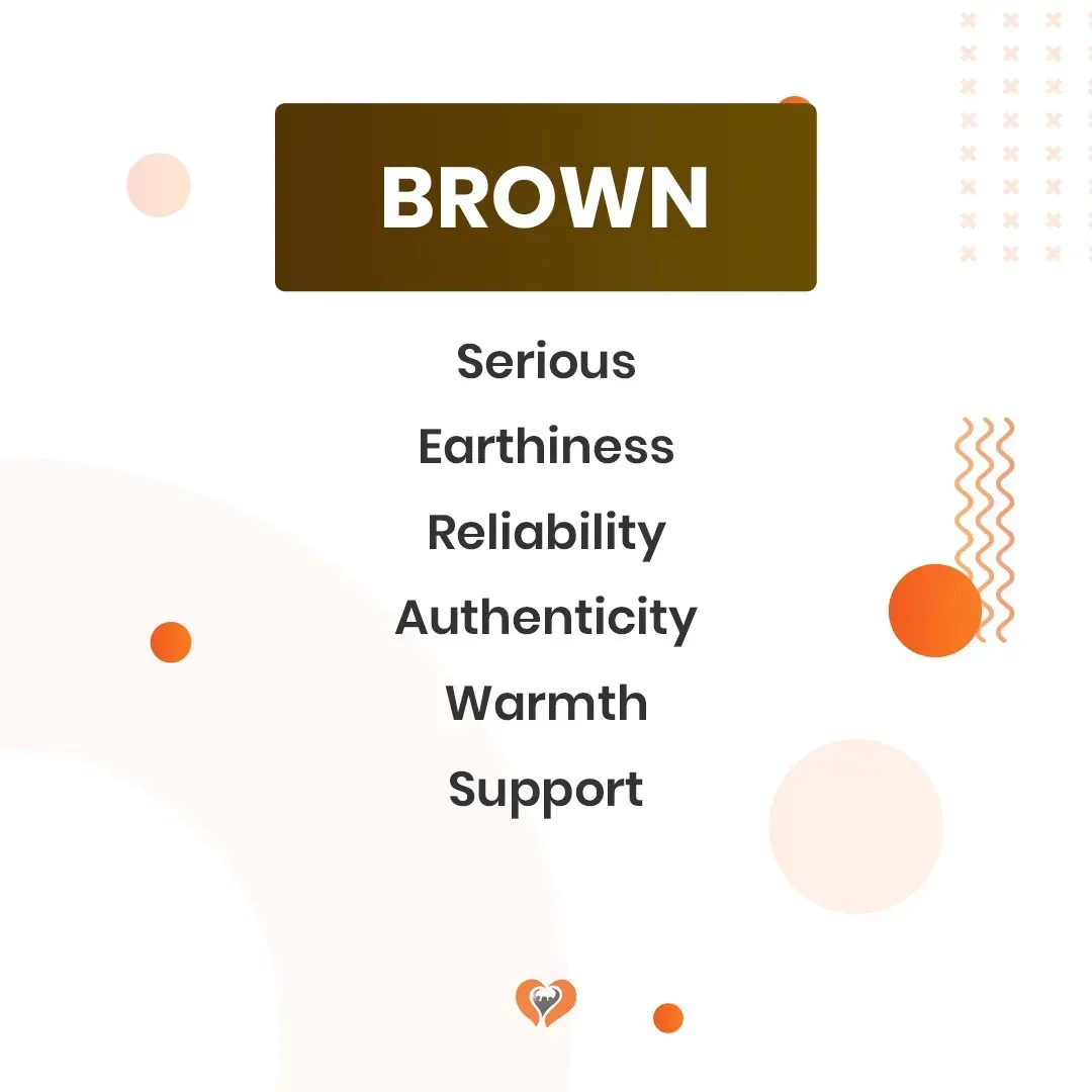
Brown Color Psychology
Brown is a very earthy and neutral colour. It’s natural and organic, which is why it often appears in more sustainable packaging. This also lends itself to brown being a good colour for a brand with an environmentally-friendly message. Many say mocha is the same colour as brown. Brown can also have some negative connotations. The colour brown has negative associations with uncleanliness or dirtiness, and that might be something you want to avoid for your brand.
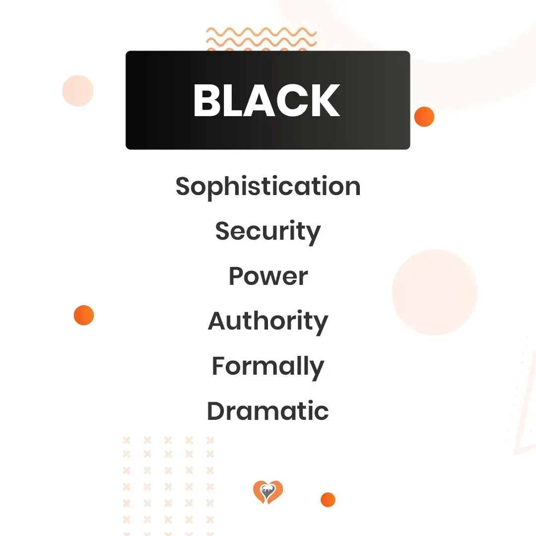
Black Color Psychology
Black is a colour that can be used to show power and prestige. It’s also the colour of night and mystery, which can make people feel like they don’t know what you have in store for them. It evokes feelings of sadness but has different meanings such as elegant and powerful.
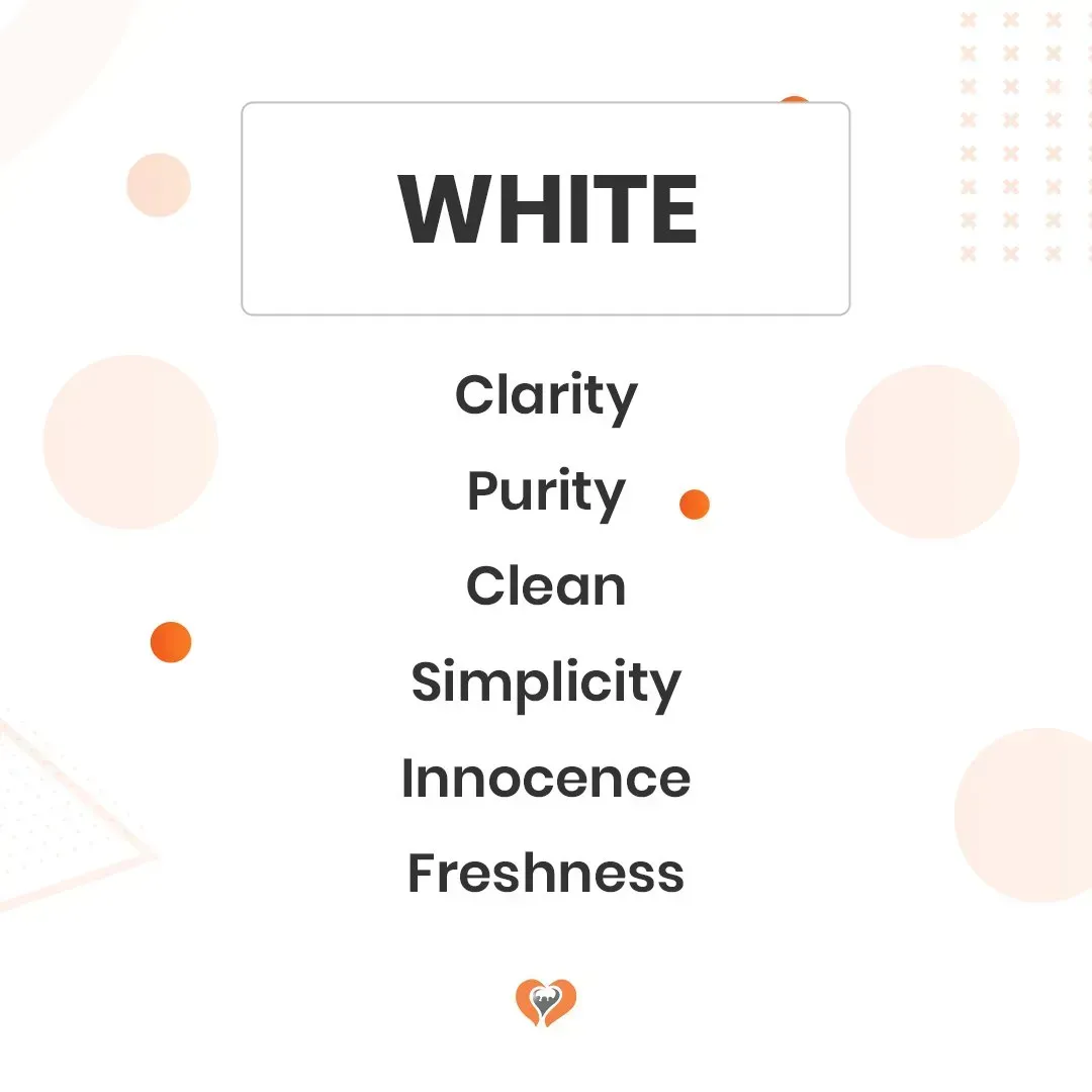
White Color Psychology
The colour white is often associated with purity and innocence, which can make people more trusting of your brand. This means that a lot of people will feel comfortable doing business with a company that uses white in its branding. White also has connotations of cleanliness and simplicity, which are two very important factors when it comes to marketing.
How to Create an Effective Campaign Using Color Theory
Now that you understand the basics of colour psychology in marketing, it’s time to put it to good use in your marketing campaigns according to your colour preferences. Here are a few tips to get you started:
- Choose one or two colour combinations for your brand and stick with them. This will help people associate those colours with your brand image over time.
- Think about the feelings you want to evoke in your customers and choose colours that will help you do that.
- Don’t be afraid to create contrast or experiment with different shades of colours to see what works best for your brand.
- And last but not least, have fun with it! Colours are a great way to add some personality to your marketing campaigns.
Key Takeaway
Color is a powerful tool to use for marketing. By knowing the psychological effects of colour and how to use them for your marketing campaigns, you can better target your audience and get the reaction you want from them.
At Love My Online Marketing, we specialise in helping big and small businesses with their digital marketing efforts. We offer a range of services, including website design, logos, and Google marketing. If you need help getting started, or if you want to take your business to the next level, book a discovery call and we'll be happy to help!


Love My Online Marketing has 10+ Years of working alongside businesses and helping them grow. Discuss your options for online success from website Design and Development through to Google Marketing.
Do you want more traffic and business leads?
Love My Online Marketing is determined to make a business grow. Our only question is, will it be yours?