Crown Street, Wollongong, 2500

Troubleshooting Flex (1.0)
Melody Jaimon • December 6, 2022
Limitations
The following details are relevant for Flex sections and Flex Mode:
- Within the editor, objects cannot be moved from one grid to another.
- Note that the Layers panel can be used to move objects from one grid to another.
- Collections cannot be linked to flexboxes.
- The header cannot contain flex sections.
Troubleshooting FAQs
When I go to tablet/mobile breakpoints, my text overlaps the items below.
When items are placed directly on the grid or the container layout is 1x1, this may happen.
Click the Desktop breakpoint in the top navigation.
- If the overlapping items are in a container, select additional rows from the drop-down menu in the Custom Layout, then position each object in a row.
- If the items are directly on the grid, add a container with rows and drag the objects to it as described above. Alternatively, you can also plan objects in a vertical flexbox.
I can’t drag to resize my grid on mobile
Grid height is specified as a minimum value, which means it will never be less than what you set. For example, if the grid minimum height is set to 400px and the container minimum height is set to 1200px, the grid can't be less than 1200px.
To resize the content:
Reconfigure the minimum height in the Design panel, under
Size. Alternatively, you may resize the content inline before resizing the grid inline or through the Design panel.
My row expanded and is very large on mobile
On mobile, Flex converts grid columns to rows. If the minimum height of an item (such as a container) is greater than the minimum height of the grid at the main breakpoint, the row may not appear appropriately on mobile.
Because the grid is resized depending on its content, this usually indicates that there is an image or container that is set in px.
To resize the content, go to:
Reconfigure the minimum height in the Design panel, under
Size, from the main breakpoint. Alternatively, you may resize the content inline and then the grid inline or through the Design panel.
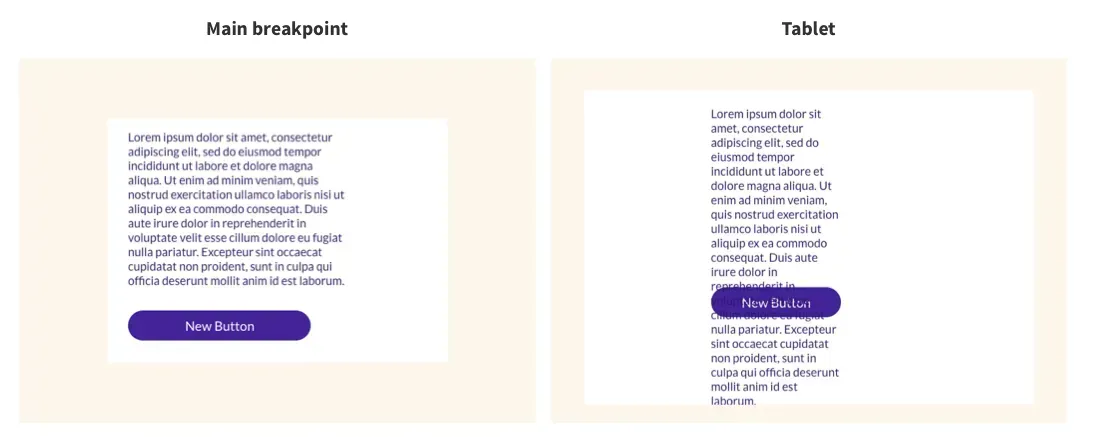
My design looks messy when I switch breakpoints
The following factors might explain why your design seems jumbled when you move breakpoints:
- Objects are not snapped to grid lines. When the cells are small, this is more prevalent.
- The grid's objects are not aligned.
- The pin is set to the default state. By default, when you add a new object, it gets pinned to the top left. When you align it, the pinning changes. Align the bottom, for example, will pin to the bottom. It should be noted that dragging the object after pinning returns it to its default state.
Drag an object and use the pink snap lines to position it on the grid to snap it to the grid lines. Alternatively, utilise the alignment controllers from the Design panel.
To manually set the pin, choose an object and then navigate to
Position in the Design panel. Next to
Pin, click the
arrow corresponding to where you wish to pin the object.
I can’t change the font size on tablet
The font size is the same on the desktop (main breakpoint and wide desktop) as it is on the tablet. We suggest that you use a font size that is appropriate for both desktop and tablet usage.
I try to rearrange elements on mobile specifically but it keeps affecting all the breakpoints
Changes to the structure have an impact on all breakpoints. On the main breakpoint, for example, if there are two adjacent containers spanning the entire grid, but you want those elements to be stacked vertically on mobile. When you attempt to move them, they get nested instead.
When nesting an element on mobile, it will affect and be nested on all breakpoints. Because there isn't enough space to move those elements vertically, so they're nested instead.
Change the minimum height of the space you're working on to fix this. Select the Grid and, in the Design panel, raise the Min Height under Size. This gives you more space to move elements around. You may adjust it to the required height after rearranging the parts.
Changing the location in mobile portrait only affects mobile landscape.


Love My Online Marketing has 10+ Years of working alongside businesses and helping them grow. Discuss your options for online success from website Design and Development through to Google Marketing.
Do you want more traffic and business leads?
Love My Online Marketing is determined to make a business grow. Our only question is, will it be yours?


