Crown Street, Wollongong, 2500


Crown Street, Wollongong, 2500
Header and Expandable Menu
Melody Jaimon • December 5, 2022
You can include an expanded menu on your desktop and tablet sites, making it simple to create modern sites with a wide range of design options. Choose from a variety of expandable menu layouts and customise them by adding widgets, rows, and columns.
The expandable menu layout for mobile allows for further customisation as well as the option to display widgets in the header and an always-visible menu.
You can modify the header style to a predefined layout that contains buttons, click to call, retail cart, social symbols, and more. The widgets panel allows you to add any widget to the expanded menu.
Desktop and Tablet
Select the Expandable Menu Layout
To choose an expanded menu style for your site, follow these steps:
- Click Design on the left panel.
- Select Site Layout.
- Select the Expandable menu layout from the Desktop section.
- Select the layout on the left in the Tablet area.
Desktop and Tablet Header
A hamburger icon appears in your site header once you select the expandable menu layout. To view the expandable menu, click the hamburger icon.
To change the position of the expandable menu in the header, follow these steps:
- Hover over the header, then click Header and choose Edit Design.
- Click
Left or
Right in the Layout section.
Desktop and Tablet Expandable Menu
To set up the expanded menu, do the following:
- To open the Menu Design editor, click the hamburger icon.
- To choose a menu layout, click the existing layout on the Layout tab.
- The following choices are available on the Style tab:
- Enter from. Choose the Top or the Side.
- Entrance effect. Choose either Push or Cover.
- Width. Move the slider to change how wide the expandable menu is when it is fully expanded. To fit all screen sizes, the width of the menu is set in percentages.
- Background. Change the background image or color.
- Close icon color. Choose a color for the close icon and the background color of the close icon.
- Change the padding on the Spacing tab.
The expandable menu can have up to 3 rows, and you can customise each one.
If both the Desktop and the Tablet have the same site layout (both expandable or both top bar), all of the customizations are the same for both. If they are different, you need to define each device separately.
If you don't see any of the above header features, you may still be using the old header. Click the header on a desktop or tablet to switch to the new header. When you change the header, a backup is made automatically.
This step is only for sites that already exist. It has nothing to do with new sites.
Mobile Header
To edit the header for mobile:
- Move your mouse over the header, click the Header, and then choose Edit Design.
- Click the layout that is already there on the Layout tab to choose a menu layout. In the mobile header, you can choose from different layouts that show widgets like social links, phone numbers, and more. Since the header layouts are set, you can't add new widgets, but you can change or remove the ones that are already there. When you add a store or use the multi-language feature, you get more layout options, such as the store shipping cart icon and the multi-language feature icon. These layouts won't show up if you don't have the store or more than one language turned on.
- Click either
Left
or
Right
to move the Menu icon.
Mobile Navigation
Open the menu in mobile view to make changes to the menu that can be expanded. The menu editor opens automatically so you can make changes.
- Select a menu layout on the Layout tab. The expanded menu displays social links, contact details, and more. You may add widgets, columns, and sort columns through the expanded menu. When you switch layouts, it deletes all menu content, keeping only the layout's widgets.
- On the Style tab, you can choose from the following:
- Enter from. Select either the Top or the Side. When Top is chosen, move the height slider. Move the width slider when Side is chosen.
- Entrance effect.
Choose either Push or Cover.
Updates to Mobile Layouts
Three mobile layouts were removed on September 8th, 2019 since they were seldom used. The two remaining layouts are more modern and functional.
If you already have a site with one of the deleted layouts and choose another layout, the layouts that were removed will be gone, but you will be able to restore them from site backup.
Click the header in mobile view to update the new mobile view header. When you change the header, a backup is made automatically.
This step only applies to sites that already exist. It has nothing to do with new sites.


Love My Online Marketing has 10+ Years of working alongside businesses and helping them grow. Discuss your options for online success from website Design and Development through to Google Marketing. Book a Free 20min Discovery Call.
Do you want more traffic and business leads?
Love My Online Marketing is determined to make a business grow. Our only question is, will it be yours?


Our Services

Latest Online Marketing Posts

Boost local visibility with 11 expert tips for Google Business Profile (formerly GMB) optimisation. Learn how to rank higher and attract more customers.
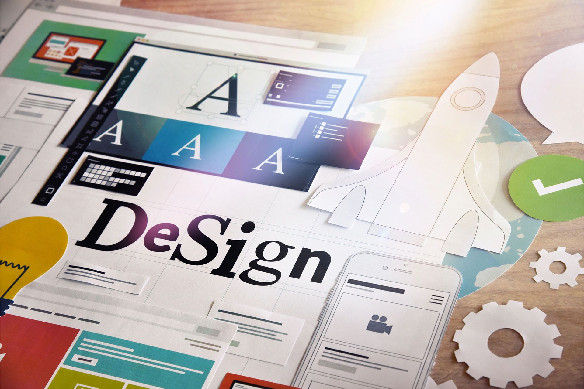
Learn how to create visually appealing websites in Australia that balance creativity and functionality. Explore tips to keep designs simple yet effective. Read more.

Learn how to grow from zero on social media in 2025 using Viplikes’ tips on content, trends, and smart promotion tools. Read more to level up your game.

We collaborate with


