Crown Street, Wollongong, 2500


Crown Street, Wollongong, 2500
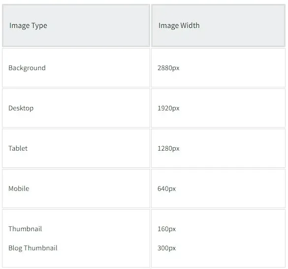
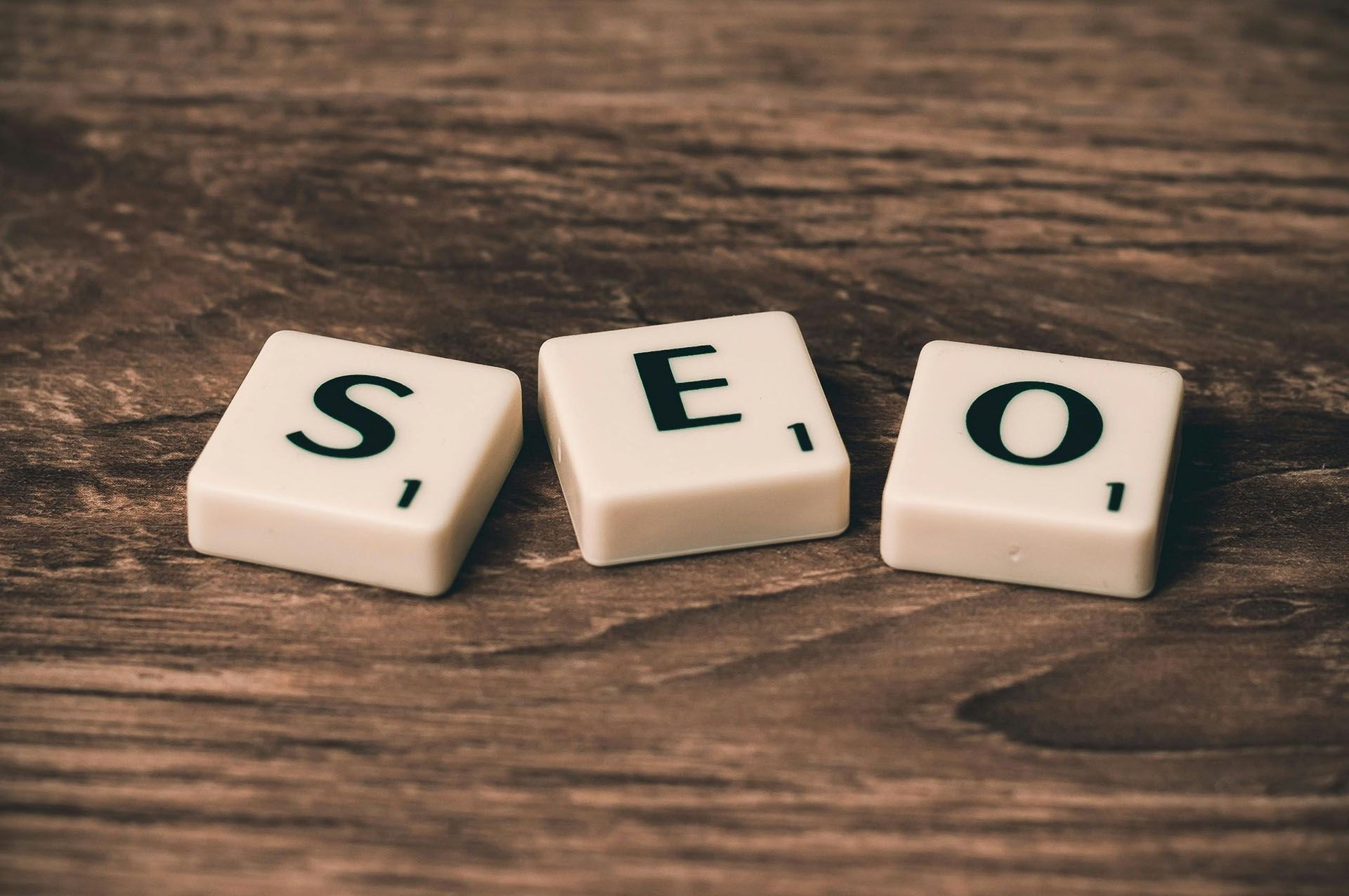
Image Size Guidelines
Melody Jaimon • December 6, 2022
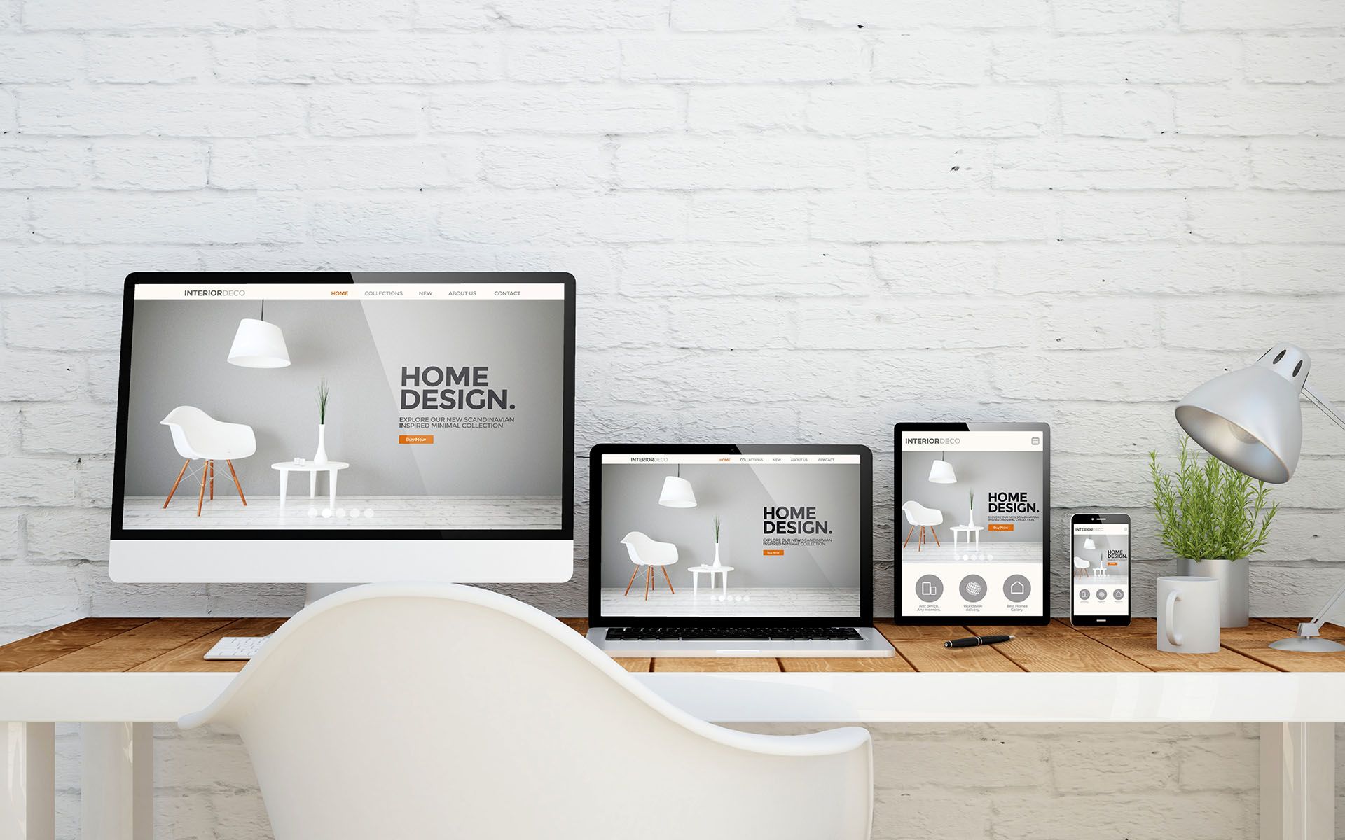
When you submit an image, up to 5 reduced-size versions of the image are created. The appropriately sized image is then immediately inserted into the desktop, tablet, and mobile sites, ensuring that your site visitors always see the correct-sized image for their device.
- Each site can have up to 15K images, and each image should be no larger than 15MB.
- Each site can hold up to 100 videos, and each video can't be larger than 200MB. You can link to as many YouTube or Vimeo videos as you want on each site. See the Video Widget page for more information.
- Image names cannot contain spaces. For example,
beautiful-image.png should be used instead of
beautiful image.png.
System Requirements for Webp
Webp images are supported in the following versions:
- iPhone: v14 and later
- Mac/Safari: latest version
- Chrome: all versions
- Android: all versions
These kinds of image files can be used:
png, jpg, jpeg, gif, svg, svg+xml, ico, x-icon, webp
Optimized Image Sizes per Device
Only images that are smaller than the original are created, and the size of the uploaded image is not increased. For example, if you upload a 2000px wide image, 5 new optimised copies will be created. If you upload an image with a width of 100px, no new image will be created.
Maximum Image Size
An image cannot exceed 3,145,728 pixels in total size. It's unlikely that any of your images will go over this limit, but you can quickly check by multiplying the pixels' width by their height.
The image size shouldn't be larger than 15MB.
If you try to upload an image that is larger than the limit, the following errors could happen:
- Images won't upload.
- Images upload, however, the thumbnails in the image picker won't show.
- Images won't load in the editor.
- On the live site, images won't load.
Image Size Guidelines per Widget Slider
For dramatic effect, the Slider widget is typically used with larger-sized photos. Commonly, sliders extend from end to end, therefore it is good to select photos with a wider width to match the slider. Use an even aspect ratio, such as 1:1 for square sliders.
It is best to select images with adequate padding so that the main content does not get cut off when resized. For design consistency, the image ratios in the slider should be the same.
- Common aspect ratios: 16:9, 3:4
- Common resolution sizes (px): 1600x900, 1280x720, 1280x960
Mobile devices typically have an opposite aspect ratio than desktop devices. You may need to utilise the hide on device feature to display mobile sliders properly.
Photo Gallery
Because there are so many layout choices, the Photo Gallery widget is the most versatile widget for using images. For example, you may have a tiled gallery of the same size for all images or a mosaic with varied sizes for each image.
The aspect ratio of images in the Photo Gallery should correspond to how you want them to appear.
- For example, square-style galleries, should have a 1:1 image ratio.
- Tall image galleries should have longer height ratios, such as 2:5, or 200px by 500px.
For design consistency, image ratios should be the same. Allow some padding in the image to use the hover effect so that your images do not get cut off.
- Common aspect ratios that are used: Any aspect ratio.
- Sizes of common resolutions (px): Any resolution, but not more than 1500px for page speed.
Icons
Icons are an essential component of every website. They are information visual indicators that can offer a modern touch to your site. Transparent PNGs, JPEGs, and SVGs are all acceptable.
- The most common aspect ratio is 1:1, however, any aspect ratio will do.
- Sizes of common resolutions (px): 200x200, 80x80, or any resolution. SVGs can be any resolution.
For more information, see
Site Icons.
SVGs are image files that include HTML code, so when you add an SVG icon to your site, you are also adding lines of code. Complex SVGs can add thousands of lines of code, slowing down your site. If you need to use numerous SVG icons on the same page, we suggest changing some of them into regular images (.png,.jpeg, etc.) to minimize loading or functionality concerns.
Favicons
Favicons are displayed on the tab when users access your website. It is advised that you use the ICO format. See the following resource to convert image files to ICO.
- Required aspect ratio: 1:1
- Allowed resolution sizes (px): 24x24, 36x36, 48x48
Logos
It is advised that you use SVG format for logo images since SVG files are not optimized like other image files, thus even if the logo you upload is small in size, the quality will not suffer.
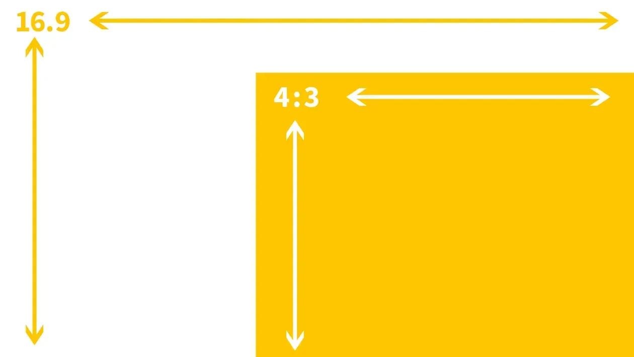
Aspect ratio vs Resolution
The aspect ratio of an image is the ratio of its width and height attributes. A 16:9 aspect ratio image can be either 16x9 px or 1600x900 px. It is practically any image resolution with a 16:9 aspect ratio.
Visualize the two of the most common aspect ratios:
Aspect Ratios per Device
While images on your site are optimized, the design of images on your site is not resized. Because a desktop device is broad, using an image with an aspect ratio of 16:9 on the desktop will seem excellent. However, because a mobile device is significantly smaller, a 16:9 aspect ratio may appear tiny at times.
To make up for this, you can use the "Hide on device" feature to make versions that only work on those devices, or you can change the size of the image to make it fit. Changes to size are device-independent.
Considerations
The biggest is not always the best
Uploading the highest quality for your site ensures high-definition images for buyers. Large images can slow page performance. Users don't perceive the resolution difference since high-quality images are scaled-down. Upload images at their proper size. You shouldn't post a 300px by 300px image as a 4000px by 4000px image.

Love My Online Marketing has 10+ Years of working alongside businesses and helping them grow. Discuss your options for online success from website Design and Development through to Google Marketing. Book a Free 20min Discovery Call.
Do you want more traffic and business leads?
Love My Online Marketing is determined to make a business grow. Our only question is, will it be yours?


Our Services

Latest Online Marketing Posts

Boost local visibility with 11 expert tips for Google Business Profile (formerly GMB) optimisation. Learn how to rank higher and attract more customers.
Learn how to create visually appealing websites in Australia that balance creativity and functionality. Explore tips to keep designs simple yet effective. Read more.
Learn how to grow from zero on social media in 2025 using Viplikes’ tips on content, trends, and smart promotion tools. Read more to level up your game.

We collaborate with


