Crown Street, Wollongong, 2500

Flex Overview

Melody Jaimon • December 8, 2022

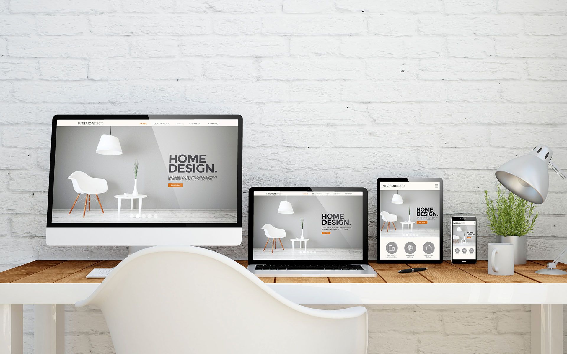
Flex is a design mode that allows you to create pixel-perfect, responsive sections with additional design possibilities. It is incorporated within the editor, so you can easily move between Flex and the classic editor.


Compared to the classic editor, the Flex editor provides design features such as auto layout, multiple element alignment and distribution, responsive size units, and more control over columns. These design capabilities enable you to build and change responsive designs faster than in the classic editor.


This article is only relevant to users who started using Flex after
July 18, 2022. See Flex Overview (1.0).

Flex Terminology

The definitions provided here are specifically for Flex terms.


  • Flex mode.  This is where you can create and update flex sections. Flex mode gives you access to design features not available in the classic editor.
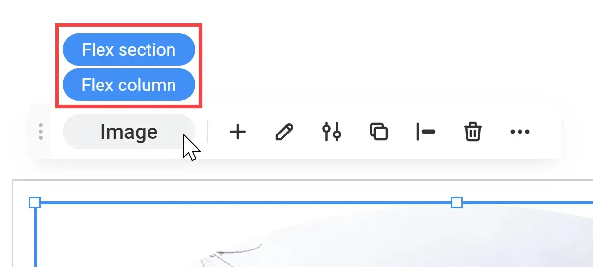
  • Flex section. A row with default flex columns forms a layout. Within a flex section, you can add, delete, or rearrange flex columns. Flex sections can be saved as templates and reused in the future.
  • Flex column. Where you can add widgets. The widgets within flex columns are automatically aligned vertically or horizontally due to auto layout. Because of the auto layout, you can't freely move items inside a flex column; instead, you must utilise the alignment, spacing, and margin settings to move elements.
  • Vertical and horizontal flexboxes.  A container that automatically aligns widgets vertically or horizontally inside it. Because of the auto layout, you can't freely move items inside a vertical or horizontal flexbox; instead, you must utilise the alignment, spacing, and margin settings to move elements.
  • Advanced grid.  To create free-form compositions or overlapping elements, use this tool. The advanced grid does not support auto layout or vertical alignment as well as flex columns. As a result, we suggest that you test your design at all breakpoints.
  • Breakpoints are pixel ranges that correspond to device widths such as desktop, tablet, and mobile. When a device's width falls inside a breakpoint's predetermined pixel range, the site's layout is updated so that the content and design are optimised for that device size and orientation.
  • Flex elements. A flex column containing an advanced grid or horizontal or vertical flexbox.

Hierarchy of Elements

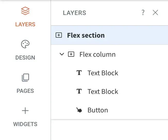
Flex sections include flex columns, and flex columns contain widgets in flex mode. Because this is a default hierarchy, you can't add a widget to a flex section unless you have a flex column.

Select Elements

To select an element (flex section, flex column, or widget), use one of the following methods:


  • Hover over the element and click. Look for the blue outline that shows which element your click will choose while hovering over an element.
  • Select elements from the layers panel. Click Layers on the side panel. You can choose any element from the selected section.
  • Select elements from the design panel. To select an element, use the breadcrumbs in the design panel.
  • Select elements from the floating menu.  If you already have one element chosen, hover over the element name in the floating menu to see the other elements in that area.

Flex Mode

Layers Panel

The layers panel appears on the left side of the flex mode and displays the flex components in the currently chosen section. Elements are shown in their hierarchical order, with sections at the top. You can add new elements, select elements, rearrange elements, rename elements, and hide or reveal elements at certain breakpoints from the layers panel.
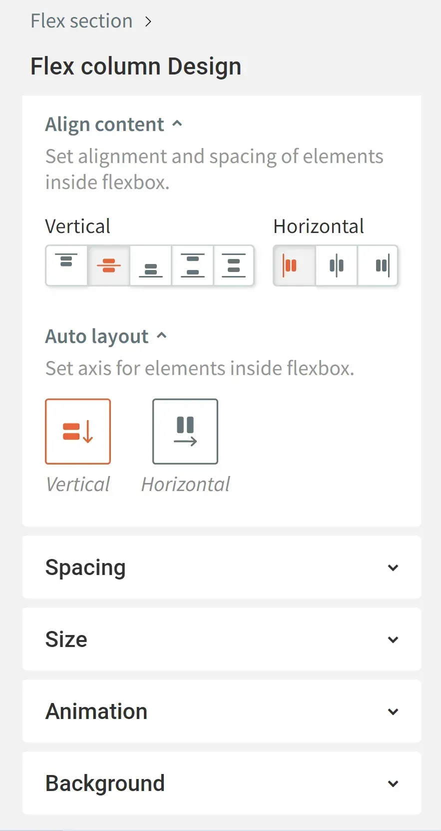
Design Panel

The design panel appears on the right side of the screen in flex mode and contains your design controls for the chosen element (flex section, flex column, or widget). Depending on the selected element, design options include layout, sizing, alignment, and more.
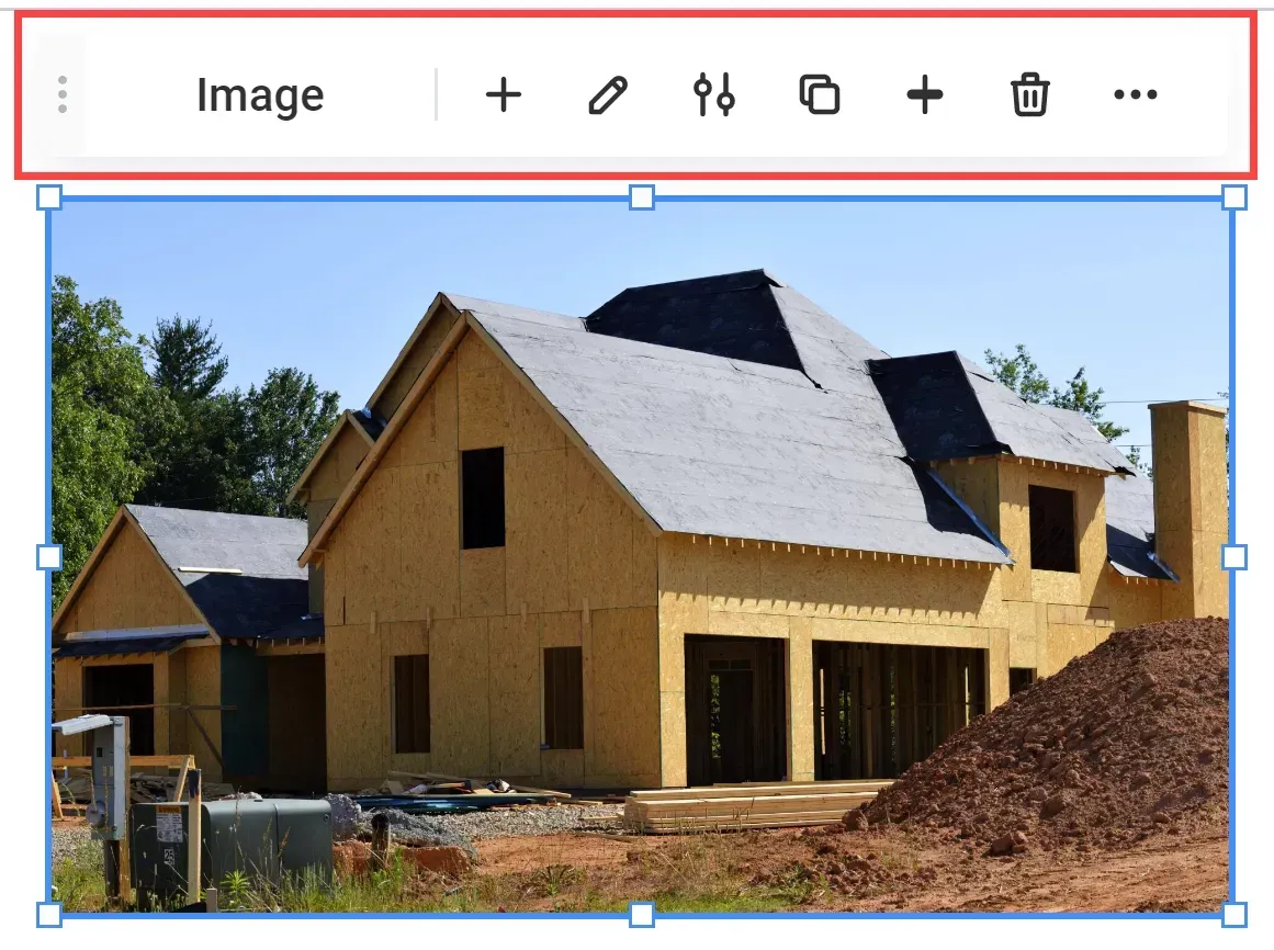
Floating Menu

When you choose an element, the floating menu displays. Toggle between elements, add elements, access the content or design panels, duplicate the element, edit alignment, remove the element, and more are available features via the floating menu.

FAQs

  • What’s the difference between Flex and the classic editor?

    When compared to the classic editor, Flex provides new design capabilities that allow you to develop responsive sites more quickly and simply. Flex provides the following design capabilities that the classic editor does not:


    • Save time.  Flex is built on auto-layout, which means that the design is tuned to fit any breakpoint.
    • Content alignment. Allows you to align all components in a flex column simultaneously. Each piece must be aligned separately with the old editor.
    • Automatic alignment. Elements are automatically aligned vertically or horizontally via flex columns and flexboxes.
    • Number of columns. In flex mode, you may add up to four columns to a section with a width of 100% of the screen.
    • Space between items.  Allows you to specify the spacing between items just once, and it will be applied to all components in a flex column.
    • Element sizing.  Optimize element sizes for screen height in pixels and screen width in percentage.
    • Faster editing. Flex advanced design tools allow you to alter an existing design considerably faster than the standard editor.
  • What is the difference between Flex versions 1.0 and 2.0?

    Before July 18, 2022, everything developed using Flex was built with Flex version 1.0. Previously-created templates and team sections will continue to be changed using Flex version 1.0, but going forwards, Flex version 2.0 will be used for all new designs. Flex 1.0 will be indicated in the top bar, on the section name, and in the layers panel if you are updating a template or team section that was produced with Flex 1.0. After July 18, 2022, all new sites and sites that have never used Flex will be on version 2.0 and will not be able to access version 1.0.


    Flex 2.0 is more streamlined and resembles the classic editor than Flex 1.0. Version 2.0 offers more predefined components, allowing users to develop and modify designs faster. Instead of placing items on a grid, users can now create columns that serve as a layout for widgets. The columns give the user with auto-layout, so items will look great at each breakpoint without the need for any editing.

See How Our Agency Can Drive Massive Amounts of Traffic to Your Website

Website Design designed for your audience and to be found on Google Searches
SEO - unlock relevant and increased SEO traffic. 

Paid Media - effective paid strategies with a clear ROI.

Get Started

Love My Online Marketing has 10+ Years of working alongside businesses and helping them grow. Discuss your options for online success from website Design and Development through to Google Marketing. Book a Free 20min Discovery Call.

Book A Discovery Call

Do you want more traffic and business leads?

Love My Online Marketing is determined to make a business grow. Our only question is, will it be yours?

Let's Chat
A woman is covering her face while using a laptop computer.
By Melody Jaimon March 14, 2025
WordPress vulnerabilities cost businesses time and money. After a hack, we found a better solution—learn why a more secure platform could be the best move for you.
a woman ready to conquer the world
By Melody Jaimon March 12, 2025
Love My Online Marketing shares some of the best and most popular inspiring business quotes for entrepreneurs, with quotes from prominent figures such as Ernest Hemingway, Thomas Edison, and Bruce Lee.
A man and a woman are looking at a laptop in a workshop.
By Melody Jaimon March 10, 2025
Efficient order management boosts sales and reduces errors. These AI-powered order management tools help small businesses streamline inventory and operations. Read more.
Business professional engaging with digital icons representing call-to-action concepts for marketing
By Melody Jaimon March 7, 2025
Without a clear CTA, potential customers may leave without taking action. Learn why CTAs matter and how to design high-converting ones.
A person is typing on a laptop computer with the word digital marketing on the screen.
By Melody Jaimon March 5, 2025
In this blog post, learn how students can master digital marketing in 2025 through online courses, certifications, SEO, content marketing, and more. Read on!
Leave a review card
By Melody Jaimon February 5, 2025
Google reviews boost trust, influence customers, and improve search rankings. Learn why they matter and how to get more. Strengthen your online presence today!
A book titled brand identity sits on a desk next to a keyboard
By Melody Jaimon January 21, 2025
Branding has evolved from ancient symbols to modern strategies shaping businesses. Explore its history, milestones, and future innovations. Read more now!
A smiling woman in glasses working on a laptop in a bright office.
By Melody Jaimon December 17, 2024
Learn how to streamline your marketing efforts with our guide to setting up an effective direct mail campaign. Discover tips for targeting your audience, crafting compelling messages, and boosting response rates for maximum impact.
woman browsing using her phone
By Melody Jaimon November 25, 2024
In this article, we highlight the importance of technologies that help iPhone users tackle cyber threats and have a safe browsing experience.
Laptop displaying LinkedIn logo and tagline on blue screen, with plant in the background.
By Melody Jaimon November 5, 2024
Learn how to add admins to your LinkedIn Page in this step-by-step guide. Boost engagement, improve page management, and expand team collaboration on LinkedIn with ease!
More Posts
Share by: